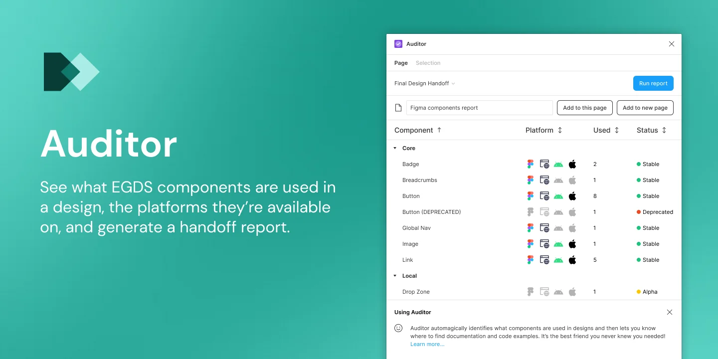
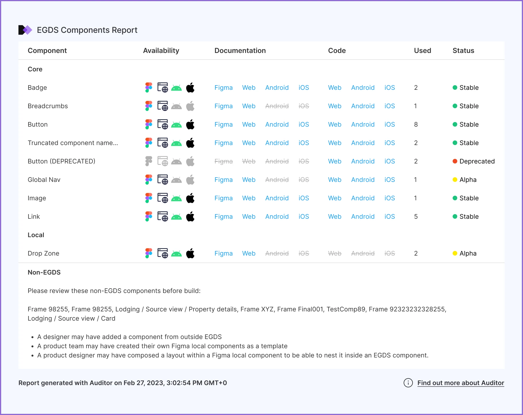
A Figma plugin that checks a design is ready to build before handoff.
Lead designer·Expedia Group·2023-24·8 min read
120+
Users by April 2025
64%
Of designers used EGDS plugins daily
30,000
Layers audited in about 5 seconds
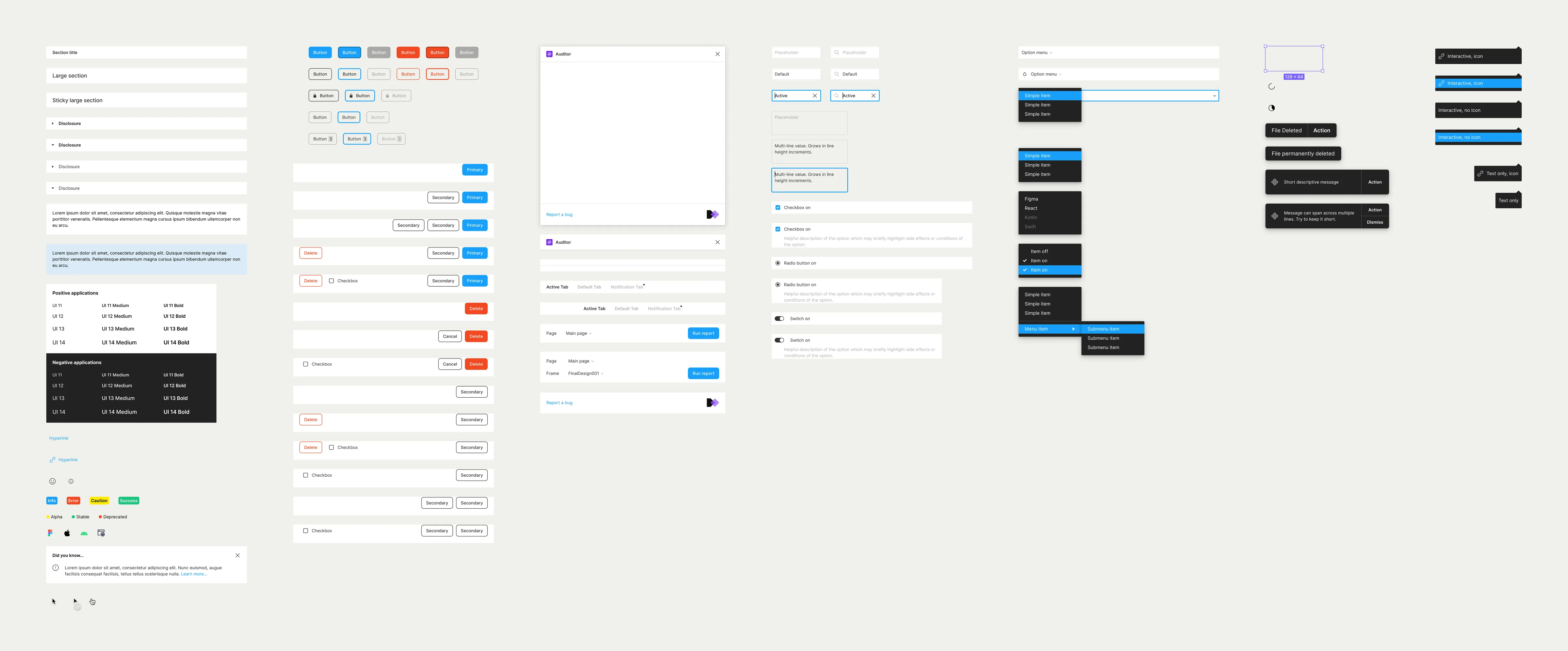
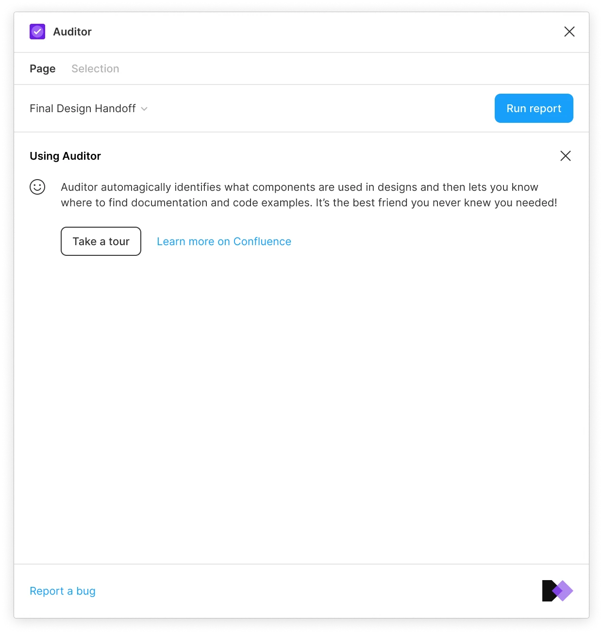
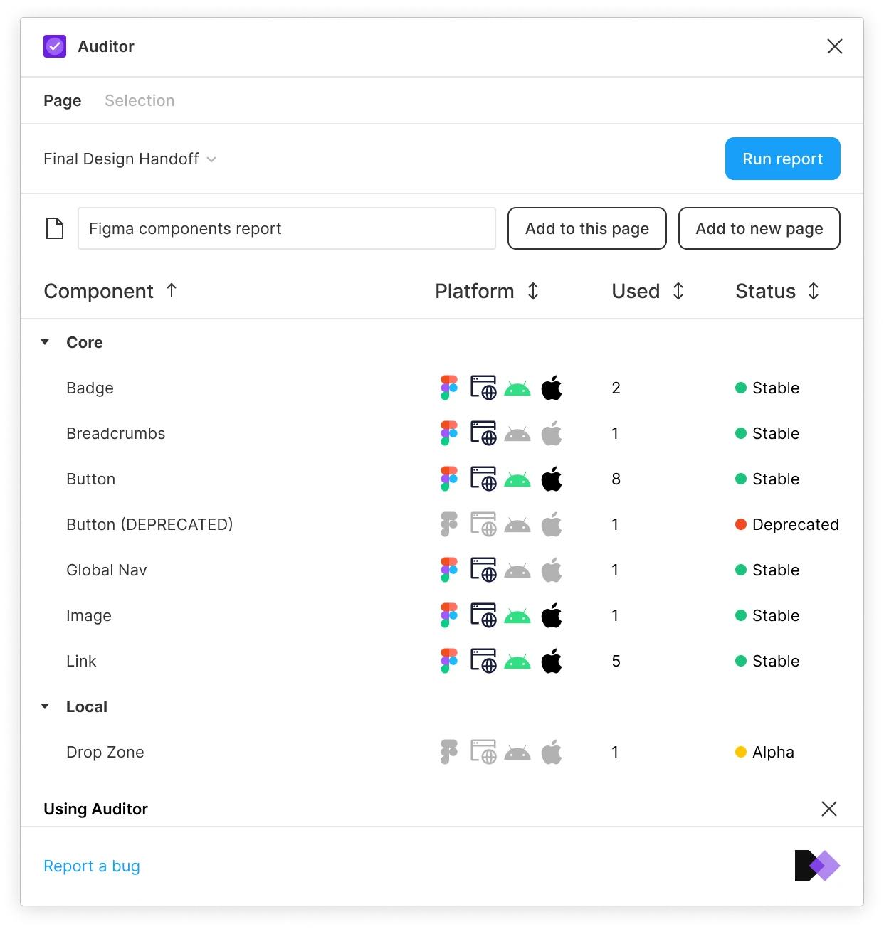
Auditor is a Figma plugin I designed for the Expedia Group Design System (EGDS). It shows designers and developers which EGDS components a design uses and whether they are ready in code, and places a report in the file for handoff. I was the lead designer, working with Eric, an engineer, throughout. Some additional developers were drafted in for parts of the project.
Where it started
EGDS had consolidated four design systems into one and graduated 55 components across iOS, Android and web, and product teams were now expected to build with it. But the system wasn’t complete. Some components weren’t built on every platform and others were being deprecated. Designers had no easy way to tell which was which, so teams were designing with components that didn’t exist in code.
The working assumption was a versioning problem, so Eric and I were put onto it. When we started talking to people who used the system, we found the terms they used didn’t match, even within our own team. So I put together a glossary first, working through each term with the design system team and a group of designers and developers until we agreed.
The EGDS glossary
One set of words for everyone working on the system.
VersioningVersioningVersioning is the creation and management of multiple product releases.
When comparing a proposed design with what is available as code in the system, a developer needs to be able to identify what has been swapped, added or deprecated over time and install or upgrade what’s needed. They also need to be aware of any potential breaking changes that could occur.
Versioning allows us to identify feature sets that exist at a particular point in time and ultimately to communicate about that feature set. This is particularly helpful given we have multiple products and systems.
Versioning is the creation and management of multiple product releases.
When comparing a proposed design with what is available as code in the system, a developer needs to be able to identify what has been swapped, added or deprecated over time and install or upgrade what’s needed. They also need to be aware of any potential breaking changes that could occur.
Versioning allows us to identify feature sets that exist at a particular point in time and ultimately to communicate about that feature set. This is particularly helpful given we have multiple products and systems.
VersioningVersioned artifactsArtifacts refer to all of the individual pieces that a design system releases, not just code.
Not all of these will need to be versioned and the method of versioning for those that do may be different, depending on type of artifact.
Examples:
Tokens, toolkits, components, fonts, Figma components, Figma sticker sheets.
Artifacts refer to all of the individual pieces that a design system releases, not just code.
Not all of these will need to be versioned and the method of versioning for those that do may be different, depending on type of artifact.
VersioningSemantic VersioningSemantic versioning or Semver is a public specification for giving meaning to product or software releases. Semver is represented by 3 numbers separated by periods eg 2.1.17 and uses the format Major.Minor.Patch, incrementing each number depending on what happened to the file.
Major - breaking or incompatible changes / major design refreshes.
Minor - adding features that are backwards-compatible
Patch - backwards-compatible bug fixes
Examples:
v0.1.0 (unstable, before first major release)
v1.0.0 (stable and dependable, first major release)
v1.1.0 (first feature released)
V1.1.1 (bug fix or patch applied)
v2.0.0 (major release launched)
Semantic versioning or Semver is a public specification for giving meaning to product or software releases. Semver is represented by 3 numbers separated by periods eg 2.1.17 and uses the format Major.Minor.Patch, incrementing each number depending on what happened to the file.
Major - breaking or incompatible changes / major design refreshes.
Minor - adding features that are backwards-compatible
Patch - backwards-compatible bug fixes
Examples
v0.1.0 (unstable, before first major release)
v1.0.0 (stable and dependable, first major release)
v1.1.0 (first feature released)
V1.1.1 (bug fix or patch applied)
v2.0.0 (major release launched)
VersioningNamed VersioningMajor versions of a system can be given a codename or release name to help with recognition and for marketing purposes. Apple, for example, has used named versioning alongside semantic versioning when releasing its products, first with big cats (Leopard, Tiger, etc), and then with mountain ranges (Yosemite, Big Sur, etc). The historical context can be lost with named versions, but many users can recall the name of the latest version.
Examples:
OS X 10.6 Snow Leopard
OS X 10.7 Lion
OS X 10.8 Mountain Lion
OS X 10.9 Mavericks
OS X 10.10: Yosemite
OS X 10.11: El Capitan
Major versions of a system can be given a codename or release name to help with recognition and for marketing purposes. Apple, for example, has used named versioning alongside semantic versioning when releasing its products, first with big cats (Leopard, Tiger, etc), and then with mountain ranges (Yosemite, Big Sur, etc). The historical context can be lost with named versions, but many users can recall the name of the latest version.
Examples
OS X 10.6 Snow Leopard
OS X 10.7 Lion
OS X 10.8 Mountain Lion
OS X 10.9 Mavericks
OS X 10.10: Yosemite
OS X 10.11: El Capitan
VersioningBreaking ChangeA breaking change is when a change in one part of the system or component causes other apps / components to fail or break (without refactoring). The issues usually occur in shared coded libraries with interdependencies, however a breaking change could also occur in design when updating to a newer component could cause other design files or coded components to break.
If using Semver, a breaking change would constitute a MAJOR update/bump to the version number.
Examples:
v1.5.0 (Component receives minor update)
v2.0.0 (Component receives major update that results in a breaking change)
A breaking change is when a change in one part of the system or component causes other apps / components to fail or break (without refactoring). The issues usually occur in shared coded libraries with interdependencies, however a breaking change could also occur in design when updating to a newer component could cause other design files or coded components to break.
If using Semver, a breaking change would constitute a MAJOR update/bump to the version number.
Examples
v1.5.0 (Component receives minor update)
v2.0.0 (Component receives major update that results in a breaking change)
VersioningSoft Breaking ChangeA version that is released containing the old and new functionality so it is backwards compatible. This gives teams an easy way to migrate to a breaking change.
A soft breaking change will then be followed by a Breaking Change after a set period of time, where the old function has been removed.
A version that is released containing the old and new functionality so it is backwards compatible. This gives teams an easy way to migrate to a breaking change.
A soft breaking change will then be followed by a Breaking Change after a set period of time, where the old function has been removed.
VersioningBackwards compatibilityA backwards compatible feature or fix should allow for interoperability with existing components or code libraries.
If using Semver, a new design feature that ensured existing compatibility could be expressed as a Minor update, whereas a bug-fix or under the hood tweak that also ensured backwards compatibility could be expressed as a Patch update.
Examples:
v1.5.0 (Component receives minor update that is backwards compatible)
v1.5.1 (Component receives a bug-fix that is backwards compatible)
A backwards compatible feature or fix should allow for interoperability with existing components or code libraries.
If using Semver, a new design feature that ensured existing compatibility could be expressed as a Minor update, whereas a bug-fix or under the hood tweak that also ensured backwards compatibility could be expressed as a Patch update.
Examples
v1.5.0 (Component receives minor update that is backwards compatible)
v1.5.1 (Component receives a bug-fix that is backwards compatible)
VersioningDeprecationThe act of no longer supporting a piece of the design system. This can be how part of a component functions, the whole component, or a set of components. Often, there is a period where it is marked “deprecating”, where it is not removed from the system, but a notice of deprecation is communicated.
Examples:
UDS token gets renamed to EGDS. Old token gets deprecated.
Component uses new sheet system as a container. The previous sub component will be marked as deprecated and eventually sunset.
The act of no longer supporting a piece of the design system. This can be how part of a component functions, the whole component, or a set of components. Often, there is a period where it is marked “deprecating”, where it is not removed from the system, but a notice of deprecation is communicated.
Examples
UDS token gets renamed to EGDS. Old token gets deprecated.
Component uses new sheet system as a container. The previous sub component will be marked as deprecated and eventually sunset.
VersioningMonorepoA monorepo is a single code repository that contains many projects. In the case of EGDS, each Toolkit (i.e. components-react) will contain several installable systems (core and all subsystems).
Example:
UITK React or lodash - 1 repository, many installable things
A monorepo is a single code repository that contains many projects. In the case of EGDS, each Toolkit (i.e. components-react) will contain several installable systems (core and all subsystems).
Example
UITK React or lodash - 1 repository, many installable things
Tiers and systemEGDS PlatformThe EGDS (Expedia Group Design System) Platform is the collection of pieces, parts, people and processes that allow us to create cohesive customer experiences at scale. It is the product that our designers and developers use that allows us to deliver a product to our travelers and suppliers. The EGDS Platform encompasses design files, patterns, documentation, processes, coded components, code toolkits, design tokens and more.
Note: Shared UI is not a part of the EGDS Platform, but is composed of EGDS components.
The EGDS (Expedia Group Design System) Platform is the collection of pieces, parts, people and processes that allow us to create cohesive customer experiences at scale. It is the product that our designers and developers use that allows us to deliver a product to our travelers and suppliers. The EGDS Platform encompasses design files, patterns, documentation, processes, coded components, code toolkits, design tokens and more.
Note Shared UI is not a part of the EGDS Platform, but is composed of EGDS components.
Tiers and systemTiersA tiered design system architecture allows additional teams to contribute and extend the core functionality of the design system.
Components released in the core, middle, and local tiers have differing minimum requirements for quality and platform adherence.
Examples:
Core system contains the EGDS core system and is owned by core team.
Middle tier contains workspaces that are collectively owned by a group of product teams.
Local tier contains workspaces that are owned by a single product team
A tiered design system architecture allows additional teams to contribute and extend the core functionality of the design system.
Components released in the core, middle, and local tiers have differing minimum requirements for quality and platform adherence.
Examples
Core system contains the EGDS core system and is owned by core team.
Middle tier contains workspaces that are collectively owned by a group of product teams.
Local tier contains workspaces that are owned by a single product team
Tiers and systemCore TierCore tier contains only the EGDS Core system.
The core tier is managed by a centralized team who are responsible for the definition and governance of the overall ecosystem.
Example:
Core tier contains the core system.
Core tier contains only the EGDS Core system.
The core tier is managed by a centralized team who are responsible for the definition and governance of the overall ecosystem.
Example
Core tier contains the core system.
Tiers and systemMiddle Tier (TBD)The middle tier contains workspaces that extend the core system. Components in these workspaces should have general capabilities and functionality that can span across multiple product teams or divisions.
Components in a middle tier workspace are collectively built, owned and maintained by a collective of 2 or more product teams.
Middle tier workspaces have a dependency on EGDS core system.
Example:
Middle tier could contain the search, shopping and reporting subsets.
Note: Middle tier naming is still TBD. There are concerns with naming it ‘Shared’, due to confusion with Shared UI.
Suggestions:
Communal
Community
Combined
Middle
Group
The middle tier contains workspaces that extend the core system. Components in these workspaces should have general capabilities and functionality that can span across multiple product teams or divisions.
Components in a middle tier workspace are collectively built, owned and maintained by a collective of 2 or more product teams.
Middle tier workspaces have a dependency on EGDS core system.
Example
Middle tier could contain the search, shopping and reporting subsets.
Note Middle tier naming is still TBD. There are concerns with naming it ‘Shared’, due to confusion with Shared UI.
Suggestions
Communal
Community
Combined
Middle
Group
Previously known as Shared tier, and now called that again.
Tiers and systemLocal TierThe local tier contains workspaces that extend the core library with specific capabilities and functionality that is limited in scope to a single line of business.
Components in a local tier workspace are built, owned and maintained by a single product team only.
Local tier workspaces have a dependency on EGDS core system and could also potentially have a dependency on a shared workspace.
Everything in local should be a net new feature of a component or a net new component, not a roll up of pre-existing components - that should live in shared UI.
Example:
Local tier could contain the air and lodging workspaces.
The local tier contains workspaces that extend the core library with specific capabilities and functionality that is limited in scope to a single line of business.
Components in a local tier workspace are built, owned and maintained by a single product team only.
Local tier workspaces have a dependency on EGDS core system and could also potentially have a dependency on a shared workspace.
Everything in local should be a net new feature of a component or a net new component, not a roll up of pre-existing components - that should live in shared UI.
Example
Local tier could contain the air and lodging workspaces.
Now called Team tier.
Tiers and systemCore SystemEGDS core system includes the design tokens, components and documentation that is used by all adopters of the EGDS platform.
EGDS core system lives in the core tier.
The core system contains platform and framework specific toolkits, which in turn contain components.
Foundation, semantic and feature tokens can be created and used within the core system.
EGDS core system includes the design tokens, components and documentation that is used by all adopters of the EGDS platform.
EGDS core system lives in the core tier.
The core system contains platform and framework specific toolkits, which in turn contain components.
Foundation, semantic and feature tokens can be created and used within the core system.
Tiers and systemWorkspaceWorkspaces are extensions to the EGDS core system and as such, have a dependency on it.
Workspaces can live in a local or middle tier of the design system.
Each workspace extension of the core would eventually include tokens, components, documentation, a dependent parent system, owners and versions.
Each workspace is responsible for establishing its operating model.
Only feature tokens can be created and used within a middle or local tier workspace.
Examples:
A shopping workspace could potentially live in the middle tier and be jointly owned by the local air and lodging teams.
The lodging workspace lives in the local tier and is owned solely by the lodging team.
The air workspace lives in the local tier and is owned solely by the air team.
Workspaces are extensions to the EGDS core system and as such, have a dependency on it.
Workspaces can live in a local or middle tier of the design system.
Each workspace extension of the core would eventually include tokens, components, documentation, a dependent parent system, owners and versions.
Each workspace is responsible for establishing its operating model.
Only feature tokens can be created and used within a middle or local tier workspace.
Examples
A shopping workspace could potentially live in the middle tier and be jointly owned by the local air and lodging teams.
The lodging workspace lives in the local tier and is owned solely by the lodging team.
The air workspace lives in the local tier and is owned solely by the air team.
Previously known as Subsystem.
Tiers and systemMiddle tier workspaceA workspace in the middle tier is collectively built, owned and maintained by 2 or more product teams working together.
Example:
The shopping workspace lives in the middle tier and is collectively owned by the local lodging and air teams.
A workspace in the middle tier is collectively built, owned and maintained by 2 or more product teams working together.
Example
The shopping workspace lives in the middle tier and is collectively owned by the local lodging and air teams.
Now called Shared tier workspace.
Tiers and systemLocal tier workspaceA workspace in the local tier is built, owned and maintained by a single product team only.
Example:
The lodging workspace lives in the local tier and is owned solely by the lodging team.
A workspace in the local tier is built, owned and maintained by a single product team only.
Example
The lodging workspace lives in the local tier and is owned solely by the lodging team.
Now called Team tier workspace.
Tiers and systemToolkitA toolkit represents the encoding of EGDS through a particular programming language or framework.
Within each toolkit (eg React) will be components that can be used to build experiences on that specific platform.
Components expressed in code have a 1:1 representation in design.
Examples:
React (web)
SwiftUI (iOS)
Jetpack (Android)
Figma (design)
A toolkit represents the encoding of EGDS through a particular programming language or framework.
Within each toolkit (eg React) will be components that can be used to build experiences on that specific platform.
Components expressed in code have a 1:1 representation in design.
Examples
React (web)
SwiftUI (iOS)
Jetpack (Android)
Figma (design)
Tiers and systemComponentComponents are the implementation of an EGDS design in code and are used as building blocks used to build experiences.
Components can contain a set of behaviors, properties, and a user interface.
Note: Components in design only are referred to as ‘Figma Components’ - these have a 1:1 representation in code.
Components are the implementation of an EGDS design in code and are used as building blocks used to build experiences.
Components can contain a set of behaviors, properties, and a user interface.
Note Components in design only are referred to as ‘Figma Components’ - these have a 1:1 representation in code.
Tiers and systemMatchmakingWhen a team has a need for a component not covered by the core system across toolkits, there will be a matchmaking phase, where a match will be attempted between that team and another workspaces component. If no match exists, then that component will be created in a new or existing workspace.
The process for matchmaking is currently TBD.
When a team has a need for a component not covered by the core system across toolkits, there will be a matchmaking phase, where a match will be attempted between that team and another workspaces component. If no match exists, then that component will be created in a new or existing workspace.
The process for matchmaking is currently TBD.
VersioningVersioningVersioning is the creation and management of multiple product releases.
When comparing a proposed design with what is available as code in the system, a developer needs to be able to identify what has been swapped, added or deprecated over time and install or upgrade what’s needed. They also need to be aware of any potential breaking changes that could occur.
Versioning allows us to identify feature sets that exist at a particular point in time and ultimately to communicate about that feature set. This is particularly helpful given we have multiple products and systems.
Versioning is the creation and management of multiple product releases.
When comparing a proposed design with what is available as code in the system, a developer needs to be able to identify what has been swapped, added or deprecated over time and install or upgrade what’s needed. They also need to be aware of any potential breaking changes that could occur.
Versioning allows us to identify feature sets that exist at a particular point in time and ultimately to communicate about that feature set. This is particularly helpful given we have multiple products and systems.
VersioningVersioned artifactsArtifacts refer to all of the individual pieces that a design system releases, not just code.
Not all of these will need to be versioned and the method of versioning for those that do may be different, depending on type of artifact.
Examples:
Tokens, toolkits, components, fonts, Figma components, Figma sticker sheets.
Artifacts refer to all of the individual pieces that a design system releases, not just code.
Not all of these will need to be versioned and the method of versioning for those that do may be different, depending on type of artifact.
VersioningSemantic VersioningSemantic versioning or Semver is a public specification for giving meaning to product or software releases. Semver is represented by 3 numbers separated by periods eg 2.1.17 and uses the format Major.Minor.Patch, incrementing each number depending on what happened to the file.
Major - breaking or incompatible changes / major design refreshes.
Minor - adding features that are backwards-compatible
Patch - backwards-compatible bug fixes
Examples:
v0.1.0 (unstable, before first major release)
v1.0.0 (stable and dependable, first major release)
v1.1.0 (first feature released)
V1.1.1 (bug fix or patch applied)
v2.0.0 (major release launched)
Semantic versioning or Semver is a public specification for giving meaning to product or software releases. Semver is represented by 3 numbers separated by periods eg 2.1.17 and uses the format Major.Minor.Patch, incrementing each number depending on what happened to the file.
Major - breaking or incompatible changes / major design refreshes.
Minor - adding features that are backwards-compatible
Patch - backwards-compatible bug fixes
Examples
v0.1.0 (unstable, before first major release)
v1.0.0 (stable and dependable, first major release)
v1.1.0 (first feature released)
V1.1.1 (bug fix or patch applied)
v2.0.0 (major release launched)
VersioningNamed VersioningMajor versions of a system can be given a codename or release name to help with recognition and for marketing purposes. Apple, for example, has used named versioning alongside semantic versioning when releasing its products, first with big cats (Leopard, Tiger, etc), and then with mountain ranges (Yosemite, Big Sur, etc). The historical context can be lost with named versions, but many users can recall the name of the latest version.
Examples:
OS X 10.6 Snow Leopard
OS X 10.7 Lion
OS X 10.8 Mountain Lion
OS X 10.9 Mavericks
OS X 10.10: Yosemite
OS X 10.11: El Capitan
Major versions of a system can be given a codename or release name to help with recognition and for marketing purposes. Apple, for example, has used named versioning alongside semantic versioning when releasing its products, first with big cats (Leopard, Tiger, etc), and then with mountain ranges (Yosemite, Big Sur, etc). The historical context can be lost with named versions, but many users can recall the name of the latest version.
Examples
OS X 10.6 Snow Leopard
OS X 10.7 Lion
OS X 10.8 Mountain Lion
OS X 10.9 Mavericks
OS X 10.10: Yosemite
OS X 10.11: El Capitan
VersioningBreaking ChangeA breaking change is when a change in one part of the system or component causes other apps / components to fail or break (without refactoring). The issues usually occur in shared coded libraries with interdependencies, however a breaking change could also occur in design when updating to a newer component could cause other design files or coded components to break.
If using Semver, a breaking change would constitute a MAJOR update/bump to the version number.
Examples:
v1.5.0 (Component receives minor update)
v2.0.0 (Component receives major update that results in a breaking change)
A breaking change is when a change in one part of the system or component causes other apps / components to fail or break (without refactoring). The issues usually occur in shared coded libraries with interdependencies, however a breaking change could also occur in design when updating to a newer component could cause other design files or coded components to break.
If using Semver, a breaking change would constitute a MAJOR update/bump to the version number.
Examples
v1.5.0 (Component receives minor update)
v2.0.0 (Component receives major update that results in a breaking change)
VersioningSoft Breaking ChangeA version that is released containing the old and new functionality so it is backwards compatible. This gives teams an easy way to migrate to a breaking change.
A soft breaking change will then be followed by a Breaking Change after a set period of time, where the old function has been removed.
A version that is released containing the old and new functionality so it is backwards compatible. This gives teams an easy way to migrate to a breaking change.
A soft breaking change will then be followed by a Breaking Change after a set period of time, where the old function has been removed.
VersioningBackwards compatibilityA backwards compatible feature or fix should allow for interoperability with existing components or code libraries.
If using Semver, a new design feature that ensured existing compatibility could be expressed as a Minor update, whereas a bug-fix or under the hood tweak that also ensured backwards compatibility could be expressed as a Patch update.
Examples:
v1.5.0 (Component receives minor update that is backwards compatible)
v1.5.1 (Component receives a bug-fix that is backwards compatible)
A backwards compatible feature or fix should allow for interoperability with existing components or code libraries.
If using Semver, a new design feature that ensured existing compatibility could be expressed as a Minor update, whereas a bug-fix or under the hood tweak that also ensured backwards compatibility could be expressed as a Patch update.
Examples
v1.5.0 (Component receives minor update that is backwards compatible)
v1.5.1 (Component receives a bug-fix that is backwards compatible)
VersioningDeprecationThe act of no longer supporting a piece of the design system. This can be how part of a component functions, the whole component, or a set of components. Often, there is a period where it is marked “deprecating”, where it is not removed from the system, but a notice of deprecation is communicated.
Examples:
UDS token gets renamed to EGDS. Old token gets deprecated.
Component uses new sheet system as a container. The previous sub component will be marked as deprecated and eventually sunset.
The act of no longer supporting a piece of the design system. This can be how part of a component functions, the whole component, or a set of components. Often, there is a period where it is marked “deprecating”, where it is not removed from the system, but a notice of deprecation is communicated.
Examples
UDS token gets renamed to EGDS. Old token gets deprecated.
Component uses new sheet system as a container. The previous sub component will be marked as deprecated and eventually sunset.
VersioningMonorepoA monorepo is a single code repository that contains many projects. In the case of EGDS, each Toolkit (i.e. components-react) will contain several installable systems (core and all subsystems).
Example:
UITK React or lodash - 1 repository, many installable things
A monorepo is a single code repository that contains many projects. In the case of EGDS, each Toolkit (i.e. components-react) will contain several installable systems (core and all subsystems).
Example
UITK React or lodash - 1 repository, many installable things
Tiers and systemEGDS PlatformThe EGDS (Expedia Group Design System) Platform is the collection of pieces, parts, people and processes that allow us to create cohesive customer experiences at scale. It is the product that our designers and developers use that allows us to deliver a product to our travelers and suppliers. The EGDS Platform encompasses design files, patterns, documentation, processes, coded components, code toolkits, design tokens and more.
Note: Shared UI is not a part of the EGDS Platform, but is composed of EGDS components.
The EGDS (Expedia Group Design System) Platform is the collection of pieces, parts, people and processes that allow us to create cohesive customer experiences at scale. It is the product that our designers and developers use that allows us to deliver a product to our travelers and suppliers. The EGDS Platform encompasses design files, patterns, documentation, processes, coded components, code toolkits, design tokens and more.
Note Shared UI is not a part of the EGDS Platform, but is composed of EGDS components.
Tiers and systemTiersA tiered design system architecture allows additional teams to contribute and extend the core functionality of the design system.
Components released in the core, middle, and local tiers have differing minimum requirements for quality and platform adherence.
Examples:
Core system contains the EGDS core system and is owned by core team.
Middle tier contains workspaces that are collectively owned by a group of product teams.
Local tier contains workspaces that are owned by a single product team
A tiered design system architecture allows additional teams to contribute and extend the core functionality of the design system.
Components released in the core, middle, and local tiers have differing minimum requirements for quality and platform adherence.
Examples
Core system contains the EGDS core system and is owned by core team.
Middle tier contains workspaces that are collectively owned by a group of product teams.
Local tier contains workspaces that are owned by a single product team
Tiers and systemCore TierCore tier contains only the EGDS Core system.
The core tier is managed by a centralized team who are responsible for the definition and governance of the overall ecosystem.
Example:
Core tier contains the core system.
Core tier contains only the EGDS Core system.
The core tier is managed by a centralized team who are responsible for the definition and governance of the overall ecosystem.
Example
Core tier contains the core system.
Tiers and systemMiddle Tier (TBD)The middle tier contains workspaces that extend the core system. Components in these workspaces should have general capabilities and functionality that can span across multiple product teams or divisions.
Components in a middle tier workspace are collectively built, owned and maintained by a collective of 2 or more product teams.
Middle tier workspaces have a dependency on EGDS core system.
Example:
Middle tier could contain the search, shopping and reporting subsets.
Note: Middle tier naming is still TBD. There are concerns with naming it ‘Shared’, due to confusion with Shared UI.
Suggestions:
Communal
Community
Combined
Middle
Group
The middle tier contains workspaces that extend the core system. Components in these workspaces should have general capabilities and functionality that can span across multiple product teams or divisions.
Components in a middle tier workspace are collectively built, owned and maintained by a collective of 2 or more product teams.
Middle tier workspaces have a dependency on EGDS core system.
Example
Middle tier could contain the search, shopping and reporting subsets.
Note Middle tier naming is still TBD. There are concerns with naming it ‘Shared’, due to confusion with Shared UI.
Suggestions
Communal
Community
Combined
Middle
Group
Previously known as Shared tier, and now called that again.
Tiers and systemLocal TierThe local tier contains workspaces that extend the core library with specific capabilities and functionality that is limited in scope to a single line of business.
Components in a local tier workspace are built, owned and maintained by a single product team only.
Local tier workspaces have a dependency on EGDS core system and could also potentially have a dependency on a shared workspace.
Everything in local should be a net new feature of a component or a net new component, not a roll up of pre-existing components - that should live in shared UI.
Example:
Local tier could contain the air and lodging workspaces.
The local tier contains workspaces that extend the core library with specific capabilities and functionality that is limited in scope to a single line of business.
Components in a local tier workspace are built, owned and maintained by a single product team only.
Local tier workspaces have a dependency on EGDS core system and could also potentially have a dependency on a shared workspace.
Everything in local should be a net new feature of a component or a net new component, not a roll up of pre-existing components - that should live in shared UI.
Example
Local tier could contain the air and lodging workspaces.
Now called Team tier.
Tiers and systemCore SystemEGDS core system includes the design tokens, components and documentation that is used by all adopters of the EGDS platform.
EGDS core system lives in the core tier.
The core system contains platform and framework specific toolkits, which in turn contain components.
Foundation, semantic and feature tokens can be created and used within the core system.
EGDS core system includes the design tokens, components and documentation that is used by all adopters of the EGDS platform.
EGDS core system lives in the core tier.
The core system contains platform and framework specific toolkits, which in turn contain components.
Foundation, semantic and feature tokens can be created and used within the core system.
Tiers and systemWorkspaceWorkspaces are extensions to the EGDS core system and as such, have a dependency on it.
Workspaces can live in a local or middle tier of the design system.
Each workspace extension of the core would eventually include tokens, components, documentation, a dependent parent system, owners and versions.
Each workspace is responsible for establishing its operating model.
Only feature tokens can be created and used within a middle or local tier workspace.
Examples:
A shopping workspace could potentially live in the middle tier and be jointly owned by the local air and lodging teams.
The lodging workspace lives in the local tier and is owned solely by the lodging team.
The air workspace lives in the local tier and is owned solely by the air team.
Workspaces are extensions to the EGDS core system and as such, have a dependency on it.
Workspaces can live in a local or middle tier of the design system.
Each workspace extension of the core would eventually include tokens, components, documentation, a dependent parent system, owners and versions.
Each workspace is responsible for establishing its operating model.
Only feature tokens can be created and used within a middle or local tier workspace.
Examples
A shopping workspace could potentially live in the middle tier and be jointly owned by the local air and lodging teams.
The lodging workspace lives in the local tier and is owned solely by the lodging team.
The air workspace lives in the local tier and is owned solely by the air team.
Previously known as Subsystem.
Tiers and systemMiddle tier workspaceA workspace in the middle tier is collectively built, owned and maintained by 2 or more product teams working together.
Example:
The shopping workspace lives in the middle tier and is collectively owned by the local lodging and air teams.
A workspace in the middle tier is collectively built, owned and maintained by 2 or more product teams working together.
Example
The shopping workspace lives in the middle tier and is collectively owned by the local lodging and air teams.
Now called Shared tier workspace.
Tiers and systemLocal tier workspaceA workspace in the local tier is built, owned and maintained by a single product team only.
Example:
The lodging workspace lives in the local tier and is owned solely by the lodging team.
A workspace in the local tier is built, owned and maintained by a single product team only.
Example
The lodging workspace lives in the local tier and is owned solely by the lodging team.
Now called Team tier workspace.
Tiers and systemToolkitA toolkit represents the encoding of EGDS through a particular programming language or framework.
Within each toolkit (eg React) will be components that can be used to build experiences on that specific platform.
Components expressed in code have a 1:1 representation in design.
Examples:
React (web)
SwiftUI (iOS)
Jetpack (Android)
Figma (design)
A toolkit represents the encoding of EGDS through a particular programming language or framework.
Within each toolkit (eg React) will be components that can be used to build experiences on that specific platform.
Components expressed in code have a 1:1 representation in design.
Examples
React (web)
SwiftUI (iOS)
Jetpack (Android)
Figma (design)
Tiers and systemComponentComponents are the implementation of an EGDS design in code and are used as building blocks used to build experiences.
Components can contain a set of behaviors, properties, and a user interface.
Note: Components in design only are referred to as ‘Figma Components’ - these have a 1:1 representation in code.
Components are the implementation of an EGDS design in code and are used as building blocks used to build experiences.
Components can contain a set of behaviors, properties, and a user interface.
Note Components in design only are referred to as ‘Figma Components’ - these have a 1:1 representation in code.
Tiers and systemMatchmakingWhen a team has a need for a component not covered by the core system across toolkits, there will be a matchmaking phase, where a match will be attempted between that team and another workspaces component. If no match exists, then that component will be created in a new or existing workspace.
The process for matchmaking is currently TBD.
When a team has a need for a component not covered by the core system across toolkits, there will be a matchmaking phase, where a match will be attempted between that team and another workspaces component. If no match exists, then that component will be created in a new or existing workspace.
The process for matchmaking is currently TBD.
PlatformPlatformPlatforms refer to the specific device type that the application will run on, either Native or Web.
Native platforms we currently support are iOS and Android. The web platform will usually mean desktop, tablet or mobile device, accessible via a web browser.
Examples:
Web
Native (iOS, Android)
Platforms refer to the specific device type that the application will run on, either Native or Web.
Native platforms we currently support are iOS and Android. The web platform will usually mean desktop, tablet or mobile device, accessible via a web browser.
Examples
Web
Native (iOS, Android)
PlatformExperience PlatformExperience platform is the name given to the EG organisation that is responsible for providing end-to-end experience architecture innovation and the design system and platform tools that power it.
Experience Ecosystem:
EG Design System
Accessibility + XD Engineering
One Design Language
Platform Tools
Core Experiences:
One Identity, Profile & Personalization
One Messaging Platform
Assistance Everywhere
eCommerce & Checkout
Experience platform is the name given to the EG organisation that is responsible for providing end-to-end experience architecture innovation and the design system and platform tools that power it.
Experience Ecosystem
EG Design System
Accessibility + XD Engineering
One Design Language
Platform Tools
Core Experiences
One Identity, Profile & Personalization
One Messaging Platform
Assistance Everywhere
eCommerce & Checkout
Also known as XD Platform, Experience Platform Design or XD Experience Platform.
PlatformFrameworkThe framework is a software toolset that provides built-in solutions meant to speed up development. The framework is built on a programming language, and often has reusable code (functions, utilities, etc) so the platform does not need to be built from the ground up. A framework does not mean a platform, as there can be multiple frameworks per platform.
Examples:
React for web
Jetpack for Android
SwiftUI for iOS
The framework is a software toolset that provides built-in solutions meant to speed up development. The framework is built on a programming language, and often has reusable code (functions, utilities, etc) so the platform does not need to be built from the ground up. A framework does not mean a platform, as there can be multiple frameworks per platform.
Examples
React for web
Jetpack for Android
SwiftUI for iOS
PlatformProgramming LanguageA type of written language that tells computers what to do.
Examples:
Javascript / Typescript for web
Kotlin for Android
Swift for iOS
A type of written language that tells computers what to do.
Examples
Javascript / Typescript for web
Kotlin for Android
Swift for iOS
PlatformLibraryA library is a set of code that’s been packaged for reuse. While we use it synonymously with “toolkit”, our preference is to use “toolkit”.
See also:
Figma library for design
A library is a set of code that’s been packaged for reuse. While we use it synonymously with “toolkit”, our preference is to use “toolkit”.
See also
Figma library for design
PlatformAdoptersThe teams, pods or organizations that consume the code to build applications or experiences.
Examples:
XD Lodging Team
Trips Team
The teams, pods or organizations that consume the code to build applications or experiences.
Examples
XD Lodging Team
Trips Team
Also referred to as Consumers or Customers.
PlatformDocumentation siteA single documentation site that combines (or federates) all previously existing documentation sites regarding EGDS, Shared-UI and Experience API.
Example content could include:
Tokens
Component examples and guidelines
A11y guidelines
Support
Guidance on developing for web & native
Design guidelines & best practice
A single documentation site that combines (or federates) all previously existing documentation sites regarding EGDS, Shared-UI and Experience API.
Example content could include
Tokens
Component examples and guidelines
A11y guidelines
Support
Guidance on developing for web & native
Design guidelines & best practice
Previously known as Federated doc site.
PlatformThe CatalogThe catalog provides a clear picture of component names and system relationships.
The catalog acts as the source of truth for what workspaces and components exist and the current state of each.
The catalog will eventually track the version history of components across platforms.
Example implementations:
Figma (design)
React (Web)
Swift (iOS)
Kotlin (Android)
The catalog provides a clear picture of component names and system relationships.
The catalog acts as the source of truth for what workspaces and components exist and the current state of each.
The catalog will eventually track the version history of components across platforms.
Example implementations
Figma (design)
React (Web)
Swift (iOS)
Kotlin (Android)
Previously known as Pipeline, Design ecosystem registry or Registry.
TokensTokenDesign tokens store repeatable style values like colours, fonts, sizing and spacing. They provide a platform and technology-agnostic way to store a value to be ingested by applications. These can represent anything defined by design: a color as a hex value, an opacity as a number, an animation ease as Bezier coordinates.
Overall, they establish the single source of truth for style decisions made across creative tools and coding languages. This allows product teams to collaborate better and ensure consistency across platforms.
Design tokens store repeatable style values like colours, fonts, sizing and spacing. They provide a platform and technology-agnostic way to store a value to be ingested by applications. These can represent anything defined by design: a color as a hex value, an opacity as a number, an animation ease as Bezier coordinates.
Overall, they establish the single source of truth for style decisions made across creative tools and coding languages. This allows product teams to collaborate better and ensure consistency across platforms.
TokensFoundation tokenFoundation tokens contain the raw values for color, spacing, size, weight, etc to define a brand in EGDS. This allows for all possible brand values to be visible in one place.
The brand overrides the default values with specific values. Brand designers typically define these tokens and don’t change very often. For the most part, foundation tokens can be considered “set-and-forget” and don’t change when doing product or component design work.
Foundation tokens contain the raw values for color, spacing, size, weight, etc to define a brand in EGDS. This allows for all possible brand values to be visible in one place.
The brand overrides the default values with specific values. Brand designers typically define these tokens and don’t change very often. For the most part, foundation tokens can be considered “set-and-forget” and don’t change when doing product or component design work.
Examples
// A color token
@color__brand__1: #DB3939;

// A spacing token
@spacing__two: 8px;

// A type size token
@type__scale__300__size: 14px;
TokensSemantic tokenSemantic tokens are an additional layer that sits between feature and foundation tokens. They provide the ability to make fast, sweeping changes to colors throughout an application.
Semantic tokens allow for consistent choices when applying meaningful color to components (eg positive / negative) and offer guidance for creating accessible experiences for our users (semantic color tokens always have dark mode mapping built in).
Semantic tokens are an additional layer that sits between feature and foundation tokens. They provide the ability to make fast, sweeping changes to colors throughout an application.
Semantic tokens allow for consistent choices when applying meaningful color to components (eg positive / negative) and offer guidance for creating accessible experiences for our users (semantic color tokens always have dark mode mapping built in).
Examples
// A positive background color
"background_color__positive__default": {
  "value": "$color__accent__4__500",
  "variations": { "dark": "$color__accent__4__200" }
}

// A negative background color
"value": "$color__accent__5__500",
"variations": { "dark": "$color__accent__5__200" }
TokensFeature tokenA feature token contains values that are specific to a component, such as a button, banner, card, etc.
Feature tokens define specific properties of a component and then map or point to a foundation or semantic token to define their brand value.
Feature tokens always point to a semantic or foundational token and never reference values directly.
A feature token contains values that are specific to a component, such as a button, banner, card, etc.
Feature tokens define specific properties of a component and then map or point to a foundation or semantic token to define their brand value.
Feature tokens always point to a semantic or foundational token and never reference values directly.
Examples
// Sets the size of favorite icon
"favorite__icon__sizing": {
  "value": "$sizing__6x"
}

// Sets the color of favorite icon in default state
"favorite__default__icon__fill_color": { "value": "$fill_color__default" }
TokensCore tokenWhen we refer to ‘Core tokens’, in conversations amongst our team as we build out our platform, we are in fact referring to any foundation, semantic and feature tokens used by the core tier of the design system. We may want to do this occasionally to distinguish the difference between a group of core feature tokens and local tier feature tokens, for example.
We can refer to the token within the core system by including the core name as a prefix before the token name:
Examples:
“Core token”
“Core foundation token”
“Core feature token”
“Core semantic token”
Or simply just refer to them by their original name:
“Foundation token”
“Feature token”
“Semantic token”
When we refer to ‘Core tokens’, in conversations amongst our team as we build out our platform, we are in fact referring to any foundation, semantic and feature tokens used by the core tier of the design system. We may want to do this occasionally to distinguish the difference between a group of core feature tokens and local tier feature tokens, for example.
We can refer to the token within the core system by including the core name as a prefix before the token name:
Examples
“Core token”
“Core foundation token”
“Core feature token”
“Core semantic token”
Or simply just refer to them by their original name
“Foundation token”
“Feature token”
“Semantic token”
TokensWorkspace tokensWhen we refer to ‘workspace tokens’, in conversations amongst our team as we build out our platform, we are in fact referring to any feature tokens used by the local or middle tier of the design system. We may want to do this occasionally to distinguish the difference between local tier, middle tier or core system tokens.
A contributor within a workspace can define feature tokens to be applied to a workspace component, but cannot define a foundational token.
When referring to the token within the workspace, we can include any combination of tier, workspace or component names as a prefix before the word token:
Examples:
{workspace} token: “shopping token”
{tier} {workspace} token: “local shopping token”
{tier} {workspace} {component} token: “local shopping comparison table token”
When we refer to ‘workspace tokens’, in conversations amongst our team as we build out our platform, we are in fact referring to any feature tokens used by the local or middle tier of the design system. We may want to do this occasionally to distinguish the difference between local tier, middle tier or core system tokens.
A contributor within a workspace can define feature tokens to be applied to a workspace component, but cannot define a foundational token.
When referring to the token within the workspace, we can include any combination of tier, workspace or component names as a prefix before the word token:
FigmaFigmaFigma is a collaborative web based design tool that allows us to create elements for reuse across design files. At EG, we have an EGDS Team Library where Figma Components are kept for use in product designs, along with documentation.
Components in Figma are published to a library and then used to compose experiences by adopting product design teams.
Figma is a collaborative web based design tool that allows us to create elements for reuse across design files. At EG, we have an EGDS Team Library where Figma Components are kept for use in product designs, along with documentation.
Components in Figma are published to a library and then used to compose experiences by adopting product design teams.
FigmaFigma componentFigma components are the building blocks of our experiences. Components are published to a Figma library.
Components in Figma can be used in designs by pulling an ‘instance’ of the component in from the EGDS Figma library. They are then able to be configured by changing properties within the component and also themed for brands, using our in-house ‘Themer’ plugin. All Figma components have a 1:1 representation in code.
Figma components are the building blocks of our experiences. Components are published to a Figma library.
Components in Figma can be used in designs by pulling an ‘instance’ of the component in from the EGDS Figma library. They are then able to be configured by changing properties within the component and also themed for brands, using our in-house ‘Themer’ plugin. All Figma components have a 1:1 representation in code.
FigmaFigma libraryIn Figma, you can share components and styles by publishing them. This turns your file into a library, so you can use instances of those components in other files. Updates to the design of your components can be published and pushed out to other documents where instances of your components live.
Currently in Figma each EGDS Core component (along with all its variations) is published as a separate library, within the larger EGDS team.
In Figma, you can share components and styles by publishing them. This turns your file into a library, so you can use instances of those components in other files. Updates to the design of your components can be published and pushed out to other documents where instances of your components live.
Currently in Figma each EGDS Core component (along with all its variations) is published as a separate library, within the larger EGDS team.
FigmaFigma instanceA Figma instance is a placed occurrence of a main component in a design file. There can be multiple instances of the same Figma component with various states and variations per design file.
When changes are made to an original Figma Core component and published to a library by the EGDS team, the end user of the instance (eg a designer on a product team) will get a notification that the component has changed and will be asked if they want to update their design to the latest version of that library.
A Figma instance is a placed occurrence of a main component in a design file. There can be multiple instances of the same Figma component with various states and variations per design file.
When changes are made to an original Figma Core component and published to a library by the EGDS team, the end user of the instance (eg a designer on a product team) will get a notification that the component has changed and will be asked if they want to update their design to the latest version of that library.
FigmaFigma stickersheetA Figma stickersheet is a single page view of commonly used Figma components, used by the design team as a quick start guide to cut and paste from.
The stickersheet is composed of instances of Figma components and is maintained by the EGDS design team.
A Figma stickersheet is a single page view of commonly used Figma components, used by the design team as a quick start guide to cut and paste from.
The stickersheet is composed of instances of Figma components and is maintained by the EGDS design team.
FigmaFigma pluginPlugins are programs or applications created by the Figma community that extend the functionality of Figma and FigJam. Plugins run in Figma or FigJam files and perform one or more user actions. They allow users to customize their experience or create more efficient workflows.
Figma plugins are written in Javascript and build UI using HTML.
Plugins interact with the Figma application via a dedicated Plugin API. They can also leverage external Web APIs. You can build plugins that run immediately, or build plugins that require users to input information via a user interface (UI).
EG currently has several published plugins that can be used to build experiences on EGDS platform:
Themer (renders components in any brand theme)
Tokenizer (applies design tokens to Figma components)
Syncer (syncs brands foundational tokens and style)
Plugins are programs or applications created by the Figma community that extend the functionality of Figma and FigJam. Plugins run in Figma or FigJam files and perform one or more user actions. They allow users to customize their experience or create more efficient workflows.
Figma plugins are written in Javascript and build UI using HTML.
Plugins interact with the Figma application via a dedicated Plugin API. They can also leverage external Web APIs. You can build plugins that run immediately, or build plugins that require users to input information via a user interface (UI).
EG currently has several published plugins that can be used to build experiences on EGDS platform
Themer (renders components in any brand theme)
Tokenizer (applies design tokens to Figma components)
Syncer (syncs brands foundational tokens and style)
FigmaFigma auditor pluginAuditor is a Figma plugin currently being built by the EGDS team. It will enable the user to be able to check the status of any component used within a design in Figma, across all platforms (eg iOS, Android, web).
Auditor is a Figma plugin currently being built by the EGDS team. It will enable the user to be able to check the status of any component used within a design in Figma, across all platforms (eg iOS, Android, web).
AssetsIconsIcons are globally recognized, simple symbols that gives a user the visual representation of common actions, objects, or ideas.
When we refer to icons in EGDS it’s important to note that there are 2 different types of icons: icon glyphs and icon components.
Icons are globally recognized, simple symbols that gives a user the visual representation of common actions, objects, or ideas.
When we refer to icons in EGDS it’s important to note that there are 2 different types of icons: icon glyphs and icon components.
AssetsIcon glyphsWhen icons are displayed using typographical characters, they are often referred to as icon-glyphs. However, in EGDS we refer to Icon Glyphs as the base unstyled icon shape, stored in Figma Foundation files and as SVG in code.
When icons are displayed using typographical characters, they are often referred to as icon-glyphs. However, in EGDS we refer to Icon Glyphs as the base unstyled icon shape, stored in Figma Foundation files and as SVG in code.
AssetsIcon componentIcon components take a foundational icon glyph and apply a size constraint and semantic color to it.
Icon components can be used both in Figma and in code to build cohesive experiences.
Icon components take a foundational icon glyph and apply a size constraint and semantic color to it.
Icon components can be used both in Figma and in code to build cohesive experiences.
AssetsMarksA graphic symbol that gives a user the visual context of a brand or program.
Examples:
Brand logo marks, payment type logos, brand loyalty program assets.
A graphic symbol that gives a user the visual context of a brand or program.
Examples
Brand logo marks, payment type logos, brand loyalty program assets.
AssetsIllustrationsA pictorial representation that communicates and illuminates a concept, idea, or process to a user with delight, interest, and beauty.
EGDS illustrations are currently restricted to single-brand use. Illustrations cannot be shared across brands.
The EGDS core team does not create or take requests for illustrations. Each brand’s design team is responsible for asset creation if defaults aren’t desired.
A pictorial representation that communicates and illuminates a concept, idea, or process to a user with delight, interest, and beauty.
EGDS illustrations are currently restricted to single-brand use. Illustrations cannot be shared across brands.
The EGDS core team does not create or take requests for illustrations. Each brand’s design team is responsible for asset creation if defaults aren’t desired.
PlatformPlatformPlatforms refer to the specific device type that the application will run on, either Native or Web.
Native platforms we currently support are iOS and Android. The web platform will usually mean desktop, tablet or mobile device, accessible via a web browser.
Examples:
Web
Native (iOS, Android)
Platforms refer to the specific device type that the application will run on, either Native or Web.
Native platforms we currently support are iOS and Android. The web platform will usually mean desktop, tablet or mobile device, accessible via a web browser.
Examples
Web
Native (iOS, Android)
PlatformExperience PlatformExperience platform is the name given to the EG organisation that is responsible for providing end-to-end experience architecture innovation and the design system and platform tools that power it.
Experience Ecosystem:
EG Design System
Accessibility + XD Engineering
One Design Language
Platform Tools
Core Experiences:
One Identity, Profile & Personalization
One Messaging Platform
Assistance Everywhere
eCommerce & Checkout
Experience platform is the name given to the EG organisation that is responsible for providing end-to-end experience architecture innovation and the design system and platform tools that power it.
Experience Ecosystem
EG Design System
Accessibility + XD Engineering
One Design Language
Platform Tools
Core Experiences
One Identity, Profile & Personalization
One Messaging Platform
Assistance Everywhere
eCommerce & Checkout
Also known as XD Platform, Experience Platform Design or XD Experience Platform.
PlatformFrameworkThe framework is a software toolset that provides built-in solutions meant to speed up development. The framework is built on a programming language, and often has reusable code (functions, utilities, etc) so the platform does not need to be built from the ground up. A framework does not mean a platform, as there can be multiple frameworks per platform.
Examples:
React for web
Jetpack for Android
SwiftUI for iOS
The framework is a software toolset that provides built-in solutions meant to speed up development. The framework is built on a programming language, and often has reusable code (functions, utilities, etc) so the platform does not need to be built from the ground up. A framework does not mean a platform, as there can be multiple frameworks per platform.
Examples
React for web
Jetpack for Android
SwiftUI for iOS
PlatformProgramming LanguageA type of written language that tells computers what to do.
Examples:
Javascript / Typescript for web
Kotlin for Android
Swift for iOS
A type of written language that tells computers what to do.
Examples
Javascript / Typescript for web
Kotlin for Android
Swift for iOS
PlatformLibraryA library is a set of code that’s been packaged for reuse. While we use it synonymously with “toolkit”, our preference is to use “toolkit”.
See also:
Figma library for design
A library is a set of code that’s been packaged for reuse. While we use it synonymously with “toolkit”, our preference is to use “toolkit”.
See also
Figma library for design
PlatformAdoptersThe teams, pods or organizations that consume the code to build applications or experiences.
Examples:
XD Lodging Team
Trips Team
The teams, pods or organizations that consume the code to build applications or experiences.
Examples
XD Lodging Team
Trips Team
Also referred to as Consumers or Customers.
PlatformDocumentation siteA single documentation site that combines (or federates) all previously existing documentation sites regarding EGDS, Shared-UI and Experience API.
Example content could include:
Tokens
Component examples and guidelines
A11y guidelines
Support
Guidance on developing for web & native
Design guidelines & best practice
A single documentation site that combines (or federates) all previously existing documentation sites regarding EGDS, Shared-UI and Experience API.
Example content could include
Tokens
Component examples and guidelines
A11y guidelines
Support
Guidance on developing for web & native
Design guidelines & best practice
Previously known as Federated doc site.
PlatformThe CatalogThe catalog provides a clear picture of component names and system relationships.
The catalog acts as the source of truth for what workspaces and components exist and the current state of each.
The catalog will eventually track the version history of components across platforms.
Example implementations:
Figma (design)
React (Web)
Swift (iOS)
Kotlin (Android)
The catalog provides a clear picture of component names and system relationships.
The catalog acts as the source of truth for what workspaces and components exist and the current state of each.
The catalog will eventually track the version history of components across platforms.
Example implementations
Figma (design)
React (Web)
Swift (iOS)
Kotlin (Android)
Previously known as Pipeline, Design ecosystem registry or Registry.
TokensTokenDesign tokens store repeatable style values like colours, fonts, sizing and spacing. They provide a platform and technology-agnostic way to store a value to be ingested by applications. These can represent anything defined by design: a color as a hex value, an opacity as a number, an animation ease as Bezier coordinates.
Overall, they establish the single source of truth for style decisions made across creative tools and coding languages. This allows product teams to collaborate better and ensure consistency across platforms.
Design tokens store repeatable style values like colours, fonts, sizing and spacing. They provide a platform and technology-agnostic way to store a value to be ingested by applications. These can represent anything defined by design: a color as a hex value, an opacity as a number, an animation ease as Bezier coordinates.
Overall, they establish the single source of truth for style decisions made across creative tools and coding languages. This allows product teams to collaborate better and ensure consistency across platforms.
TokensFoundation tokenFoundation tokens contain the raw values for color, spacing, size, weight, etc to define a brand in EGDS. This allows for all possible brand values to be visible in one place.
The brand overrides the default values with specific values. Brand designers typically define these tokens and don’t change very often. For the most part, foundation tokens can be considered “set-and-forget” and don’t change when doing product or component design work.
Foundation tokens contain the raw values for color, spacing, size, weight, etc to define a brand in EGDS. This allows for all possible brand values to be visible in one place.
The brand overrides the default values with specific values. Brand designers typically define these tokens and don’t change very often. For the most part, foundation tokens can be considered “set-and-forget” and don’t change when doing product or component design work.
Examples
// A color token
@color__brand__1: #DB3939;

// A spacing token
@spacing__two: 8px;

// A type size token
@type__scale__300__size: 14px;
TokensSemantic tokenSemantic tokens are an additional layer that sits between feature and foundation tokens. They provide the ability to make fast, sweeping changes to colors throughout an application.
Semantic tokens allow for consistent choices when applying meaningful color to components (eg positive / negative) and offer guidance for creating accessible experiences for our users (semantic color tokens always have dark mode mapping built in).
Semantic tokens are an additional layer that sits between feature and foundation tokens. They provide the ability to make fast, sweeping changes to colors throughout an application.
Semantic tokens allow for consistent choices when applying meaningful color to components (eg positive / negative) and offer guidance for creating accessible experiences for our users (semantic color tokens always have dark mode mapping built in).
Examples
// A positive background color
"background_color__positive__default": {
  "value": "$color__accent__4__500",
  "variations": { "dark": "$color__accent__4__200" }
}

// A negative background color
"value": "$color__accent__5__500",
"variations": { "dark": "$color__accent__5__200" }
TokensFeature tokenA feature token contains values that are specific to a component, such as a button, banner, card, etc.
Feature tokens define specific properties of a component and then map or point to a foundation or semantic token to define their brand value.
Feature tokens always point to a semantic or foundational token and never reference values directly.
A feature token contains values that are specific to a component, such as a button, banner, card, etc.
Feature tokens define specific properties of a component and then map or point to a foundation or semantic token to define their brand value.
Feature tokens always point to a semantic or foundational token and never reference values directly.
Examples
// Sets the size of favorite icon
"favorite__icon__sizing": {
  "value": "$sizing__6x"
}

// Sets the color of favorite icon in default state
"favorite__default__icon__fill_color": { "value": "$fill_color__default" }
TokensCore tokenWhen we refer to ‘Core tokens’, in conversations amongst our team as we build out our platform, we are in fact referring to any foundation, semantic and feature tokens used by the core tier of the design system. We may want to do this occasionally to distinguish the difference between a group of core feature tokens and local tier feature tokens, for example.
We can refer to the token within the core system by including the core name as a prefix before the token name:
Examples:
“Core token”
“Core foundation token”
“Core feature token”
“Core semantic token”
Or simply just refer to them by their original name:
“Foundation token”
“Feature token”
“Semantic token”
When we refer to ‘Core tokens’, in conversations amongst our team as we build out our platform, we are in fact referring to any foundation, semantic and feature tokens used by the core tier of the design system. We may want to do this occasionally to distinguish the difference between a group of core feature tokens and local tier feature tokens, for example.
We can refer to the token within the core system by including the core name as a prefix before the token name:
Examples
“Core token”
“Core foundation token”
“Core feature token”
“Core semantic token”
Or simply just refer to them by their original name
“Foundation token”
“Feature token”
“Semantic token”
TokensWorkspace tokensWhen we refer to ‘workspace tokens’, in conversations amongst our team as we build out our platform, we are in fact referring to any feature tokens used by the local or middle tier of the design system. We may want to do this occasionally to distinguish the difference between local tier, middle tier or core system tokens.
A contributor within a workspace can define feature tokens to be applied to a workspace component, but cannot define a foundational token.
When referring to the token within the workspace, we can include any combination of tier, workspace or component names as a prefix before the word token:
Examples:
{workspace} token: “shopping token”
{tier} {workspace} token: “local shopping token”
{tier} {workspace} {component} token: “local shopping comparison table token”
When we refer to ‘workspace tokens’, in conversations amongst our team as we build out our platform, we are in fact referring to any feature tokens used by the local or middle tier of the design system. We may want to do this occasionally to distinguish the difference between local tier, middle tier or core system tokens.
A contributor within a workspace can define feature tokens to be applied to a workspace component, but cannot define a foundational token.
When referring to the token within the workspace, we can include any combination of tier, workspace or component names as a prefix before the word token:
FigmaFigmaFigma is a collaborative web based design tool that allows us to create elements for reuse across design files. At EG, we have an EGDS Team Library where Figma Components are kept for use in product designs, along with documentation.
Components in Figma are published to a library and then used to compose experiences by adopting product design teams.
Figma is a collaborative web based design tool that allows us to create elements for reuse across design files. At EG, we have an EGDS Team Library where Figma Components are kept for use in product designs, along with documentation.
Components in Figma are published to a library and then used to compose experiences by adopting product design teams.
FigmaFigma componentFigma components are the building blocks of our experiences. Components are published to a Figma library.
Components in Figma can be used in designs by pulling an ‘instance’ of the component in from the EGDS Figma library. They are then able to be configured by changing properties within the component and also themed for brands, using our in-house ‘Themer’ plugin. All Figma components have a 1:1 representation in code.
Figma components are the building blocks of our experiences. Components are published to a Figma library.
Components in Figma can be used in designs by pulling an ‘instance’ of the component in from the EGDS Figma library. They are then able to be configured by changing properties within the component and also themed for brands, using our in-house ‘Themer’ plugin. All Figma components have a 1:1 representation in code.
FigmaFigma libraryIn Figma, you can share components and styles by publishing them. This turns your file into a library, so you can use instances of those components in other files. Updates to the design of your components can be published and pushed out to other documents where instances of your components live.
Currently in Figma each EGDS Core component (along with all its variations) is published as a separate library, within the larger EGDS team.
In Figma, you can share components and styles by publishing them. This turns your file into a library, so you can use instances of those components in other files. Updates to the design of your components can be published and pushed out to other documents where instances of your components live.
Currently in Figma each EGDS Core component (along with all its variations) is published as a separate library, within the larger EGDS team.
FigmaFigma instanceA Figma instance is a placed occurrence of a main component in a design file. There can be multiple instances of the same Figma component with various states and variations per design file.
When changes are made to an original Figma Core component and published to a library by the EGDS team, the end user of the instance (eg a designer on a product team) will get a notification that the component has changed and will be asked if they want to update their design to the latest version of that library.
A Figma instance is a placed occurrence of a main component in a design file. There can be multiple instances of the same Figma component with various states and variations per design file.
When changes are made to an original Figma Core component and published to a library by the EGDS team, the end user of the instance (eg a designer on a product team) will get a notification that the component has changed and will be asked if they want to update their design to the latest version of that library.
FigmaFigma stickersheetA Figma stickersheet is a single page view of commonly used Figma components, used by the design team as a quick start guide to cut and paste from.
The stickersheet is composed of instances of Figma components and is maintained by the EGDS design team.
A Figma stickersheet is a single page view of commonly used Figma components, used by the design team as a quick start guide to cut and paste from.
The stickersheet is composed of instances of Figma components and is maintained by the EGDS design team.
FigmaFigma pluginPlugins are programs or applications created by the Figma community that extend the functionality of Figma and FigJam. Plugins run in Figma or FigJam files and perform one or more user actions. They allow users to customize their experience or create more efficient workflows.
Figma plugins are written in Javascript and build UI using HTML.
Plugins interact with the Figma application via a dedicated Plugin API. They can also leverage external Web APIs. You can build plugins that run immediately, or build plugins that require users to input information via a user interface (UI).
EG currently has several published plugins that can be used to build experiences on EGDS platform:
Themer (renders components in any brand theme)
Tokenizer (applies design tokens to Figma components)
Syncer (syncs brands foundational tokens and style)
Plugins are programs or applications created by the Figma community that extend the functionality of Figma and FigJam. Plugins run in Figma or FigJam files and perform one or more user actions. They allow users to customize their experience or create more efficient workflows.
Figma plugins are written in Javascript and build UI using HTML.
Plugins interact with the Figma application via a dedicated Plugin API. They can also leverage external Web APIs. You can build plugins that run immediately, or build plugins that require users to input information via a user interface (UI).
EG currently has several published plugins that can be used to build experiences on EGDS platform
Themer (renders components in any brand theme)
Tokenizer (applies design tokens to Figma components)
Syncer (syncs brands foundational tokens and style)
FigmaFigma auditor pluginAuditor is a Figma plugin currently being built by the EGDS team. It will enable the user to be able to check the status of any component used within a design in Figma, across all platforms (eg iOS, Android, web).
Auditor is a Figma plugin currently being built by the EGDS team. It will enable the user to be able to check the status of any component used within a design in Figma, across all platforms (eg iOS, Android, web).
AssetsIconsIcons are globally recognized, simple symbols that gives a user the visual representation of common actions, objects, or ideas.
When we refer to icons in EGDS it’s important to note that there are 2 different types of icons: icon glyphs and icon components.
Icons are globally recognized, simple symbols that gives a user the visual representation of common actions, objects, or ideas.
When we refer to icons in EGDS it’s important to note that there are 2 different types of icons: icon glyphs and icon components.
AssetsIcon glyphsWhen icons are displayed using typographical characters, they are often referred to as icon-glyphs. However, in EGDS we refer to Icon Glyphs as the base unstyled icon shape, stored in Figma Foundation files and as SVG in code.
When icons are displayed using typographical characters, they are often referred to as icon-glyphs. However, in EGDS we refer to Icon Glyphs as the base unstyled icon shape, stored in Figma Foundation files and as SVG in code.
AssetsIcon componentIcon components take a foundational icon glyph and apply a size constraint and semantic color to it.
Icon components can be used both in Figma and in code to build cohesive experiences.
Icon components take a foundational icon glyph and apply a size constraint and semantic color to it.
Icon components can be used both in Figma and in code to build cohesive experiences.
AssetsMarksA graphic symbol that gives a user the visual context of a brand or program.
Examples:
Brand logo marks, payment type logos, brand loyalty program assets.
A graphic symbol that gives a user the visual context of a brand or program.
Examples
Brand logo marks, payment type logos, brand loyalty program assets.
AssetsIllustrationsA pictorial representation that communicates and illuminates a concept, idea, or process to a user with delight, interest, and beauty.
EGDS illustrations are currently restricted to single-brand use. Illustrations cannot be shared across brands.
The EGDS core team does not create or take requests for illustrations. Each brand’s design team is responsible for asset creation if defaults aren’t desired.
A pictorial representation that communicates and illuminates a concept, idea, or process to a user with delight, interest, and beauty.
EGDS illustrations are currently restricted to single-brand use. Illustrations cannot be shared across brands.
The EGDS core team does not create or take requests for illustrations. Each brand’s design team is responsible for asset creation if defaults aren’t desired.
What was going wrong
With the language agreed, we went back to the research. Most problems showed up at handoff, when a developer found parts of a design couldn’t be built. I laid out one common scenario for a PM, a designer and a developer: a design using components that weren’t built on every platform. After a lot of back and forth, the team falls back on an older version already in code, which might look and work differently.
A handoff, as it worked then
One piece of work, followed through each role. The red cards are where the design and the code fall out of step. Scroll or drag sideways to follow it.
I’m aPM
My team identifies the need for a feature
We assign some design & dev resource to the project in quarterly planning
Write Jira tickets, estimate project time & contact resources to begin work
I review designs with the rest of the team, all looks good to me so far
Designer tells me we can’t build the designs as we intended as some components aren’t up to date
Hold Zoom meeting to discuss with designer. Developer estimates it will be a few weeks to get component up to latest version.
No time allocated due to other workstreams. Discuss with designer and agree to use the older (current) version in code.
Receive an updated design using the older (current) components. Tell team & stakeholders some features are missing.
I’m aDesigner
I get briefed on some new project work and assigned
I put together a page flow using EGDS components from the library
I prepare the design as ready for dev handoff with a11y specs etc
I share the design with the team for review. Once it’s signed off, it goes to development.
Developer tells me several of the components aren’t built yet in EGDS and asks what to do next.
I discuss the issue with my PM. Apparently we have a limited window to ship the feature.
Developer wonders if we can use a previous version of the component that is readily available in code.
This sounds ok, however some features may be missing.
I look on the web and native documentation sites to see what version of the component is available right away.
I can see what the version is on the web documentation site but it has a different number on native platforms
I speak to a dev for each platform to see what state the component is.
The dev asks me to mock up the designs with an older version of the component?
I go to Figma and look through the version history to see when major changes were made.
There are no version numbers but I think I can match up the right old version of the component before feature X was added.
I revert the history to see the older version. I can’t inspect the component, just view it.
I manage to duplicate the component file into my drafts. I can now use this in my design.
I’m aDeveloper
I get assigned to a project
I receive a design spec
I inspect every component in the design and notice some features don’t match what’s in the web component library.
A team mate who’s worked in this space before suggests I use the current version of the component as the features aren’t built yet.
This sounds like a good idea so I ask designer to mock up a new comp with the current components in.
I wait for the new designs...
I receive the designs and can now begin to code up the page flow
User story
As a PM working on a new experience
I want to ensure my developers can build the designs within our scheduled timescale, and to know early if they can’t
So that we hit our deadlines, deliver on the roadmap and our quarterly targets, and don’t miss the conversion bps the feature was planned to deliver.
User story
As a designer working on a new experience
I want to use the latest components and features, and know straight away whether I can
So that I don’t have to compromise my designs, dig through documentation sites or get dragged into meetings to find out.
User story
As a developer working on a new experience
I want to receive a design that I know has been pre-checked for feasibility
So that I can just get on and build it, without wasting time on feasibility studies I don’t need to do.
A change of focus
It looked less like a versioning problem and more like a status one.
Most questions people brought us were about whether a component was ready to use, not which version it was.
What each group needed
From our conversations with the people building with EGDS.
Product designers
Want to use the latest components without compromising their designs.
Need to see every component’s status before handoff, without digging through doc sites.
Developers
Want designs already checked for feasibility, so they can get on and build.
Need to know when updating a component or library will cause breaking changes.
Product and programme managers
Want designs that can be built in the allotted time, so deadlines are met.
Need to know early if a component has to be built on a platform, as that’s a whole stream of work.
The idea
I then looked at how someone could check a component’s status. The simplest way was by hand: a designer or developer looks up each component in the registry.
Inspect file
Find components
Note names
Check the registry
Write a status report
Repeat for every component in the design
We ruled that out first. It was too slow, and nobody would do it the same way twice. So we looked at automating it, with an audit that runs over the design and does every lookup at once.
Run the audit
Every component checked
Report ready
Once, in seconds
The audit could be run by the designer before handoff, or by the developer after it. We went with the designer, so problems could be sorted while the design was still in progress and the designer still had time set aside for it, before it reached a developer. Developers also couldn’t run plugins without a full design seat, as Dev Mode hadn’t launched.
The same handoff, with a component audit
The same piece of work, as we expected it to run before we built anything. The designer runs the audit before handoff and sorts out anything that isn’t ready with the PM. Switch between the happy and unhappy paths to see both.
I’m aPM
My team identifies the need for a feature
We assign some design & dev resource to the project in quarterly planning
Write Jira tickets, estimate project time & contact resources to begin work
Designer tells me components are out of date. Due to time constraints, I suggest we use the current versions.
I review designs with the rest of the team, all looks good to me so far
Developer estimates build time and updates Jira
Designer sends me link to page flow to review with team
I’m aDesigner
I get briefed on some new project work and assigned
I put together a page flow using EGDS components from the library
I prepare the design as ready for dev handoff with a11y specs etc
I run a component audit which gives me a list of all components in my design and checks which version they are all on
I notice a few components aren’t available to use. Hold meeting with PM.
All components are up to date
Modify design using older (current) version of components.
I share the design with the team for review. Once it’s signed off, it goes to development.
I run the component audit again and share the design with the team for review. Once it’s signed off, it goes to development.
I get sent coded page flow to review / UAT
I’m aDeveloper
I get assigned to a project
I receive a design spec with a list of all components.
All the components are ready to use so it’s easy for me to estimate delivery time
Begin work
Finish working on page flows
User story
As a PM working on a new experience
I want to ensure my developers can build the designs within our scheduled timescale, and to know early if they can’t
So that we hit our deadlines, deliver on the roadmap and our quarterly targets, and don’t miss the conversion bps the feature was planned to deliver.
User story
As a designer working on a new experience
I want to use the latest components and features, and know straight away whether I can
So that I don’t have to compromise my designs, dig through documentation sites or get dragged into meetings to find out.
User story
As a developer working on a new experience
I want to receive a design that I know has been pre-checked for feasibility
So that I can just get on and build it, without wasting time on feasibility studies I don’t need to do.
What needs to happen early
Spot the components that can’t be used, then decide what to do about them.
The earlier it’s surfaced, the more time there is to decide: use an older version already in code, or build what’s missing, which can affect the roadmap.
Why a plugin
To decide early, someone had to know which components weren’t ready on every platform. The Design System Resource Service (DSRS) already held that, and much more.
Lifecycle status
Platforms
Owner
Docs
Repo links
Tier
Figma IDs
DSRSDesign System Resource Service
Everything about a component, gathered in one place.
The designs were in Figma, so a plugin made sense, checking every component against the DSRS in one go. It ran the audit for you, so we called it Auditor.
Deciding what to build first
We started with real handoff files. Every team handed off differently, often with many frames on one page, so Auditor needed to check a selection of frames as well as a whole page.
We then tested static mock-ups with designers and UI engineers, turned the feedback into features, and stack ranked them with the team by impact and feasibility.
High impactLow impactLow feasibilityHigh feasibility
P1 15
Plugin designsDesign an MVP version of the plugin
UsabilityFeedback to tell the user the report is running (loader / spinner)
SelectionConsider how to read content nested within Figma components, eg using nested areas in cards
ContentCollapsible panels to break up Core / Local / anything else
ContentIcons instead of links in the report to declutter (UI only, the placed report can’t link an image)
ContentRecognise and potentially flag deprecated components
ComprehensionEducate users on what lifecycle status actually means
ComprehensionSome way to say what the number of instances of a component means, eg a header
ComprehensionInstall landing page in Figma explaining what Auditor does
ComprehensionA header row on the report table explaining what the data means, eg how many times a component is used
ComprehensionA best practice guide on designing and building with Auditor
ComprehensionOnboarding section that links out to Confluence / Figma to find out more
ContentLink to Android docs site
ContentLink to iOS docs site
ContentLink to UITK docs site
P2 16
SelectionFeedback to say which frames have been selected
SelectionSelect multiple frames in the page
UsabilityMake the plugin performant
Plugin designsDesign a north star version of the plugin with all features
UsabilityFeedback for the user when they’ve completed an action
ContentRecognise a user’s own local Figma component as not EGDS, then check the components inside it
UsabilityGive the report a name
UsabilityIf several frames are selected, the report says which frames it ran against
ComprehensionA link to docs or onboarding in the placed report, for a developer seeing one for the first time
ComprehensionMake it obvious where the links in the report go
UsabilitySortable table, eg A to Z or number of times a component is used
Plugin designsDark mode version of the stickersheet
ComprehensionOnboarding content inside the plugin window itself
UsabilityReport for one, several or all platforms, eg only web if that’s all you’re building
UsabilityGenerating a report could place the frames and report into a section
UsabilityAdding the report to a new page could bring the selected designs across into a section
P3 8
SelectionList selected frames with checkboxes to toggle before running, so a wrong frame is easy to remove
ContentShow detached instances of components
UsabilityMake a report easier to find on a busy page, eg zoom to it, highlight it, blur the rest
SelectionRemember which frames were selected when a report is regenerated
ContentShow things that aren’t EGDS, eg a plain text layer
UsabilityMake the plugin delightful, eg illustrations and animation
SelectionLock layers such as specs and documentation so Auditor skips them
UsabilityOne click to open the Figma, web, iOS and Android code for a component in separate tabs
Every feature plotted by impact and feasibility, then stack ranked.
A UI kit for our plugins
We wanted Auditor to feel like a native Figma tool, using Figma’s own design language to keep the learning curve low. Figma’s UI2 community file gave us a start in design, but there was nothing reliable in code, so we built our own kit. I forked UI2 and extended it with everything our plugins needed. Eric rebuilt the same set 1:1 in React, so we could turn an idea into a working prototype in code quickly. It became the base for every plugin we built after that.
Loading the full sheet…
Hold Ctrl/⌘ + scroll to zoom · drag to panPinch to zoom, then drag to pan
The plugin kit in Figma. The same components existed in React, so a design could go straight into a build.
Loading the full sheet…
The pilot
Once we had an early version working, we invited product teams into a pilot. The pilot group shared comments in a Slack channel, which we fed straight back into the build, so bugs and usability issues were caught early.
What we shipped
After the pilot, we published Auditor as a private plugin in Expedia Group’s Figma organisation, so anyone in the company could use it. It runs on a page or a selection of frames, with a short tour the first time you open it, and lists every EGDS component in the design, grouped into Core and each team workspace. For each one you can see:
How many times it’s used
Its lifecycle status: alpha, beta, stable or deprecated
The platforms it’s built on, with a link to the docs for each. Platforms without a coded version are greyed out
From there, designers can place a report next to the design or on a new page, so developers can read it in the file without running the plugin. Every link goes straight to that component’s documentation or code repo for each platform.
The first-run tour
What people saw the first time they opened Auditor. Press Take a tour to step through it.
Auditor’s first-run tour
Report added to the current page
Under the hood
1 / 5The bridge
Auditor is a plugin that runs inside Figma. It acts as a bridge between the design file and the DSRS, where everything about each EGDS component is stored. Step through to see what happens when you run it.
Under the hood
Turn your phone sideways for a bigger view.
What we learned
Take-up took time
Auditor didn’t take off straight away. We’d planned ongoing work to raise awareness after launch, but we were moved onto a different project before we could do it.
When we launched Discover, the second plugin we built, we promoted Auditor alongside it, which gave it more visibility. We also built plugins into our EGDS training sessions, with a section on fitting them into everyday work and setting up files for handoff. Take-up grew gradually, and by April 2025, the last figure I have, its Figma page showed over 120 users.
The data had to be kept up to date
The report was only as good as the data behind it. Auditor matched components by their Figma keys, so whenever a component was published or deprecated, the DSRS had to be updated to match. Keeping that data accurate became a big part of keeping Auditor working.
Keeping it working
By 2024 Auditor and Discover were well used, but the people who knew them best had moved on to other work. I wrote a pitch to put the basics right before we promoted them any further.
Most of that was about the DSRS data. I wrote a playbook for the designers who published components, setting out when the DSRS needed updating, and we added a DSRS flow so any Core designer could pull a component’s keys in with one button. The longer-term aim was a Figma webhook that updated the DSRS on every publish, but the team’s focus moved to bigger priorities, like the AI workstream, before we got to it.
We also made sure anyone could raise a bug and that it reached someone who could fix it, and did some housekeeping to future-proof the plugins as Figma changed.
By 2025, plugins were part of everyday work. In the design system’s survey that year, 64% of the designers who responded said they used EGDS plugins every day, and another 16% weekly.
After Dev Mode
Auditor was built before Figma launched Dev Mode, to fill a gap in Figma’s own tools. With Dev Mode, a developer could click a component to see which library it came from and whether it had been changed, right down to its overrides. That covered much of what Auditor did, and I’d expect it to be retired in time. For a while, though, it solved one of the biggest pain points at handoff.
What I’d do differently
I’d plan Auditor’s launch the way we planned Discover’s, with demos, announcements and training from day one, rather than leaving it until after.
At the time, the DSRS sat on the internal network, behind security built for staff rather than external vendors. Some vendors struggled to get access, which probably held back take-up early on. I’d tackle that much earlier.