EGDS, one enterprise system for 100+ brands.
Lead designer
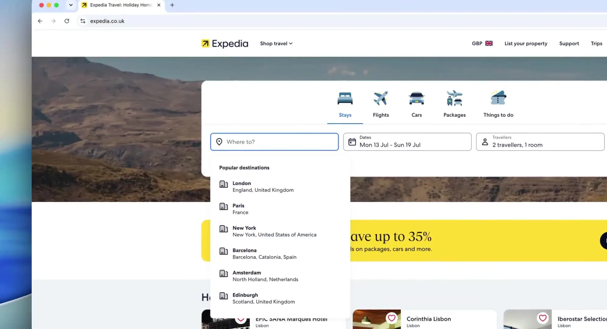
Expedia, Hotels.com, Vrbo and the partner side of the business were each solving the same problems in their own way. I joined the group effort as the Hotels.com design system lead. With the leads from the other systems I worked out how far the convergence should go and what we would recommend to the business, then stayed with EGDS from its first components through to its tooling and governance, and on to readying it for the future: a system machines can read as well as humans.
The same problems, solved four times over
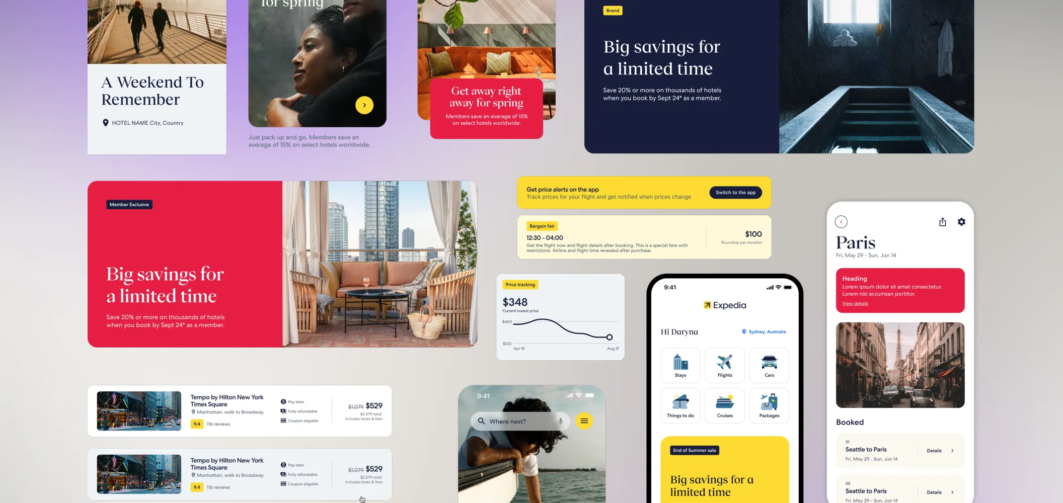
Expedia, Hotels.com and Vrbo each had their own design and development teams and their own design system, as did the partner and supply side. All of them were solving the same problems in different ways. The business wanted to stop paying for that four times over, and asked the design system leads at each brand to work out how.
The five levels of integration
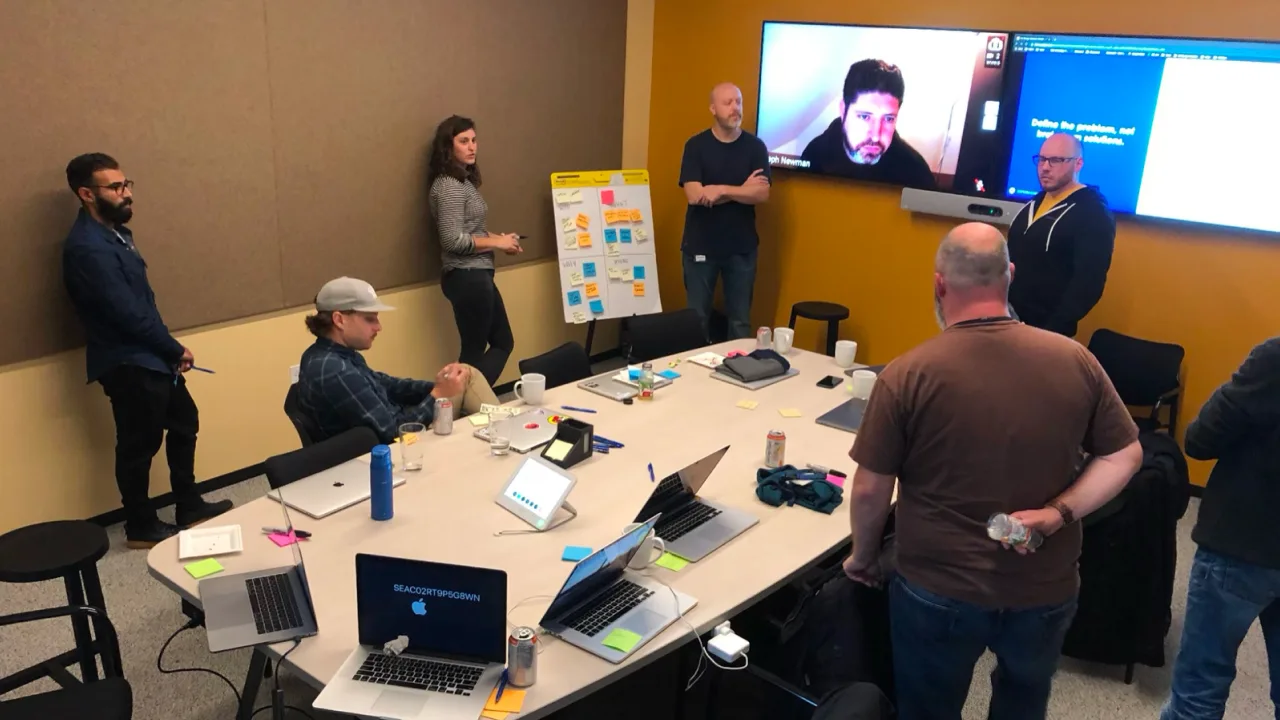
Nothing could be shared until we were all in the same tool. Hotels.com was on Sketch, so I ran the migration of the entire UHDS library to Figma and onboarded the design, development and PM teams onto it. It left us ready to integrate with the group system as soon as there was one.
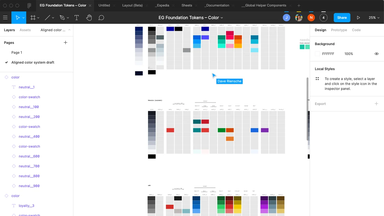
The leads explored five convergence scenarios, from independent systems sharing foundational tokens to a single UI platform used by every brand.
While we wanted the most ambitious option, we knew Expedia Group’s experimentation culture made a full re-platform difficult to justify incrementally. Instead we recommended the furthest point we thought would get funded: start with shared foundational tokens and the highest-cost shared components. Once that proved its value, the organisation could naturally evolve towards a fully shared architecture.
The decision
The business went further than we had asked for.
It took the top of the scale: one design system for the whole group, every business becoming a brand on it, and a full re-platform to get there. EGDS was formed, and the team with it.
What that eventually meant, once the system existed:
Tokens first
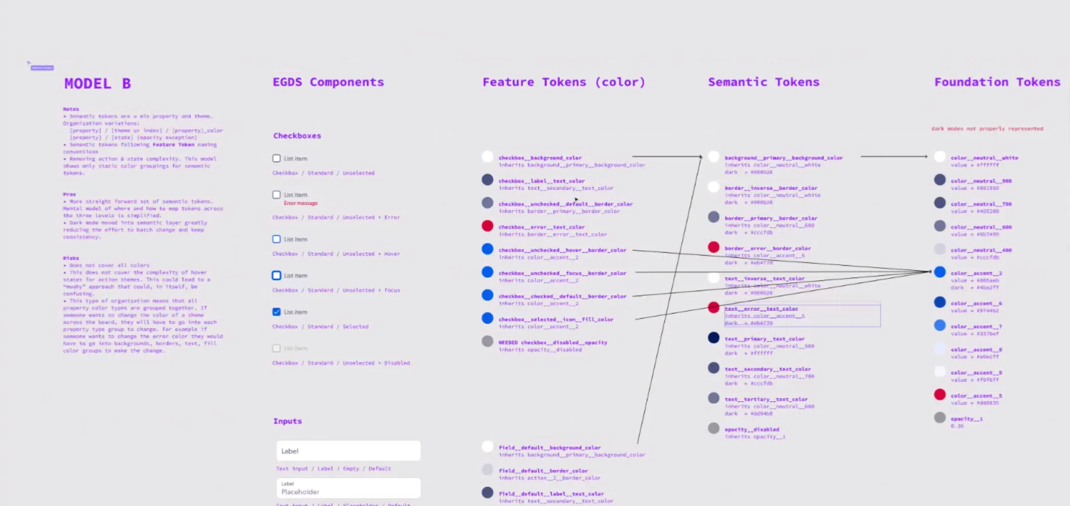
No component work could start until the token architecture was in place. Expedia’s UDS was already built for multi-brand theming, so we leaned on it and spent a long stretch mapping every brand’s tokens onto a shared foundational set: foundation tokens, semantic tokens on those, then feature tokens at component level. Brands differentiate by overriding tokens rather than rewriting components, which is how one library renders as any of 100+ brands and white-label partners.
Component graduation
Then the component work, a process we called graduation. We compared every component across the existing systems, captured every use case from the live products, and stack ranked them into a build order set by what the group needed first. The plan was for each component to keep the look it had on its original system, so no brand gave anything up - which meant building four very different design languages into every one.
The complexity was enormous, and it was clear we would miss the deadline while scope grew underneath us. We changed approach: instead of building from scratch, we used the UDS Expedia component as a base, adding brand tokens and additional features on top.
Several of us had already been suggesting sizing and spacing be shared, so the team was in agreement. We called it fast-track graduation, and it meant working differently: more autonomy, less ceremony, and constant trade-offs between the shippable version and the preferred one.
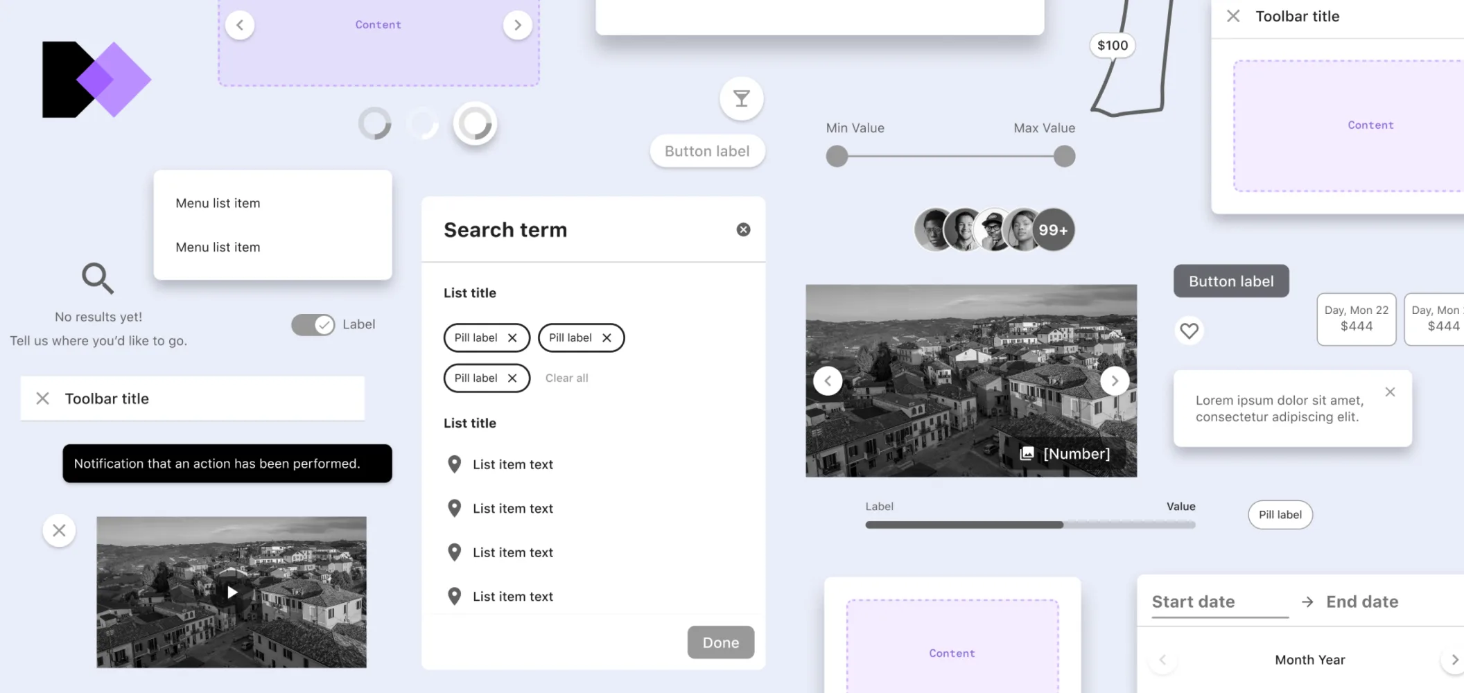
We pulled developers from across the org to build out every platform in time. The core library grew past 55 graduated components, each built to the same bar:
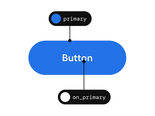
Light_1
light_1__primary: #2471E7light_1__on_primary: #FFFFFF
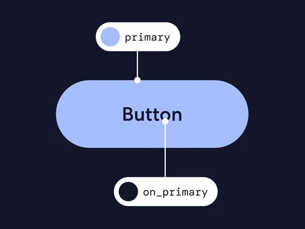
Dark_1
dark_1__primary: #A6BEFFdark_1__on_primary: #121629
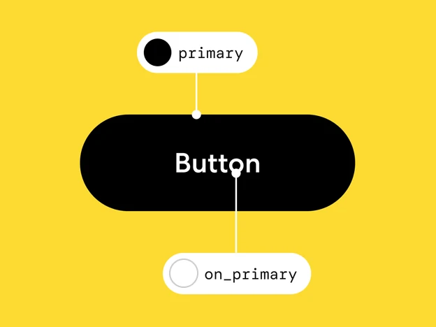
Bright_1
bright_1__primary: #000000bright_1__on_primary: #FFFFFF
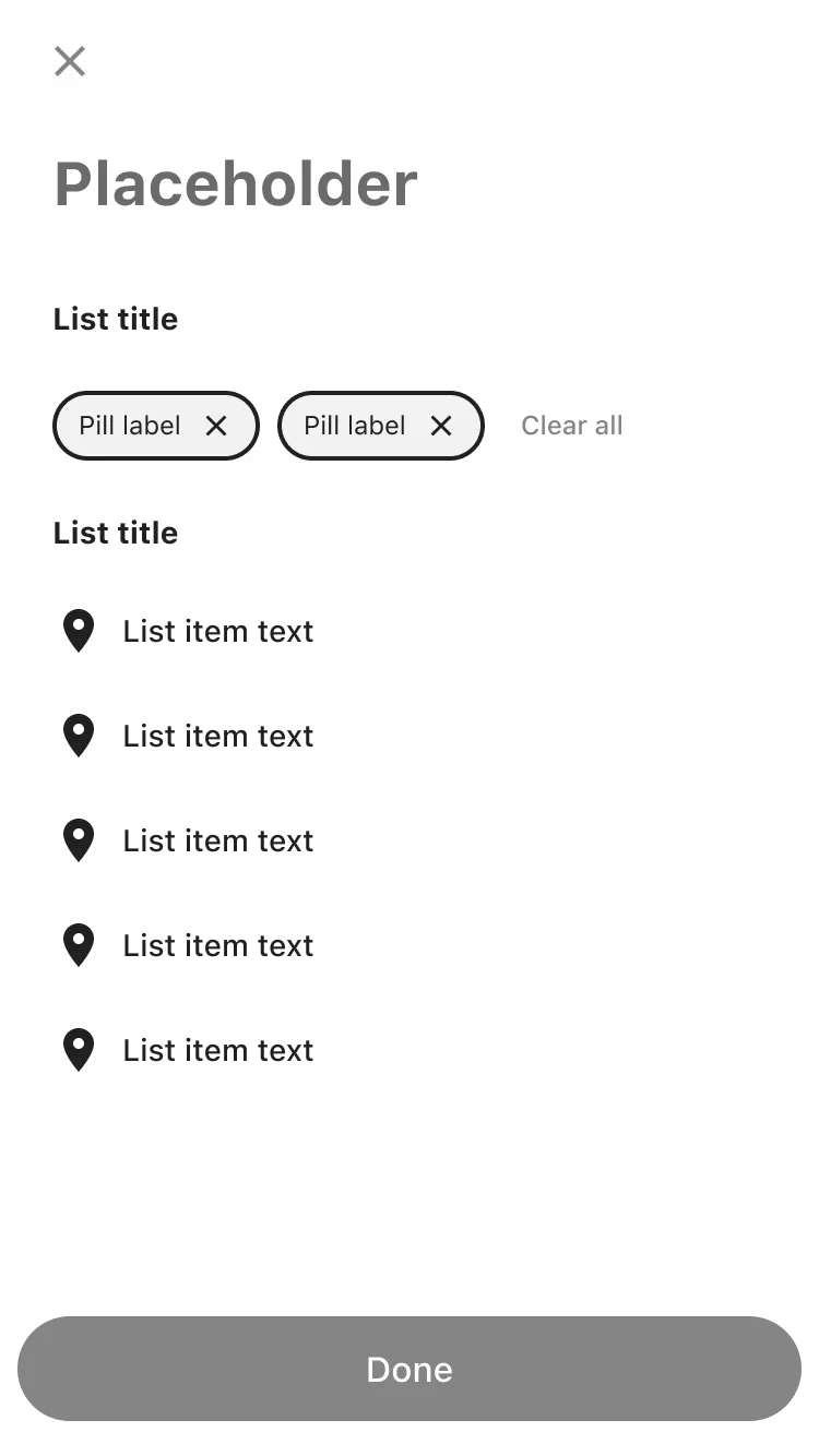
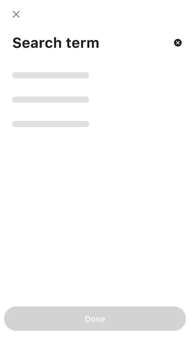
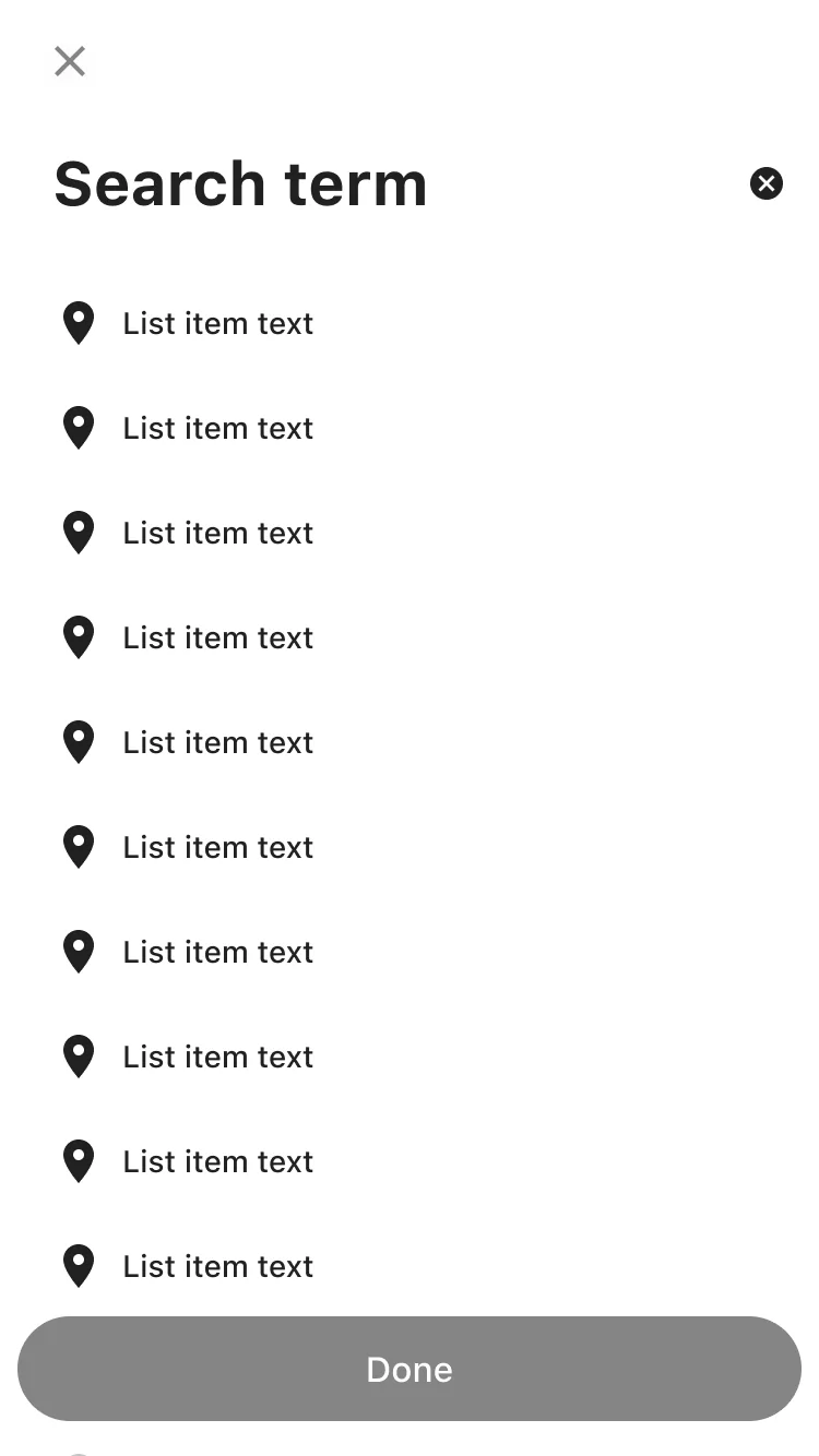
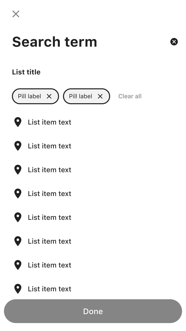
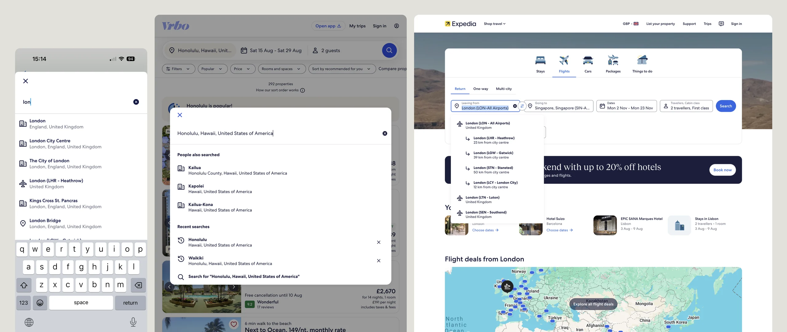
Typeahead
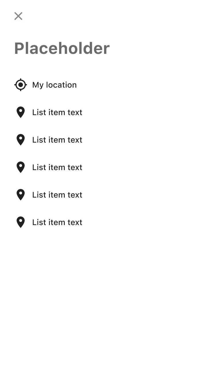
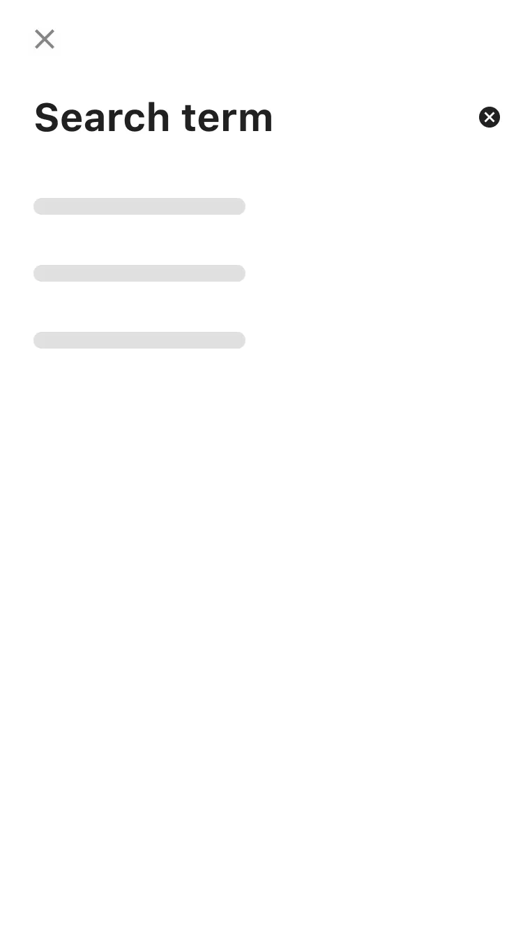
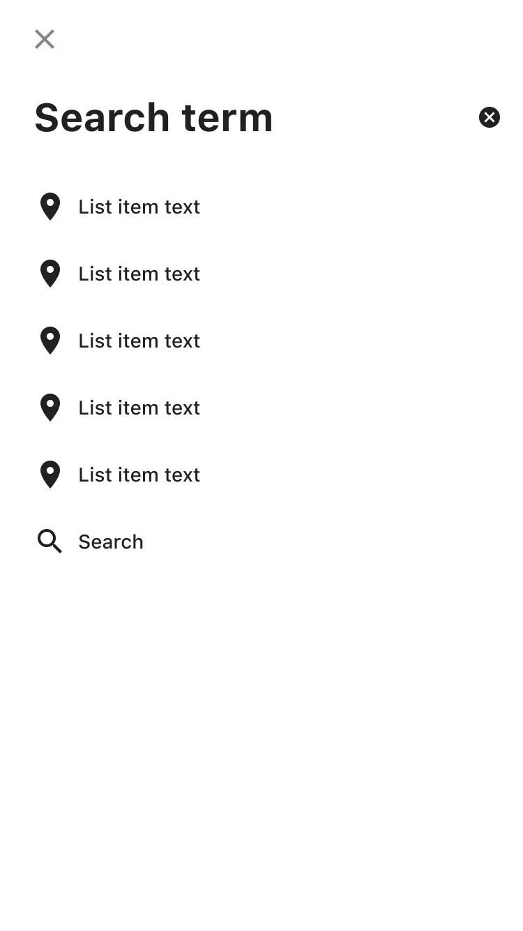
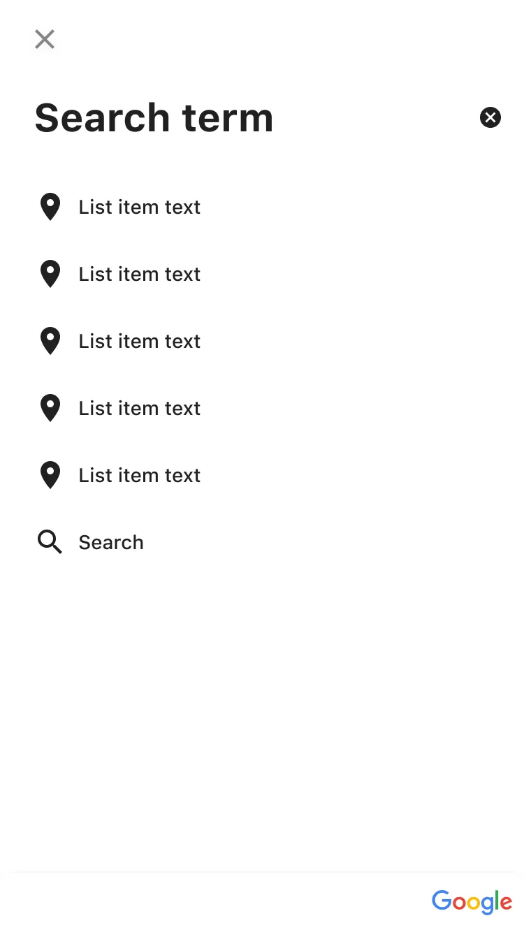
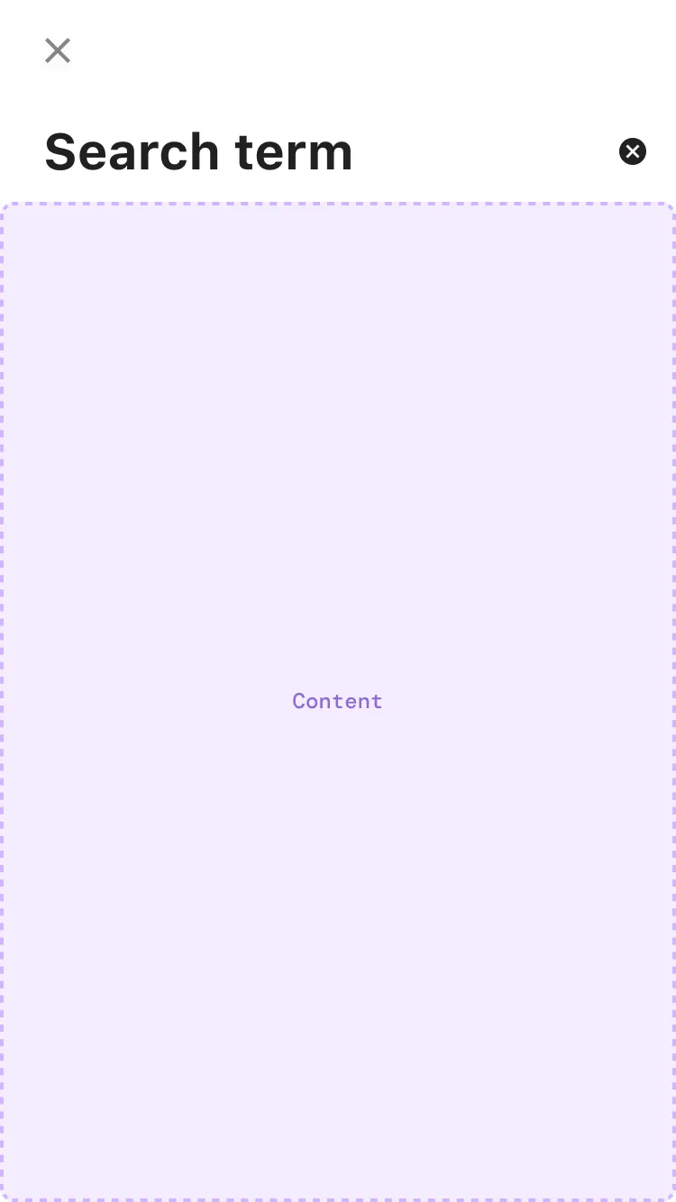
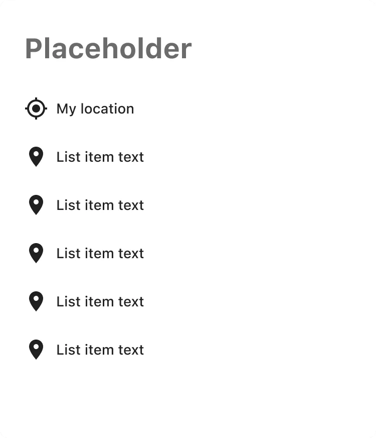
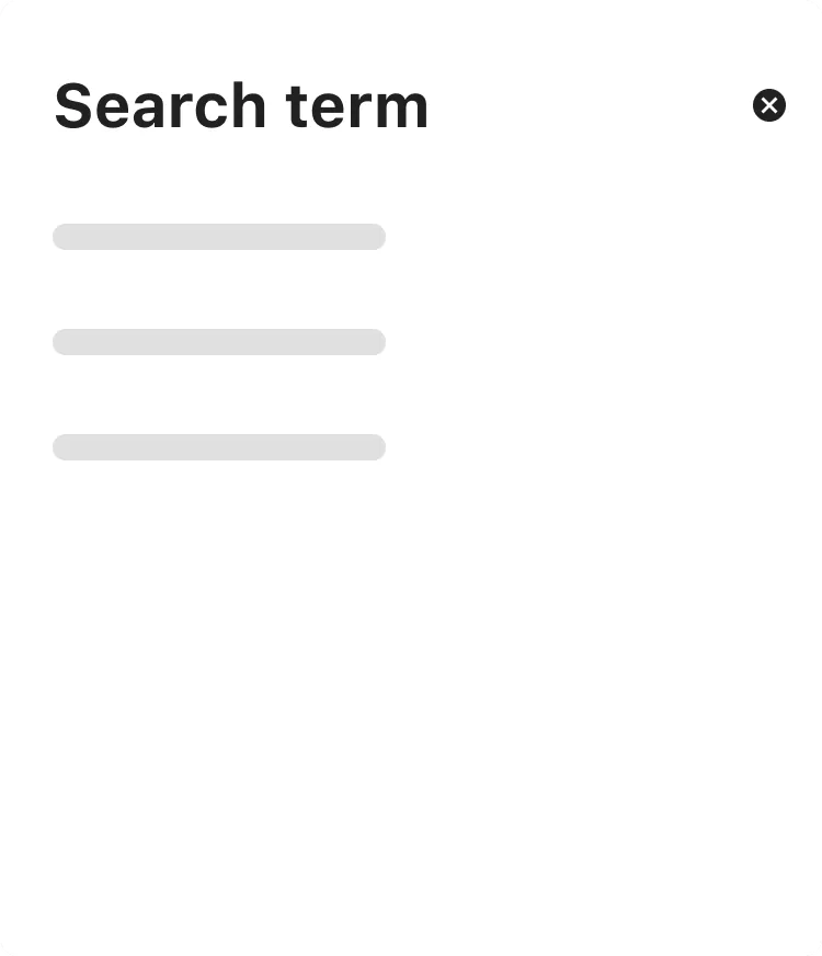
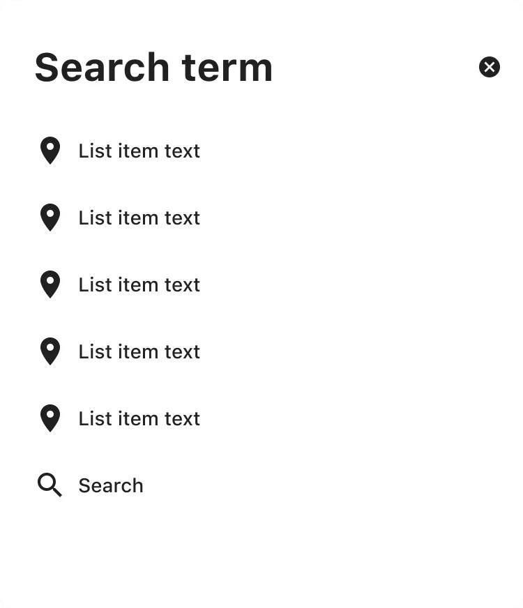
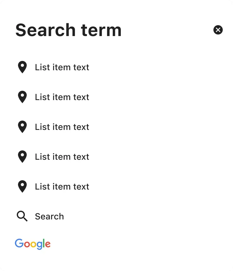
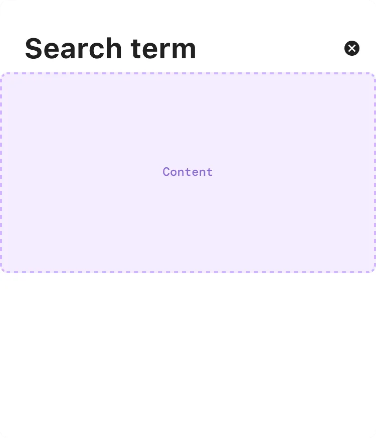
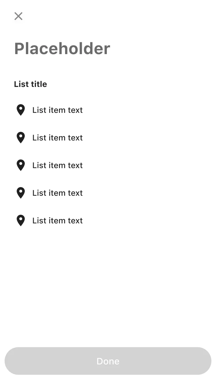
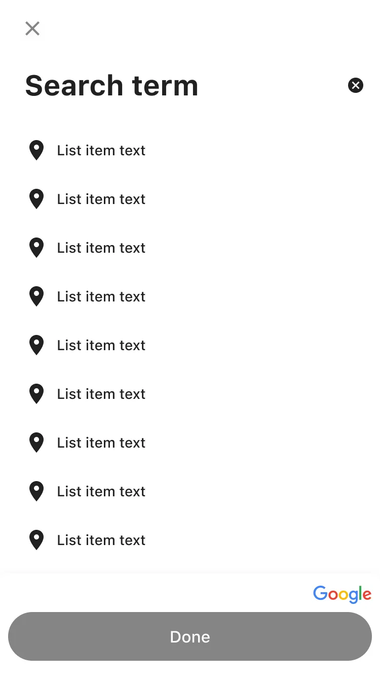
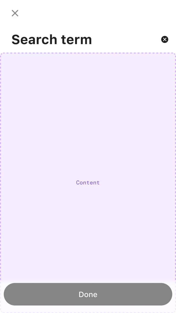
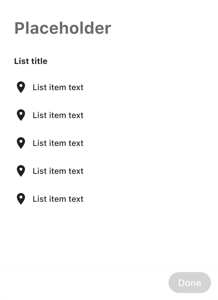
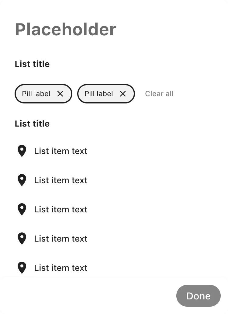
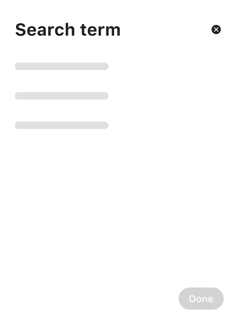
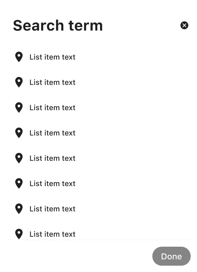
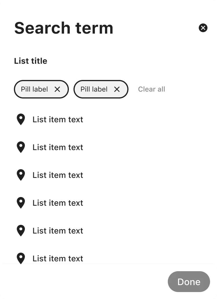
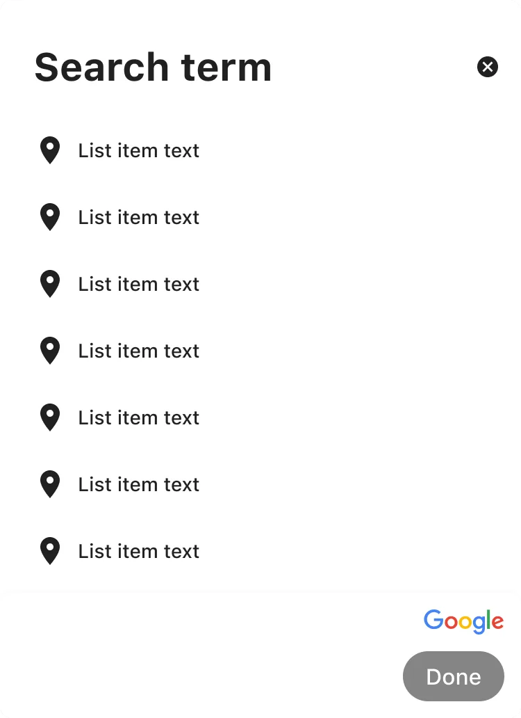
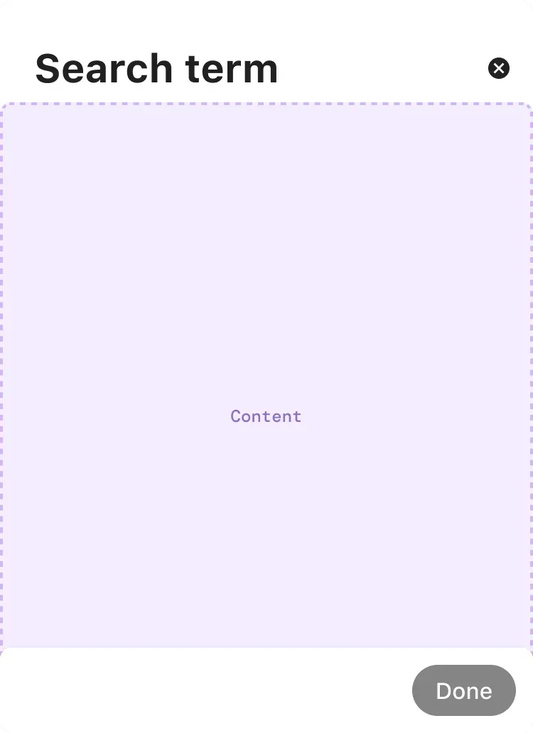
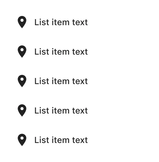
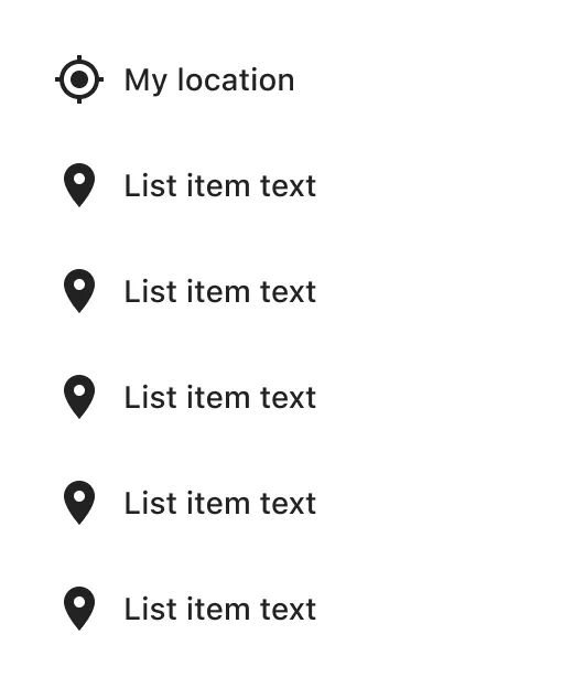
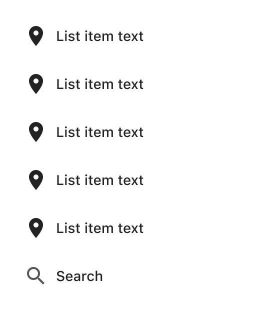
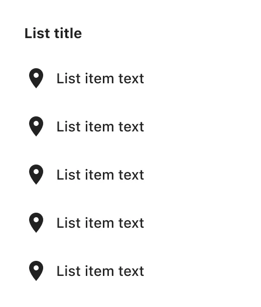
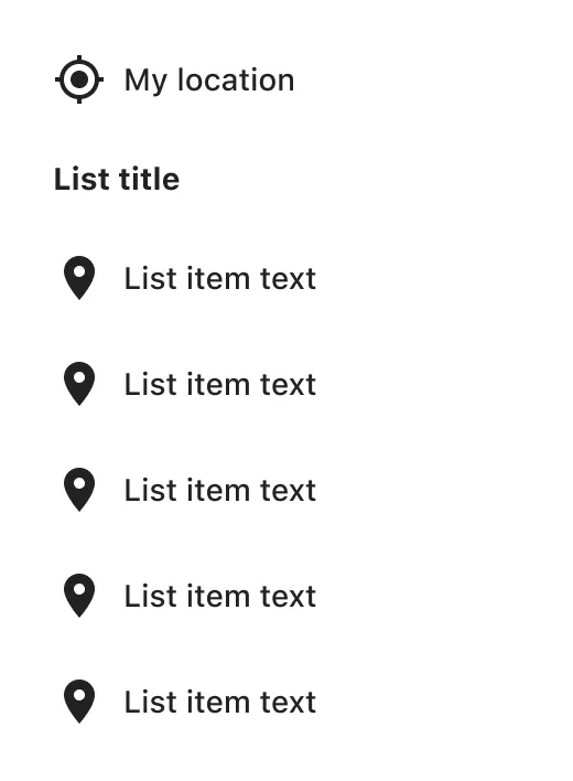
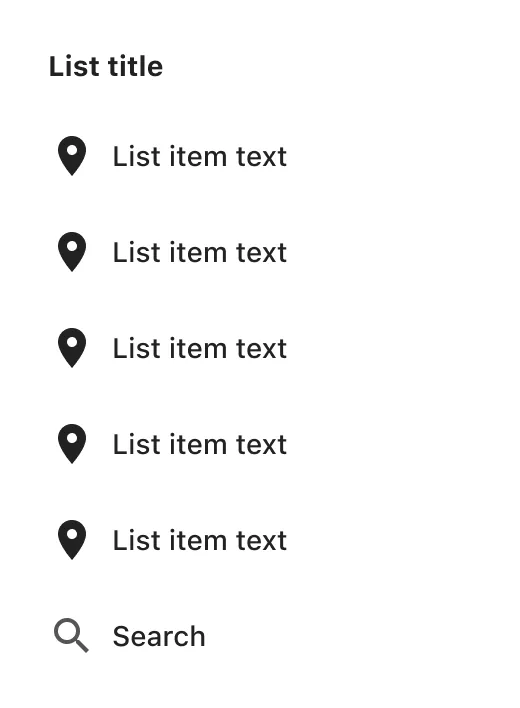
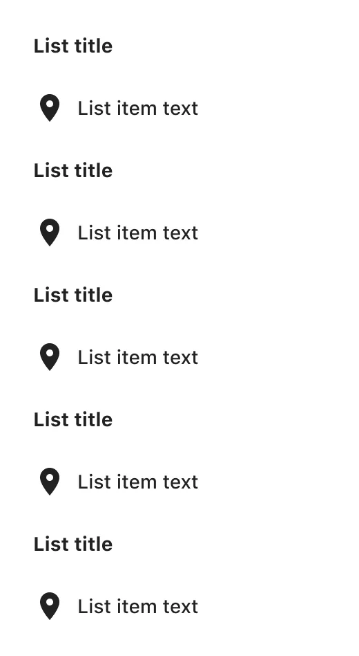
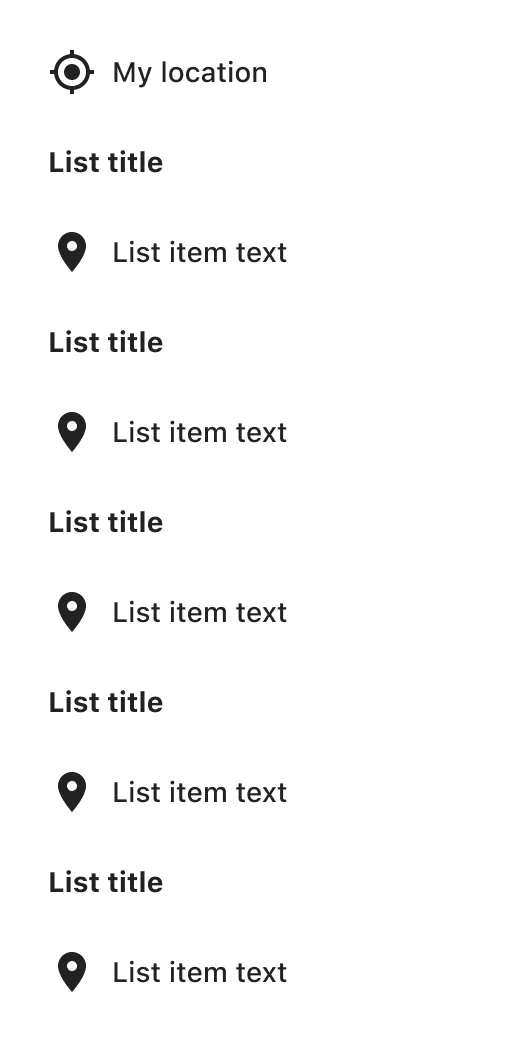
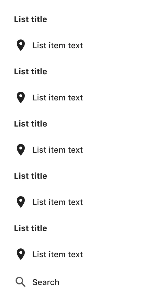
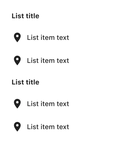
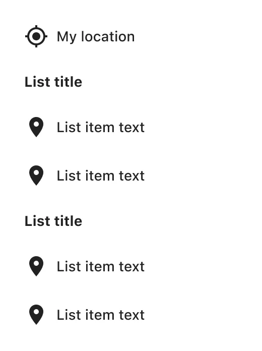
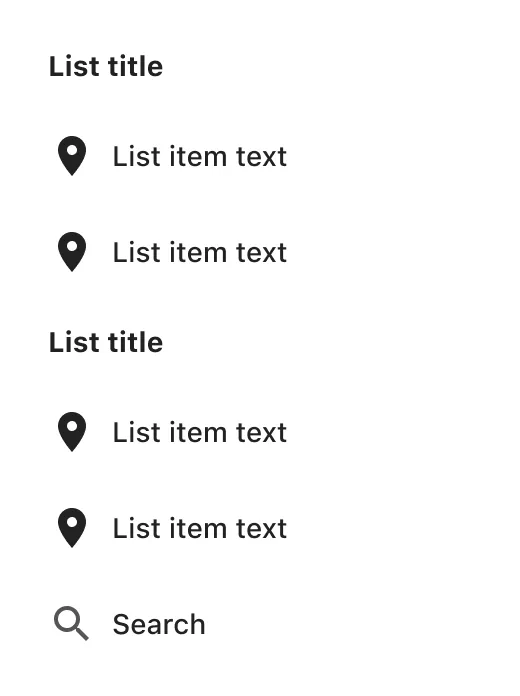
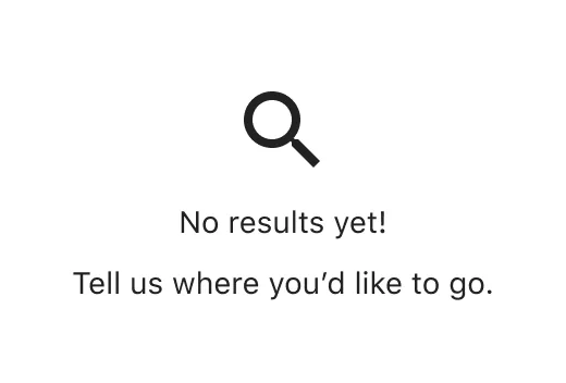
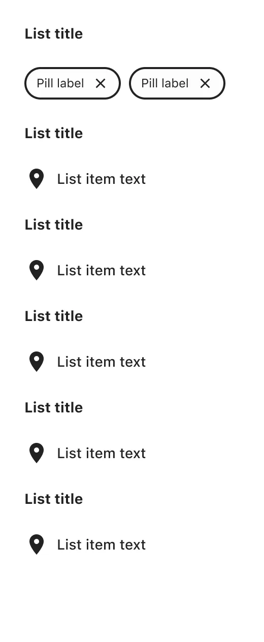
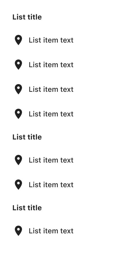
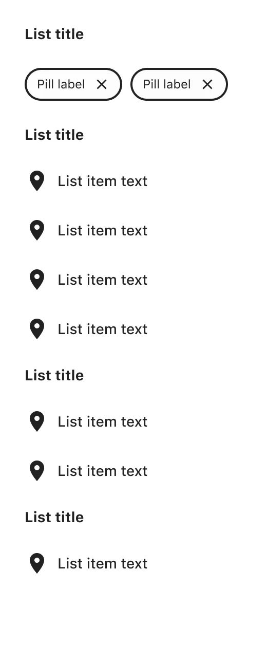
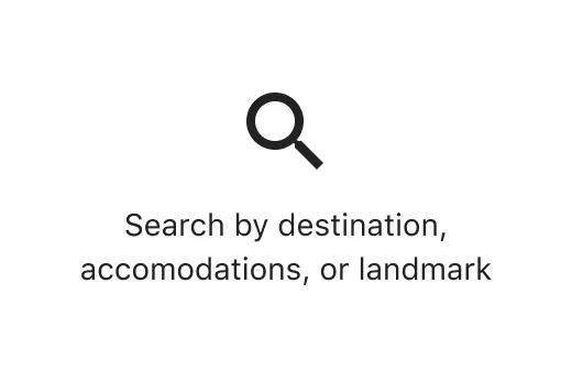
Typeahead was mine through graduation, and among the most complex in the library. Underneath: a sheet on small screens and a popover on larger, chosen by breakpoint; single and multi-select; nested results, logos and attributions; skeleton, empty and no-results states; all themed per brand and holding in dark mode. Closing it out meant UAT with web, iOS and Android developers across Seattle, Brisbane and Gurgaon. It now runs search across the group’s brands.
Exported from the component set itself: change a property to see what ships, or set Content to Blank to open the pattern nested inside.
Building the system’s tooling
Once the core library existed, the question stopped being what the system contained and became how the 1,000+ designers and developers using it got through their day. I took on the services domain, the part of EGDS responsible for the tooling everyone else ran on. Squads held their domains permanently rather than moving between projects, and each had its own leads, a handful of us across the whole system.
The leads also set the roadmap for EGDS as a whole, six to twelve months at a time: which workstreams ran when, what we dropped, and how each one laddered up to whatever the wider business was pushing that year.
We worked in Shape Up cycles - find the friction, shape it into a pitch, win the investment, then build it - and each pitch could have variable headcount, so the pod generally flexed between four and eight designers, developers and content designers.
I led the design in the pod, though not as a line manager. With no product or project manager attached, I set the strategy, wrote the pitches, ran the rituals, reported to the business and mentored the team, while still designing and shipping alongside everyone else.
Two pieces of that friction became Figma plugins, both of which I led:
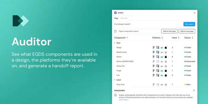
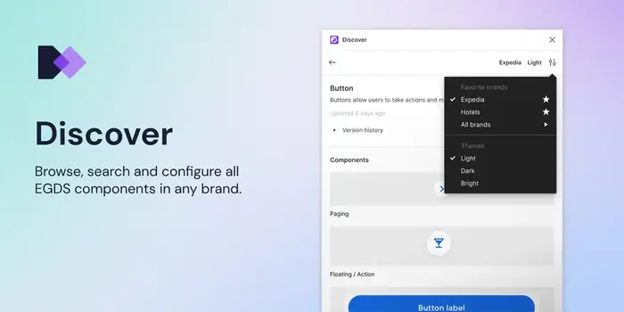
We also maintained Themer, an earlier EGDS plugin for re-theming existing designs into another brand. Auditor and Discover each have their own case study.
"He has a knack for spotting friction in how designers and engineers work together - and then turning those observations into thoughtful solutions... That collaboration led to two Figma plugins we built together: Auditor and Discover."
Eric Scott, Senior UX Engineer at Expedia GroupTeaching the system
Tooling only takes adoption so far, so EGDS ran in-person workshops across the group’s offices and I taught on several. I ran the prototyping workshops in London and Gurgaon: a FigJam kit built from EGDS components let PMs, engineers and anyone with an idea wireframe it rather than describe it in a document. I also helped teach Designing with EGDS in London.
In Seattle I led an empathy workshop for the EGDS design team itself, where the people building the components spent a session designing with them. It surfaced plenty we had overlooked: components harder to use than we thought, and the problems that only appear once you put several together.
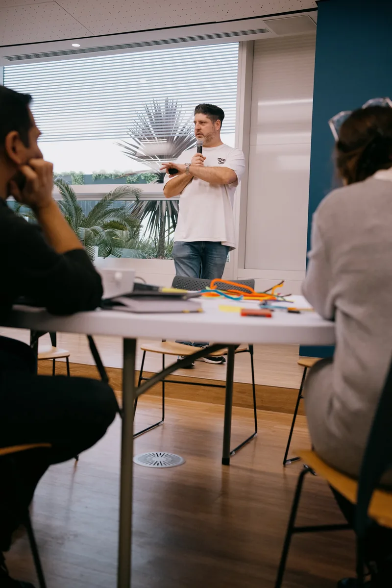
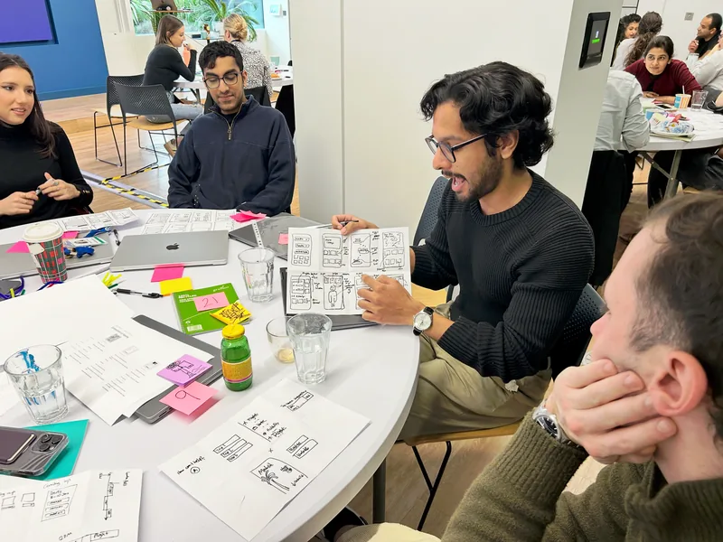
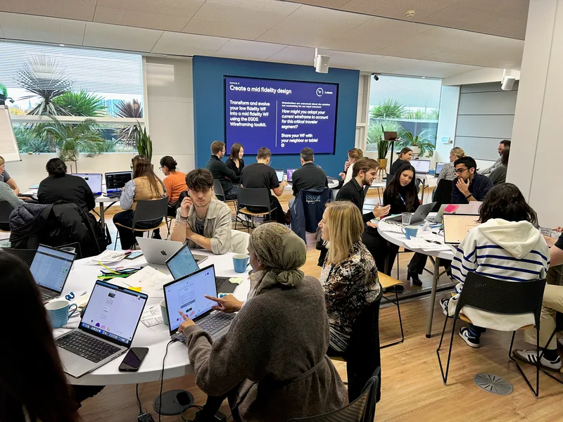
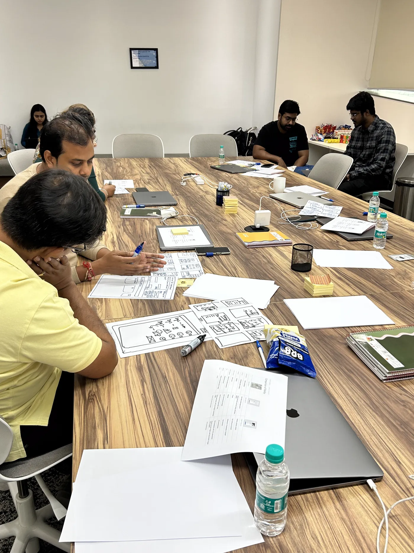
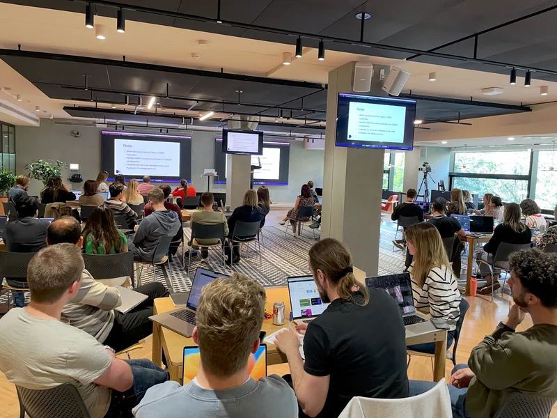
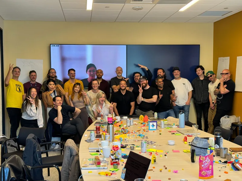
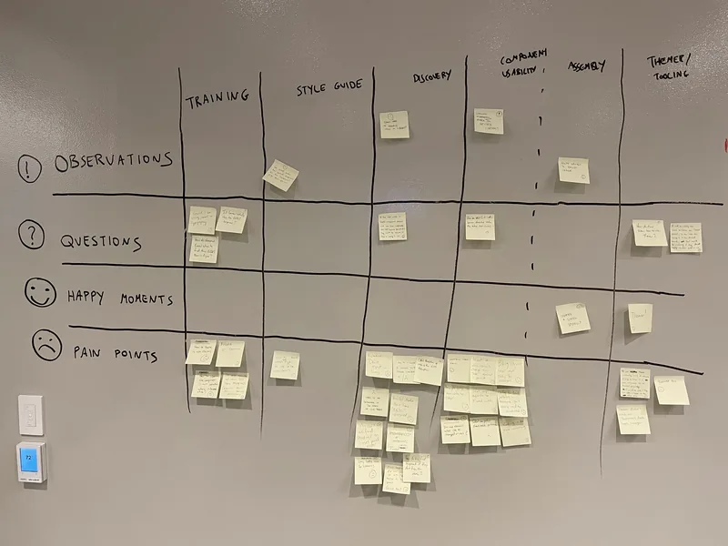
"My personal highlight working with Joe was when we traveled to offices around the world, teaching classes on design. Joe was such a great teacher, helping people feel welcomed into the class and capable of learning the material, even if they were new to the things he was teaching."
Michael Metts, Principal Content Designer, Expedia GroupOpening the system up to product teams
With graduation complete, every brand was re-platforming onto EGDS. New features had to be built on it too. The system spread fast, and teams kept needing components it did not have yet. Adding one was hard: every core component had to be accessible, themeable, documented and built on all four platforms. That bar is right for something every brand uses. It is too high for a team testing an idea. Some needs were too niche to ever be core. Others appeared mid-project and stopped the work. The core team fielded all of it, permanently firefighting.
A tier for product teams. Build and test your own components on EGDS foundations, and the strongest get promoted into core. If the system didn’t have what you needed, you built it yourself rather than waiting on us.
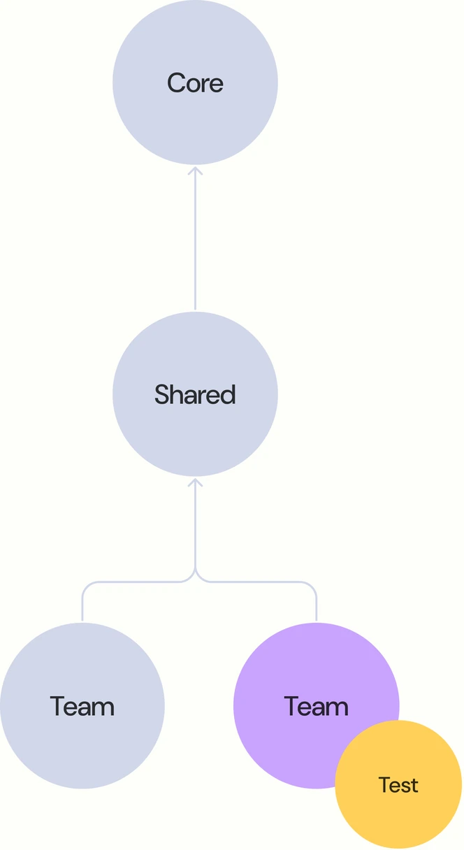
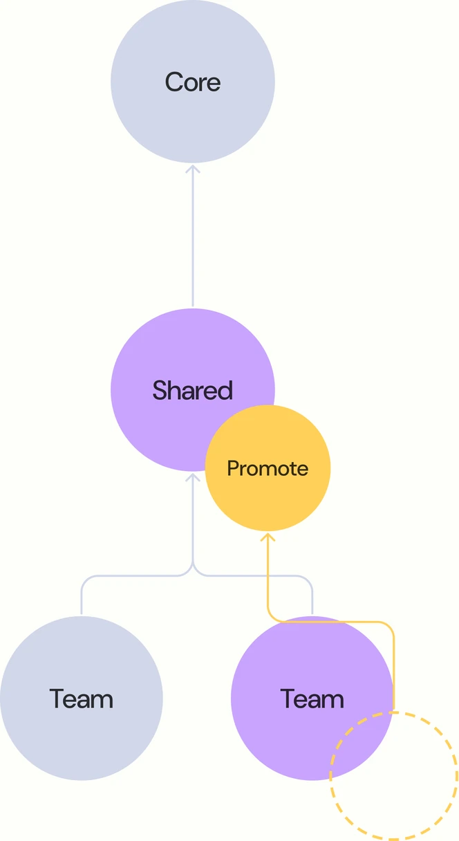
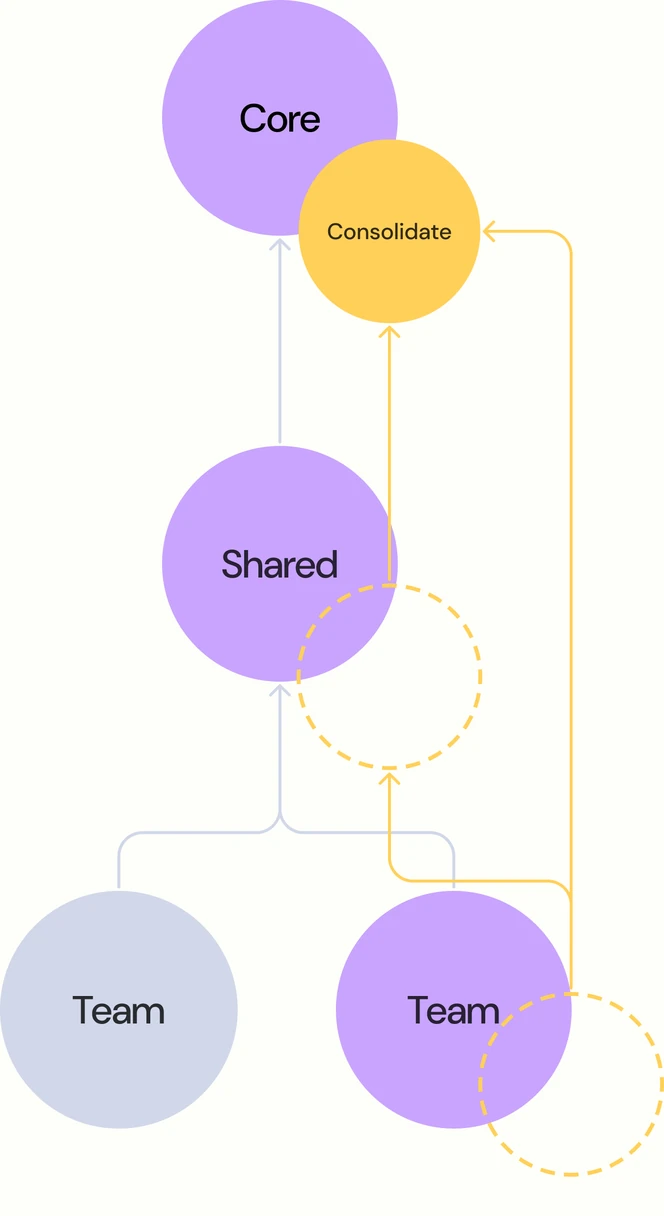
I designed how a component moves between the tiers and helped run the initiative day to day. The tier concept itself came from elsewhere. There were two ways in: a team proposed its component, or EGDS spotted it. Either way it had to meet the same bar as any core component. Candidates were RICE-scored, so selection stayed objective. I mapped the route as one Shape Up cycle, with a playbook and comms so teams knew what they were signing up for.
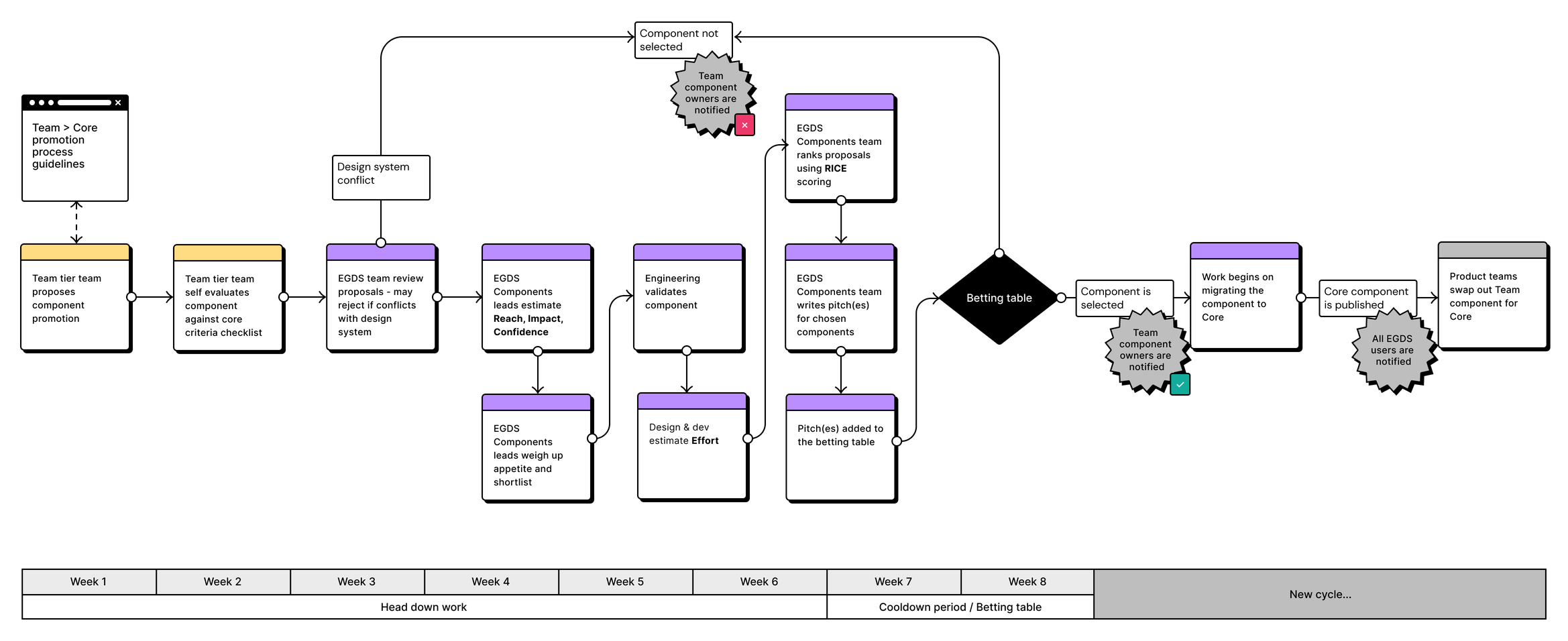
Not many components went all the way up. In practice we ran a looser version of the process than the map shows, and the tier was more useful as a signal than as a ladder: when several teams built the same thing, that told us more than any single proposal.
Teams either built something new or extended a core component, which meant forking it. When we rebuilt the library as the EGDS 2.0 Figma UI Kit, we used what they had built rather than waiting for anyone to propose it. Extensions that were general enough became props on the component itself.
The more bespoke ones needed somewhere to sit, so we built a slot-based structure into the components by hand. A team could change part of a component without forking it, and we shipped ready-made patterns to drop into those slots. Figma had no slots feature at the time; its own arrived in beta while we were building.
Components moved down as well as up. Maps started in core with its own team, and when more people needed to work on it we moved it out into the shared tier.
"Joe is a design leader gifted at building components and, perhaps more importantly, processes that ensure design system health, and continued enhancement, at scale."
Corin Edwards, Senior Interaction DesignerWhat it added up to
Four design systems became one, serving every brand in the group from the flagships to 100+ brand and white-label experiences, with 1,000+ designers and developers building on it.
Looking back, the all-in version was the right call and probably the only one: the company’s strategy was a single shared platform, so the architecture had to follow it. We could have got part of the way with the systems teams staying separate and sharing pieces between them, but what made it possible was becoming one centralised team rather than four cooperating ones.
I was there for all of it: the strategy, the token mapping and component builds, then leading a domain once the system’s biggest problems became tooling and governance, and finally making it readable by machines as well as people. That last stretch has its own case study.
"Joe is rare unicorn with excellent design taste and instincts coupled with deep technical and code understanding... Adding in his years of expert systems design on the Hotels.com and then Expedia Group Design Systems multiplies his ability to deliver solutions that actually work at scale."
Andrew Wade, Principal Designer, EG Design System @ ExpediaWhat I’d do differently
Size the graduation work more honestly. Keeping every brand’s design language was the diplomatic choice, but the complexity showed early and the move to the UDS base could have come months sooner. Components are nearly always more complex than they first look.
Measure before changing things. The savings our tooling made were real, but we only measured them after rollout. Knowing what designers and developers were losing beforehand would have given us a proper before and after, and made the next pitch easier.
Shape Up suited new problems and kept the work varied, but it was a poor model for maintenance. Keeping the plugins healthy meant re-pitching against competing priorities and possibly not getting picked up that cycle. Some things need a standing pod rather than a pitch.