Making a design system machines could read.
Lead UX Designer, EGDS Services
We originally built Expedia Group Design System for people to use. Its documentation and data were spread across several tools, some of which could not be reached by LLMs. As AI tools became part of how teams worked, that started to hold us back. I worked on the projects that got it into something machines could work with. The specs it produced are what designers and non-designers across the business now build AI prototypes from.
When it had to change
In June 2024 a few of us went to Figma Config in San Francisco. I arrived in a self-driving car, had a coffee made for me by a robot, and watched Figma’s own AI generate designs on stage. It felt like a turning point. Software was going to start putting interfaces together, and it would need to read our design system to do it. At the time, ours was not readable.

Our principal designer won the investment from the business, and making the system readable by AI became our main job that year. Engineering needed no convincing: they had wanted a spec for years, one written description of a component every platform could build from. But nobody had worked out where to keep it.
Finding out how far off we were
Code Connect was new in Figma at the time. It shows an engineer a component’s real code while they look at the design. We pitched for it, were turned down, and kept testing it quietly until a later pitch was approved. I led the pod that took it on. We aimed to connect around ten components in one cycle and connected 46.
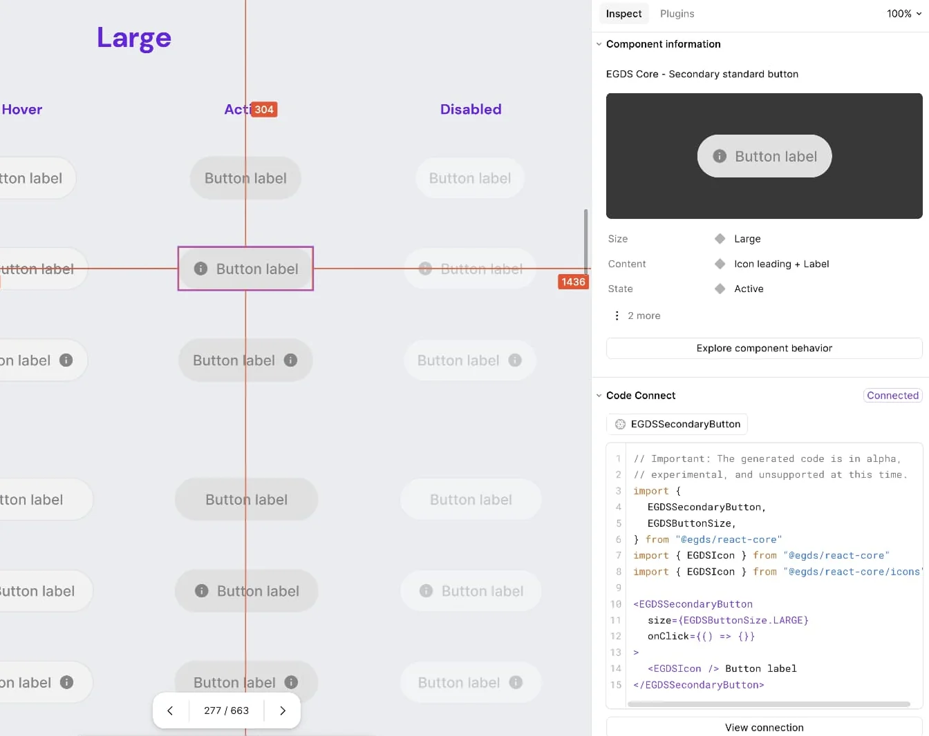
We kept it to web, because the platforms were further apart than we’d thought: the same setting named differently on web and iOS, the same idea named differently from one component to the next, and no fixed set of names to check against.
We released the web version as a beta rather than wait for the other two. Afterwards we surveyed the engineers using it. On average, they estimated it saved them about a day a week, a fifth of their time back.
What support was costing us
Designers and engineers across Expedia Group came to us when they got stuck, and we staffed that ourselves: a rota of five or six of our people every eight-week cycle, answering questions instead of building the system. An engineer and I spent a cycle testing ticketing platforms, then questioned whether we needed one at all. Both platforms wanted our documentation copied into their system, where it could go stale, and neither would have reduced the questions arriving.
So we recommended fixing how people found things. First a Slack workflow, built as a decision tree, that worked out what someone wanted and pointed them at it. Anything it could not resolve dropped into a queue.
Then a support chatbot for everything a decision tree could not anticipate. Nearly every question already had an answer written down somewhere. The hard part was finding it. I found the people at Expedia Group who had built something similar, chose the internal framework, and helped the same engineer prototype two versions. We built it and ran it with the support team internally before opening it up.
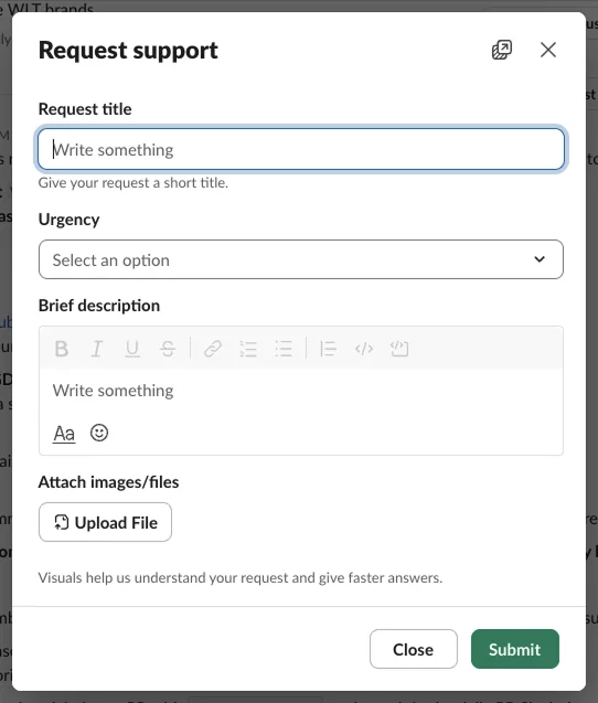
Between the workflow, the chatbot and some other changes, support now takes one designer full time and three engineers at 50%, two and a half people in all.
One place to keep the data
We had already started building the Design System Resource Service, or DSRS, which kept a record of every component: who owned it, which platforms it was on, and where its Figma file, documentation and code were. None of that started out being about AI. It was about having one place to store all our design data.
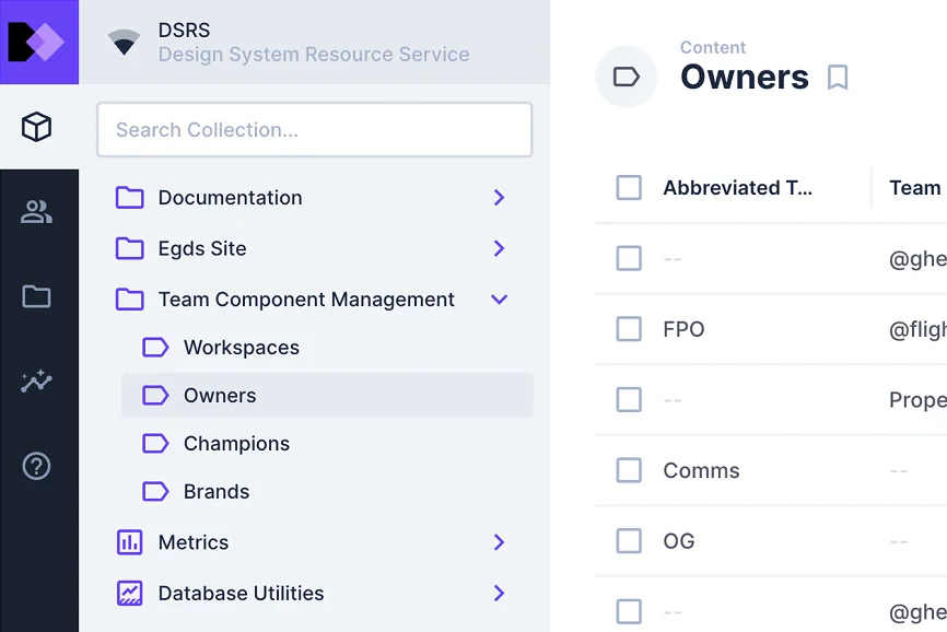
The DSRS was built on Directus, an open-source data platform and headless CMS. It fed our documentation site and our Figma plugins, so both showed the same thing. That meant recording an ID for every Figma component, so anything reading the service could point at one exact component.
At first the IDs were dug out of Figma’s developer tools by hand and pasted into the DSRS, which was slow and easy to get wrong. My team built Keyer, a plugin that fetched them, but only our plugin developers could run it. So we built a Directus flow instead: a button anyone on the core design team could press.
A designer opened the component’s record in the DSRS and pressed the button. The flow went into Figma through its API, found the component set, or every set if the component had more than one, and wrote their IDs into the record’s key field, each marked as active or deprecated. It only needed running when a component was published or deprecated, not every time a variant changed, so I wrote the playbook and decision tree that told designers when a change needed it. The next step was to have it run on its own whenever a component was published in Figma.
The documentation, migrated and rewritten
Building the chatbot also showed us a problem. We could point it at engineering’s documentation straight away, because it lived in Confluence and Github. The design documentation was in Figma, and there was nothing to point it at.
Designers and AI tools want the documentation in quite different forms.
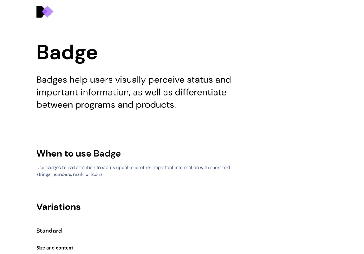
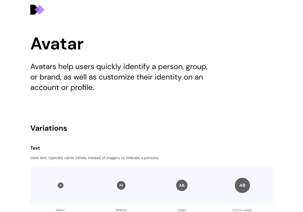
All the design documentation already existed, laid out on Figma pages for designers to read. An AI tool reading the Figma file just saw loose bits of text and where they sat on the page.
We tried to automate the move first. We built a second Directus flow to pull the documentation out of Figma, but it was never reliable, and having AI restructure the writing lost too many details. New Component Architecture, which I come to below, was about to change the documentation anyway, so we moved it across by hand, page by page.
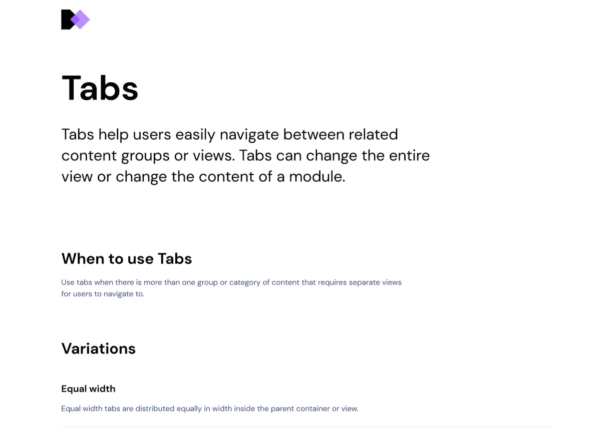
Once it was in Directus, the documentation site became proper HTML pages, searchable and linkable, instead of an iframe of the Figma file. An LLM could read it straight from Directus, and later through an MCP server, the standard way an AI tool plugs into an outside source. Then we gave every component the same sections in the same order, so a model could go straight to the part it needed.
Rebuilding the library
The versioning had been a problem for years. On web every component had its own repository. In Figma every component was its own library file, so a designer had to switch on sixty-odd of them before they could work, and nobody could tell which version of what they were looking at.
New Component Architecture changed that. It was a business-wide initiative, not just a Figma exercise. Designers and engineers worked on it together, and Nathan Curtis was brought in to architect it. We rebuilt every component from scratch.
Web moved onto a single repository, and we rebuilt Figma as one library file, which also made components easier to find. The spec, which I come to below, kept a versioned list of everything in it.
65 component libraries, each switched on one by one
One library file with all 65 components inside
Web code65 component repositories, versioned one by one
One repository holding every component
I was one of the four or five designers rebuilding the Figma library. I took components through the whole process, from the plan to the finished Figma build.
How each component was rebuilt
Each component started with analysis. We used an AI tool to analyse the Figma component and the code on web, iOS and Android: its anatomy, its props and what everything was called. It compared them side by side, showing where the platforms matched, where they had drifted and what was missing, then suggested a naming structure. That became the first draft of the plan.
As designers we reviewed the plan, sketched out how it would work in practice and took it back to the team. Once we were all aligned, we began the design work. The AI helped with the analysis and we did the rest, building every component in Figma by hand to get the details right.
#### Elements- `root` (`COMPONENT`), theme:dark_1, backgroundColor:surface- `message` (`TEXT`), textColor:on_surface, bound to `message` configuration- `action` (`INSTANCE`) -> EGDS Toast / _ / Action // actionVisible:true## Decisions- Do not include a `verticalOffset` prop currently supported in React, since parents - not components themselves - should control arrangement and spacing outside the component.- Do not include margin outside the dark container. Instead, the toast’s parent should control layout.- Do not include `maxHeight` constraints.- Do not force a `dark` theme. Instead, style with suitable inverse tokens.The AI saved us the slow job of digging through every repository by hand. Reviewing the plan together meant we all used the same naming and approached slots and ready-made configurations the same way, and components in the same family stayed consistent. It was more work up front, but it saved time in everything after.
What a spec is
All of this was working towards a spec for each component. A spec is a written description of a component, stored as data: its parts, its options and the tokens it uses. Figma and code each describe a component in their own way. A spec describes it once, in a form any tool can read, so the Figma file, the code and the documentation can all be made from it. A machine can read it as easily as a person. Nathan sets out the thinking in his article Components as Data.
Point at the spec below to find it on the Pill, or change its props.
Anatomy
The parts it is made of, and what kind of part each one is.
root: type:containerChildren: type:containerStart Icon: type:instanceLabel: type:textCode only props: type:containerA11y label: type:textProps
The settings it takes, with their types and defaults. Try them.
Selected: type:boolean default:falseCustom: type:boolean default:falseLabel: type:stringChildren: type:slotStyles
Every value points at a token rather than a raw number.
elements: root: styles: height:$tokens/sizing__8x backgroundColor:$theme/color/surface_low_elevation cornerRadius:$theme/cornerRadius/max Label: styles: textColor:$theme/color/on_surfaceVariants
The combinations of props that change how it looks. Pick one to apply it.
- configuration: State:Hover- configuration: State:Active- configuration: Selected:true- configuration: Disabled:true- configuration: Selected:true State:Active
This also helps with the problem we hit on Code Connect. Each platform still needs its own connection, but because every platform uses the same names, there is much less to work around and far fewer custom overrides to write.
While we built each component, the specs plugin could produce its spec from the Figma file at any point, which made it a way of checking our work. Reading it back caught what is easy to miss on screen, like a spacing value typed in by hand or a name that did not match its neighbours. The final spec lived in git alongside the code, so each one had a history you could compare and roll back.
With every component written down the same way, you can do a lot more with it, like starting the code on each platform or generating the documentation. Most importantly, an AI tool reading a spec gets the real answer about a component, not a guess from a screenshot or one platform’s code.
Modernising the Figma library
We used the rebuild to tidy up the Figma library too, and the biggest change was slots. A slot is an open space inside a component where a designer can drop in whatever they need. Before, every combination had to be its own variant, so components grew long lists of options. Slots meant more thinking up front about what stayed fixed and what could be left open, but far fewer variants to build. For the patterns we saw most often, we added ready-made configurations, so designers had a head start.
To choose them, we looked at the team tier we had set up earlier: components that product design teams had built themselves, extending ours for their own features. They showed us what people needed from each component, and we built some of them into the ready-made examples.
Brand themes moved to Figma variables, replacing Themer, the legacy plugin the EGDS team had built to pull in each brand’s token values. Designers could now switch a component’s brand natively, or set one on a frame and have everything inside it follow. Light and dark mode worked the same way. Put a frame into dark mode and every component inside it switches too.
Styles worked the same way. Every colour, size and spacing value came from a token. The spec listed them, and developers linked the spec to their code, so nothing was typed in by hand.
"pill": {"elements": {"root": {"styling": {"backgroundColor": "$theme/color/surface_low_elevation","borderColor": "$theme/color/outline","borderWidth": "$tokens/sizing__0x__quarter","cornerRadius": "$theme/cornerRadius/max","itemSpacing": "$tokens/spacing__0x","height": "$tokens/sizing__8x","padding": {"left": "$tokens/spacing__3x","right": "$tokens/spacing__3x"}}},"children": {"styling": {"itemSpacing": "$tokens/spacing__1x"}},"label": {"styling": {"textColor": "$theme/color/on_surface","textStyle": "$tokens/font__200__regular"}}}}What people are building with it
The rebuilt library shipped as the EGDS 2.0 Figma UI Kit, where most designers at Expedia Group meet the system day to day. It launched a few weeks after I left, and in under five months over half the teams we track had picked it up.
After I left, a colleague used those specs to build the EGDS 2.0 Prototype Kit: components in code that an LLM can build with. It is part generated, part hand-written and not the finished article, but what comes out of it uses the system’s real values.
Over 350 people have taken a copy, and more than 250 prototypes have been published from it. They are not all designers: product managers, engineers, researchers, content designers and design leaders describe what they want in Cursor and get a working prototype back. One researcher told me she had built her own proofs of concept that way and found it straightforward.
The MCP server was built by the wider EGDS team over the whole system, so a tool can ask for just the part it needs, which uses far less of the context window.
In future it could work the other way too. An engineer could change the spec in code, and the change would reach every platform and the Figma library.
Why this matters
At Config in 2024 I watched software put interfaces together, and our design system was not something it could read. By the time I left, the documentation lived in one place a machine could query and the components were being rebuilt around specs. Since then, people across the business, many of them not designers, have built working prototypes from it. It still works for the people who use it every day, and now it works for AI tools too.
There was no single button that made the system machine-readable. It took a lot of unglamorous work and hard graft: tracking where everything lived, moving the documentation page by page, and rebuilding the components so every platform used the same names.