UHDS, Hotels.com’s first design system.
Lead Product Designer, Design Systems
Built alongside the Hotels.com rebuild, UHDS became the design language for five products: web, iOS, Android, CRM and social. I led it for three years, from the first reused component to the migration that replaced it.
It started as a side project
Hotels.com was rebuilding its site as a Progressive Web App, a single React application assembled from shared components rather than a collection of individually built pages. We were designing it all from scratch, so on each new screen I’d use as much as I could of what we had already drawn, and those pieces got collected, named and written down with the values they shared. Before anyone had proposed a design system, we had the beginnings of one.
For that first stretch the system and the product were one piece of work: design a screen, pull out what was reusable, build it, bring it back. We sat with the developers, most of the time at the same desk, and because the rebuild was judged on speed, what a component cost to render was part of designing it. Three of us kept it moving and made the case to leadership every week, until they invested in it and put developers on it. The rebuild case study has the argument we made.
"What I valued most was how Joe engaged with the engineering teams - not just delivering specs, but taking the time to understand the technical challenges of implementing a complex design system and using that to inform his work... That kind of design and engineering alignment is hard to find, and any team building or scaling a design system would benefit from having Joe bring that to their work."
Niall Johnson, Senior Engineering Manager, Hotels.comFrom atoms to foundations
We started small, taking a lead from Brad Frost’s atomic design: text, buttons, badges, images, the pieces that assemble into larger ones. For a while it was a pattern library rather than a design system. On web, every one shipped with a coded counterpart, so anything a designer picked up was already built.
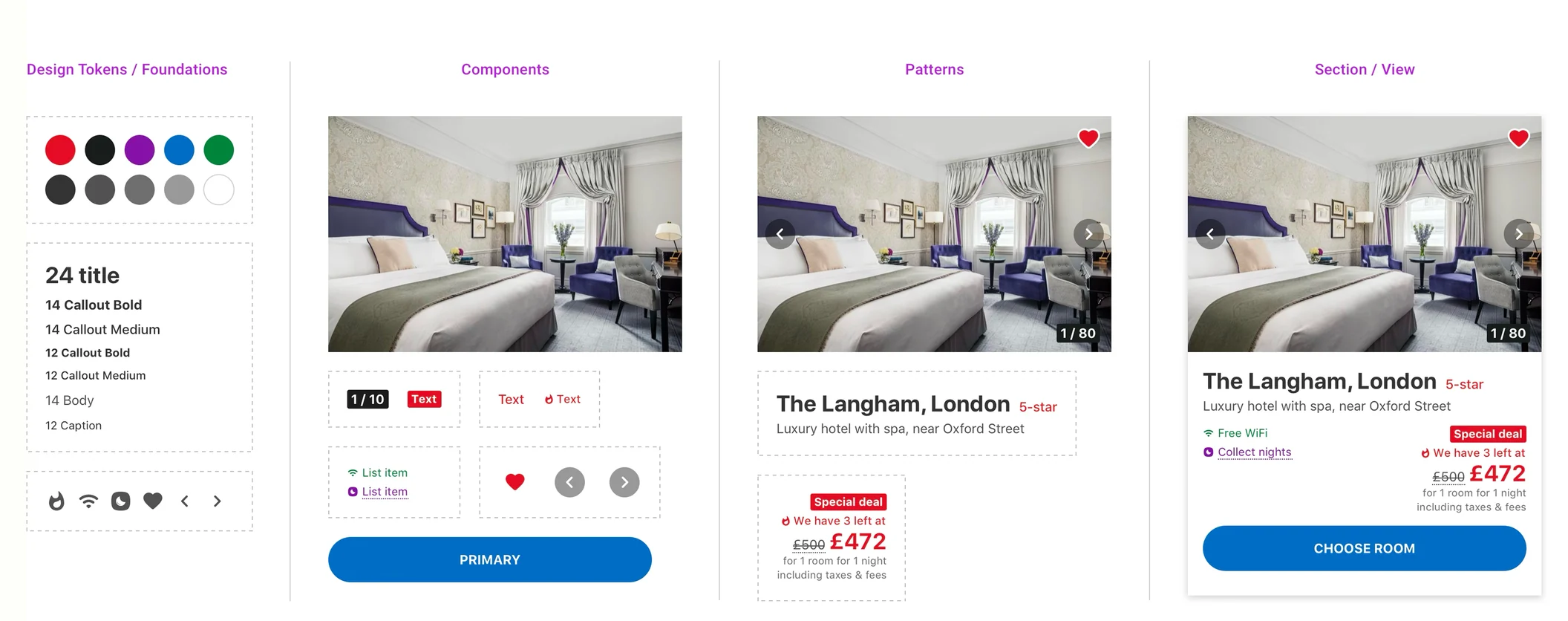
As those pieces multiplied, the decisions underneath them had to be settled rather than made again each time. We refactored colour into ramps off the brand hues, built a type scale, worked out a sizing scale and density rules for type, and declared the foundations as tokens. Changing one then moved through the whole system instead of being re-set screen by screen.
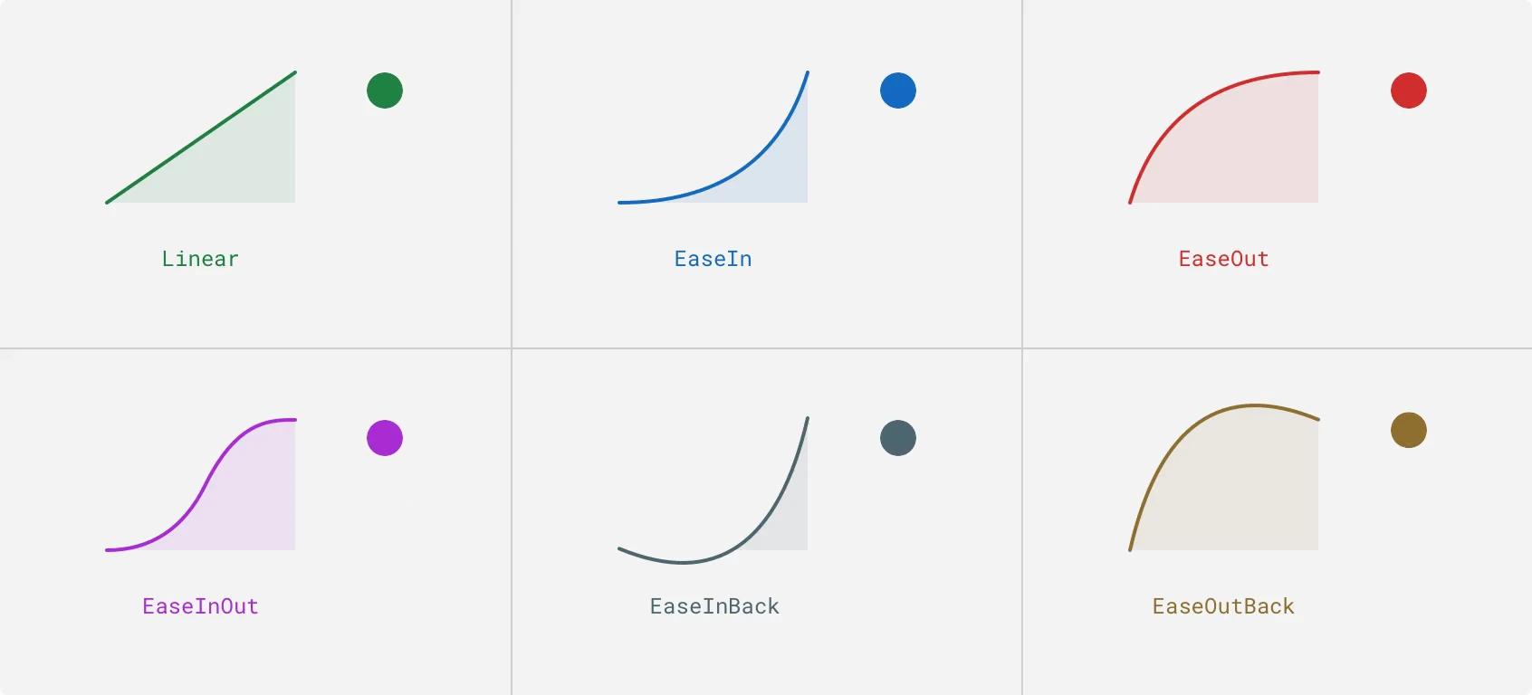
Motion got the same treatment. We built a framework of easing curves and durations, encoded them as tokens, and documented which to use and why, matching a duration to the distance travelled and an easing to the component’s job.
A shared vocabulary
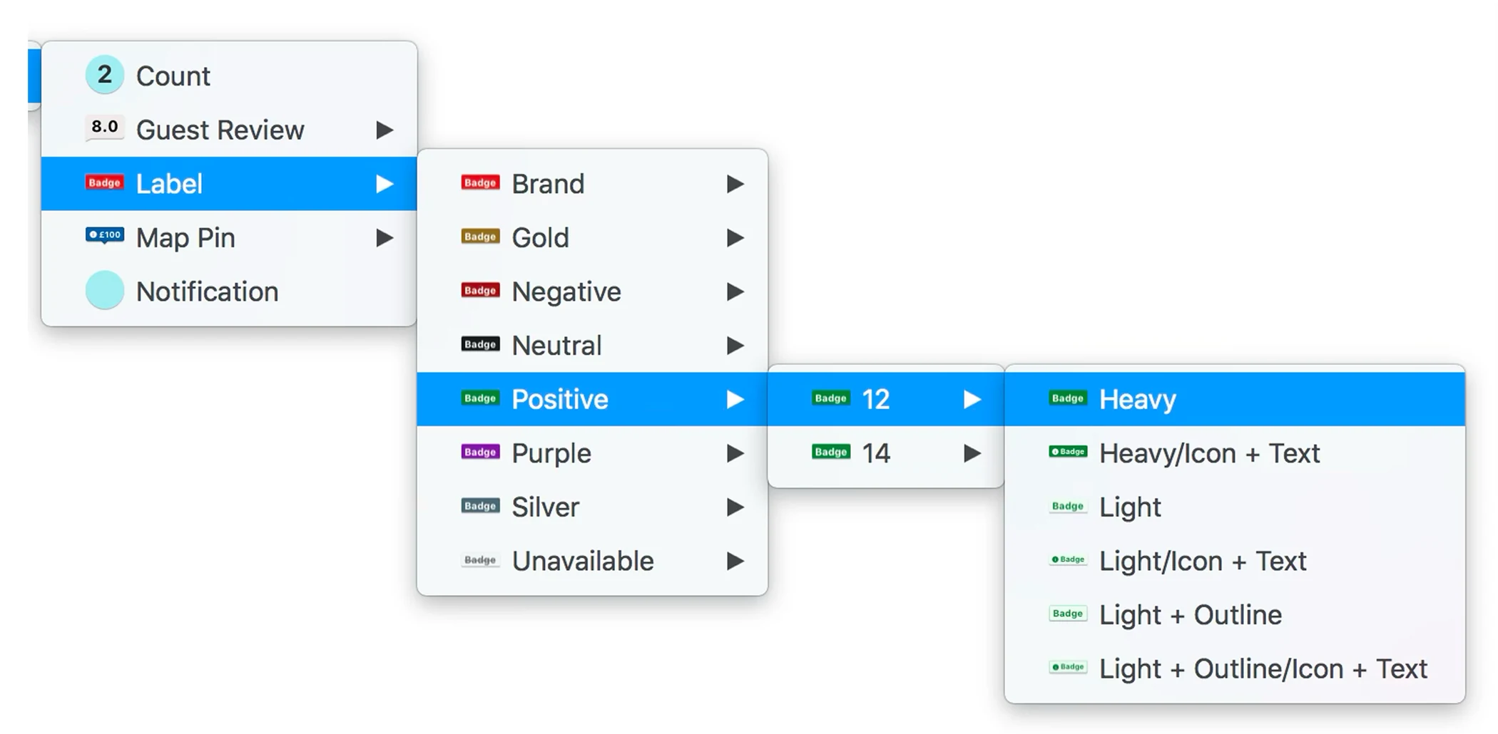
Sketch had no concept of component properties, so we encoded them in the name: Item, Purpose, Scale, Style, Content. "Label / Positive / 14 / Light / Icon + Text" was a component’s configuration written out, each segment standing in for a prop in React. We spent a long time working that taxonomy out with the development team, and it was one of the more useful things we did.
The names spread past the design team. In a meeting about a new screen, a PM could say "let’s use the text plus image option" and the designer and the engineer both knew which component was meant, in which configuration.
Patterns and the layout underneath them
Certain blocks kept reappearing, so we consolidated them into patterns: combinations of components solving a recurring problem, assembled only from what already existed. Each was drawn with every element it could contain on show, so a designer hid what they didn’t need. They were then encoded in Storybook. The documentation covered the thinking and historical context as well as the UI, so a decision got reused instead of remade.
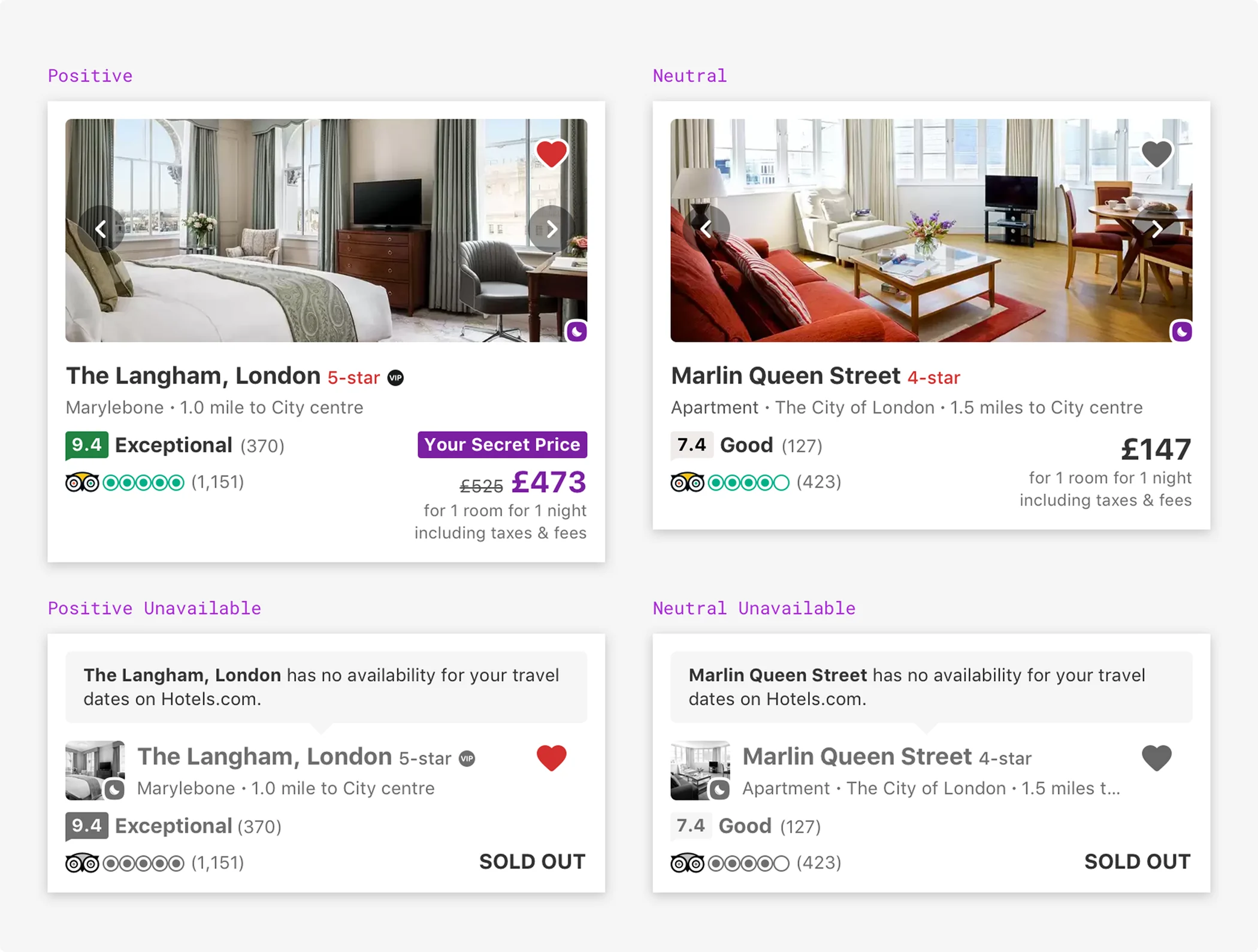
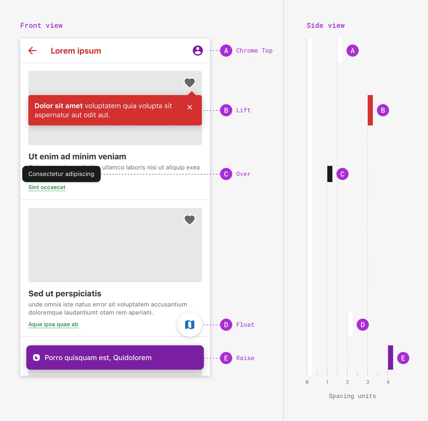
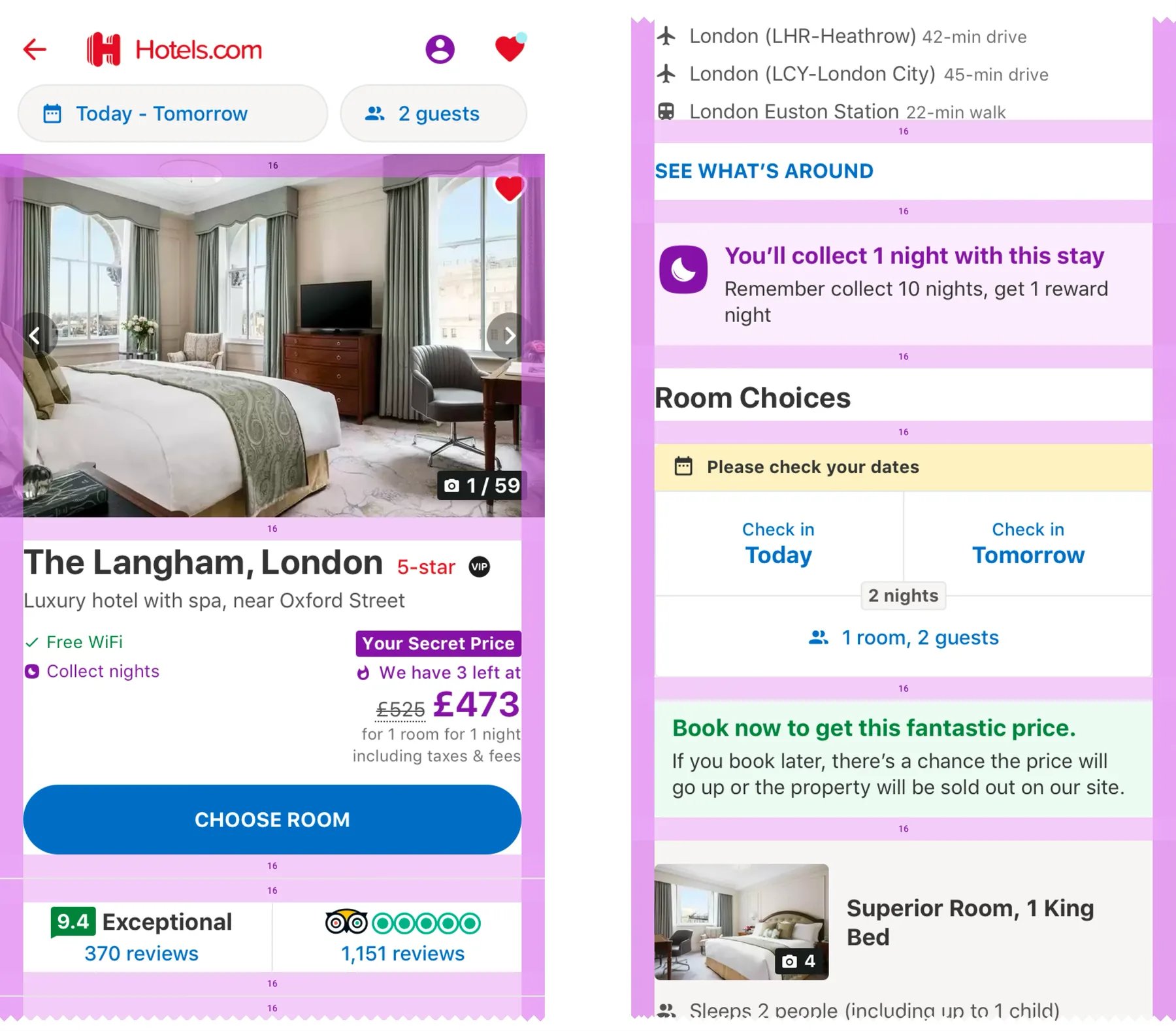
Underneath sat a layout system built so components could be reordered. Spacing was consistent between the items in a block and between the blocks themselves, so blocks nested and nothing needed a bespoke measurement.
Drawing the line between system and product
Desktop put the system under real strain. It had been built mobile-only, so a lot of it did not hold up at a second set of widths. Working out what could stay shared and what had to flex is told on the rebuild case study.
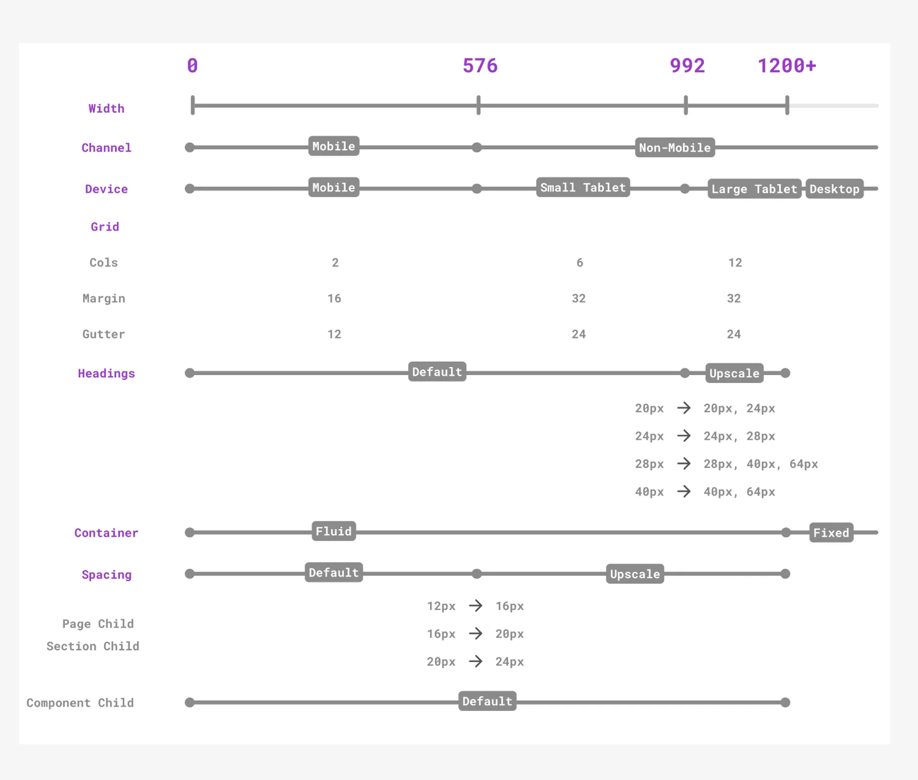
Once the desktop proof of concept landed, the business wanted everyone on it, and the role split. A colleague and I took the system, and the product side grew to around twenty designers. What made it workable was being explicit about where system design ended and product design began.
Teaching a team that had never used one
Most of the designers had never worked in a design system and were used to free rein, so a large part of the job became education. Developers took to it quickly. The PMs were the sceptics: the site ran on MVT testing at high velocity and they assumed a system would get in the way.
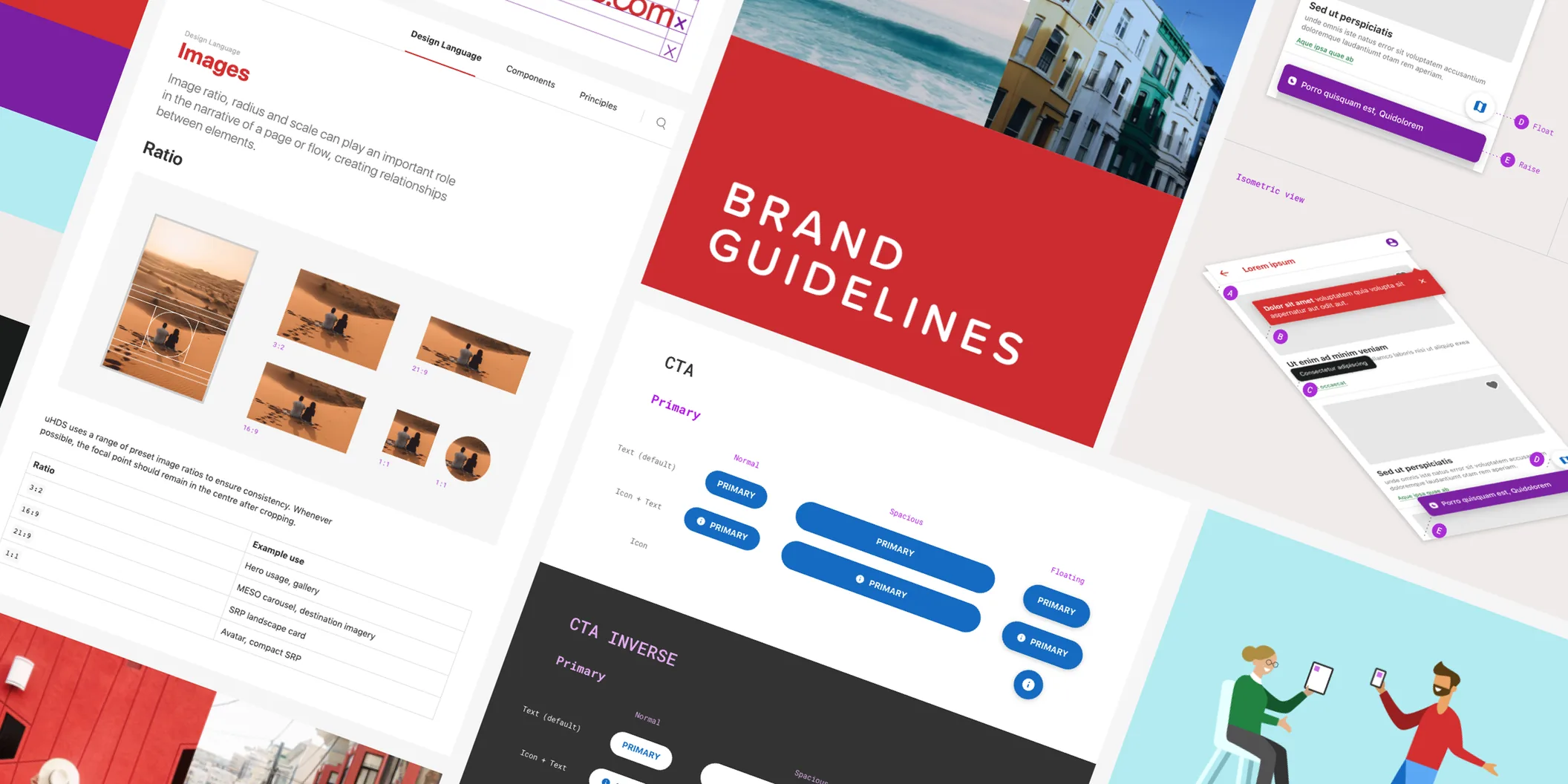
A lot of the teaching ended up in the documentation. We put the design language, the components and the principles behind them on a zeroheight site, and added a knowledge hub for designing with the system. At handoff, Zeplin showed developers the real components under their real names.
Testing went the other way. It had been page-level and small: individual colours and micro-enhancements injected into specific pages. Designing through the system moved people up a level, and a test could run across a whole experience instead of page by page. We could test more broadly and faster at the same time. We ran talks and workshops for designers, developers and PMs on both.
Measuring whether it was working
The UX team already ran a quarterly pulse, so we added a design system section to it: three statements, each scored out of ten. It gave us a read we had never had, and something to point at when leadership asked what the system was worth.
All three moved the right way. Speed went first and fastest, then held while coverage caught up behind it. The scores were never the point on their own: each round we took the weakest one into deep dives with the team, worked out what sat behind it, and put the fix in the next quarter’s plan.
Moving the whole library to Figma
Expedia Group was working out how its design systems could converge, and nothing could be shared while we were in different tools. The first agreement was React in code and Figma in design, by a fixed date.
We worked through it component by component, teaching everyone Figma as we went because almost nobody had used it. Two days before we were due to finish, Figma shipped auto layout. It changed how components should be built, and we decided that mattered more than the date, so we moved the deadline by a week or two and rebuilt the library on auto layout, every component responding to its content.
On top of it we built a page for every core surface at every breakpoint, listing every component and pattern it could contain in sequence rather than as a finished design. We called them kitchen sinks: a designer pasted one in and re-sorted it into the page they needed.
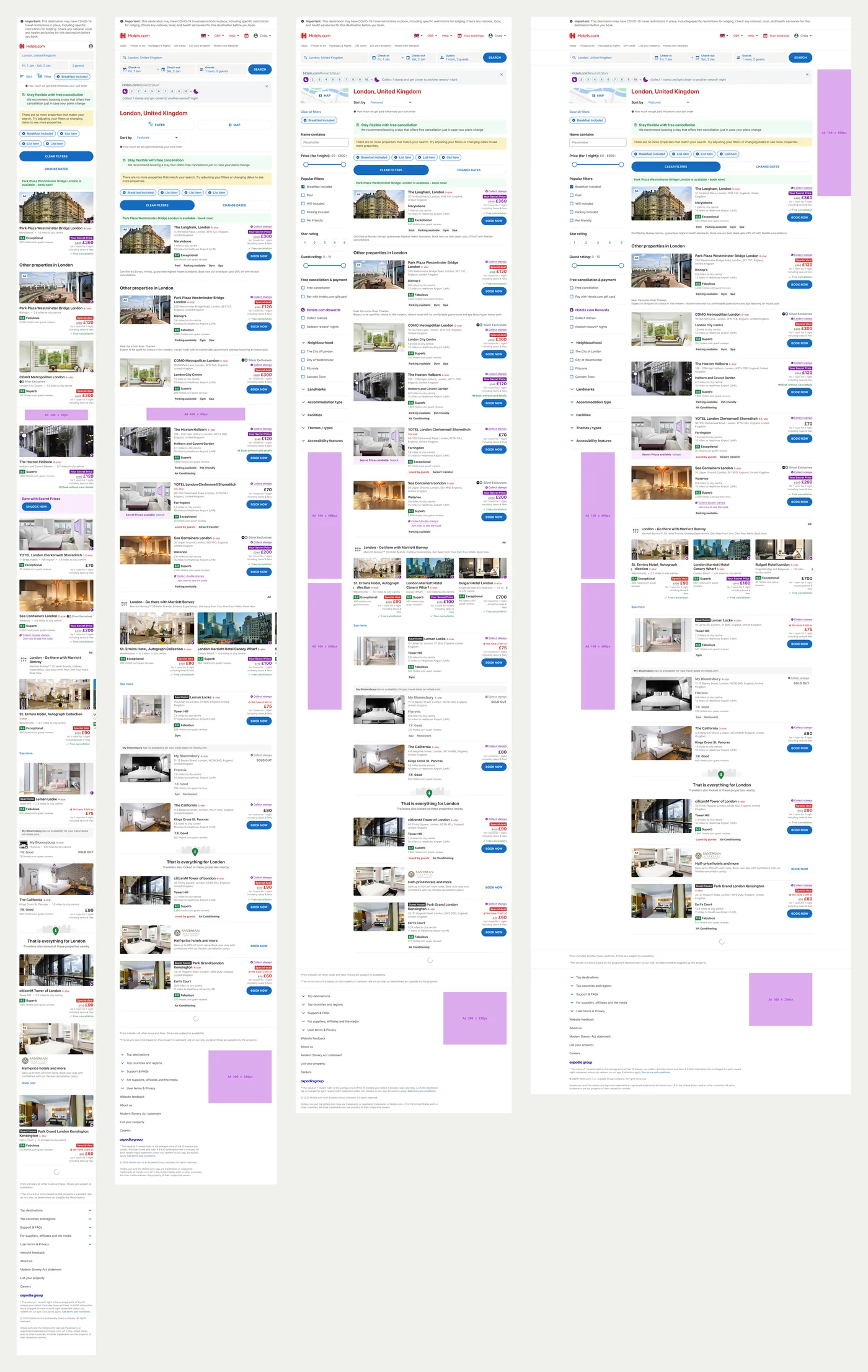
Once every system was on Figma, designers from different brands and different systems could work in the same files in real time. None of the shared token work could have started without it.
Handing it over
Once everyone was in Figma, we were no longer the only people who could build components. We set up a Slack channel and kept every question in a thread so the answers stayed findable, ran open hours, and took bookings for one-to-one time. Teams had been working around us; after a while they started bringing us proposals.
We split the library into three kinds of component, each with its own rule about who could change it.
We treated anything bigger than a component as a pattern and handed those to the product teams, who were organised in pods around home, search, shopping and checkout. Each pod lead owned their patterns and documentation and published them into Figma for others to use as a starting point.
Getting the other channels onto it
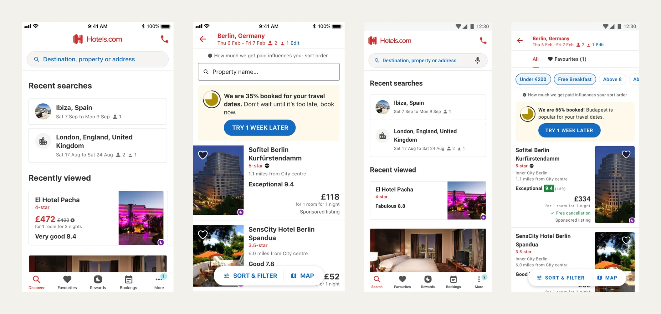
UHDS had started on web, so web was already on it. Apps and CRM wanted the same design language, and social after them. None of them wanted to stop feature work to take on someone else’s library, and each had its own team and its own roadmap. So we gave them a first step they could reach.
We were aiming for a coherent look and feel across the channels rather than a shared implementation underneath. The code and the technology could vary, as long as the customer felt they were in one place.
That gave teams something they could sign up to, and we set it out as a ladder of four tiers they could climb at their own pace.
The apps team took the ladder and ran it themselves. They built their own toolkit in Figma from the design language rather than consuming our library, and they were not on our tokens, so underneath the code had nothing in common with web. They carried the look and feel across and left the rest. Designs reached tier two on both iOS and Android before the eventual migration across to the group system.
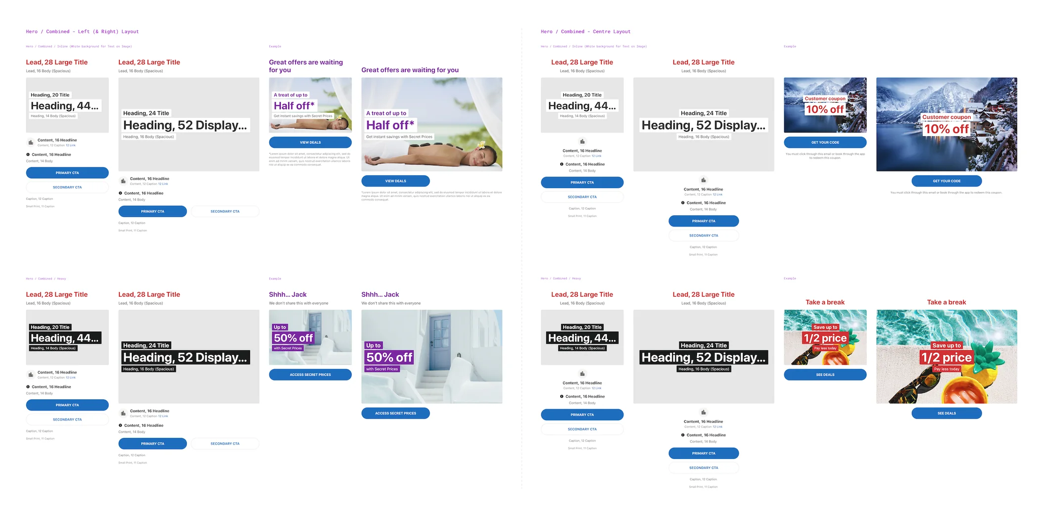
CRM went a different way. We audited every campaign and component the channel was running, then built a toolkit with them: the hero and campaign layouts spec’d down to the type roles, each one paired with a real campaign so it was clear how to use it. The CRM and social teams then built the first campaign designs themselves from the key components and patterns we took across, and the channel moved off its old red mastheads onto the same white canvas and red logo as everything else.
The end of the road
As the group’s own system ramped up I was initially spending two days a week on EGDS, the Expedia Group Design System. The plan was to hand UHDS over and keep it running as I transitioned into a full-time role on EGDS. It was at this point that the business went to a house of brands strategy, the Hotels.com brand work was parked, and the handover stopped where it was. The group moved onto one shared platform, and that was the end of the road for UHDS.
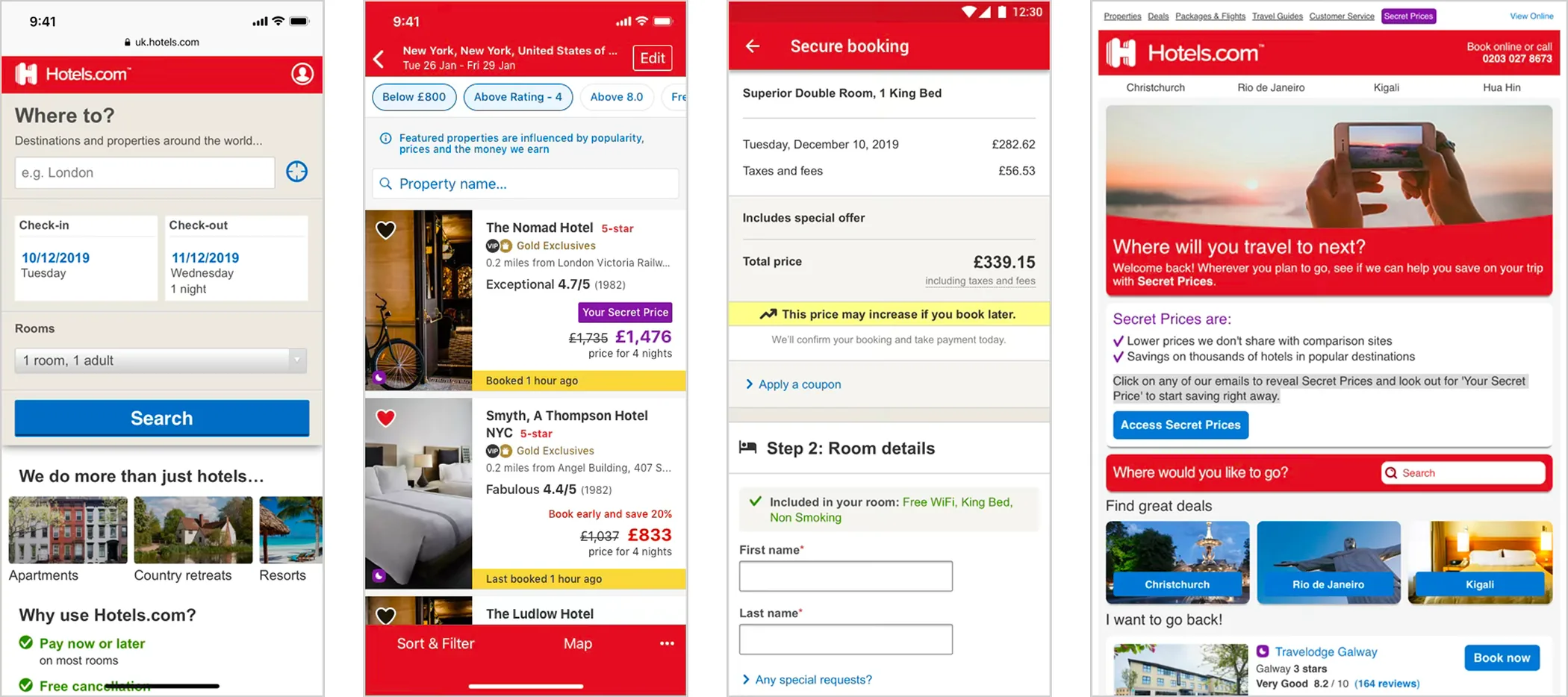
The whole site had to migrate a second time, onto the EGDS stack. It was painful at the start and some of the finer design thinking got lost in the translation. The reasoning underneath it carried over: the size and spacing scales, the density rules, the way we had thought about type. UHDS became one of the four systems that merged into EGDS, and I went with it.
What I’d do differently
Baseline the measures before the first component shipped. We agreed early how we’d judge the system: component coverage, design and tech debt, shipping velocity, team sentiment. I wrote the plan to track it, including usage analytics once we were in Figma, and it kept getting pushed behind delivery. The pulse questions were the only part that ran, so we could say how the team felt but never what the system saved.
Write the contribution rules down sooner. We agreed changes case by case for a long time before the three tiers existed.
Grow the team as adoption grew. Every new channel and every new designer added support, documentation and core work, and the team stayed the same size. Documentation was the part that could always wait another week. We won the argument for people once to get the system built, and I would make it again with every channel that came on.