A Figma plugin for finding the right component and seeing it in your brand.
Lead designer
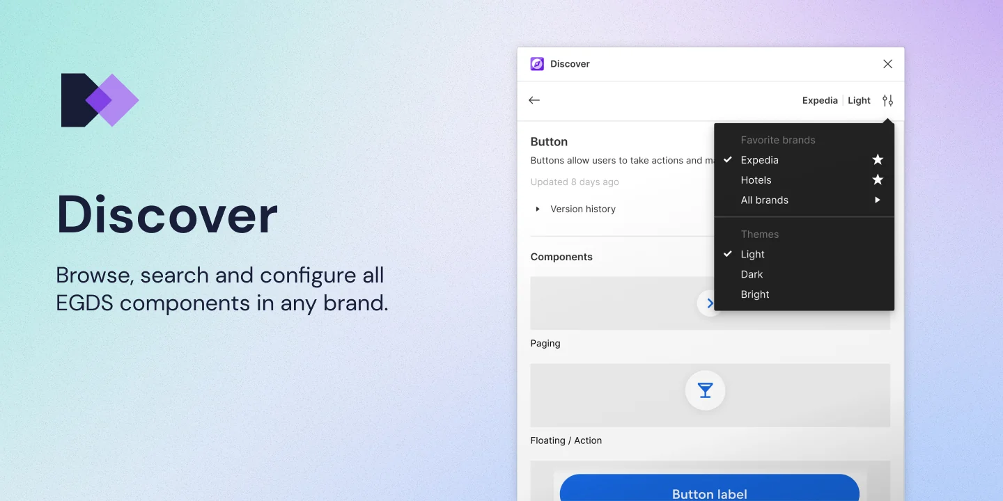
Discover is a Figma plugin I designed for the Expedia Group Design System (EGDS). It helps designers find the right component, see it in their brand and add it to their design. It followed Auditor, built on the same UI kit and component data. I was the lead designer, working with an engineer throughout.
The problem
Auditor checked a design once it was built. Discover was about the step before that, when a designer is choosing a component. Designers found EGDS components through Figma’s Assets panel, and three things were hard.
- Finding the right component. There were 56 Core component libraries, and each one had to be added separately. Search returned results from every system a designer had ever used, and you had to hover over each one to see which were EGDS. If you didn’t know a component’s EGDS name, it was hard to find at all.
- Seeing it in your brand. Components came in a grey default theme. To see one in a brand’s colours, you placed it, themed it with Themer, and did that again every time.
- Knowing more about it. Thumbnails were small, and nothing said what a component was for or whether it was built in code. To check, you connected to the VPN and ran Auditor, or went to each platform’s docs site.
Discover put all three in one plugin window, inside Figma.
Try Discover
I’ve rebuilt the plugin as a working demo you can use in the browser. It plays through the key features first. When it finishes, you can play around with it yourself.
Insert a component, or drag one here
68 EGDS components. Search, open one, and build something on the frame.
A short run through the plugin. It plays on its own, then it’s yours to try.
What Discover does
Discover opens on the full EGDS library, in a grid or a list. Search copes with misspellings and with the names other systems use for a component. Each component has its own page with what it’s for, a preview of each variation, its Figma version history and status, links to its documentation for each platform, and similar components that might suit the job better.
You choose a brand and a light, dark or bright theme, and star the brands you use most. The previews change to match, and a component dragged onto the canvas arrives with that brand and theme applied. The variant explorer lets you set its properties before you insert it.
A few things aren’t in the demo. You could hide deprecated components, and the demo only has light themes. Discover also tracked usage the same way as Auditor, down to which component pages people opened and which components they placed.
Full case study coming soon.