Rebuilding Hotels.com from the ground up.
Lead Product Designer


I led the rebuild of Hotels.com as a Progressive Web App, and argued for building the design system underneath it in the same workstream, not after.
The short version
I led Hotels.com’s move to a Progressive Web App: we rebuilt the mobile web experience, then scaled it to desktop. It went conversion positive at the end of 2019, with NPS (Net Promoter Score) up alongside it. What outlasted the project was the design system we built in the same workstream: UHDS, the Universal Hotels Design System, which went on to power Hotels.com across web, iOS, Android and email.
Four years inside the product first
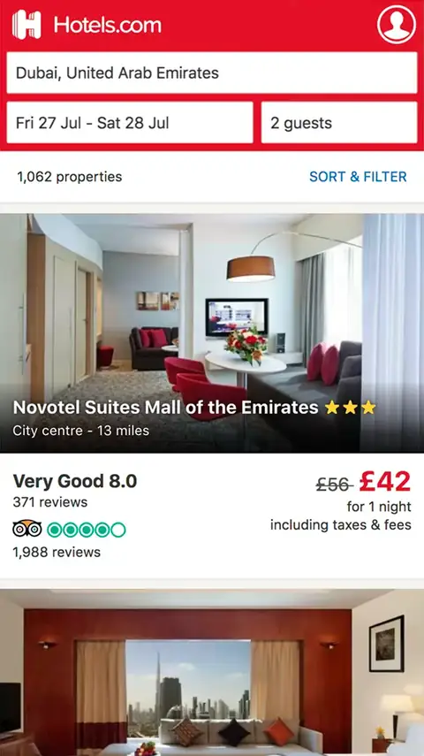
Before the rebuild I’d spent four years at Hotels.com as a product designer - in the lab sessions and usability tests, reading the research, embedded with the engineers. So there was no traditional discovery phase to run; I’d effectively spent four years in one. The business wanted to know whether a Progressive Web App could replace the ageing mobile experience, and gave us three months and a small team to prove it: three developers, a PM, and me as the only designer. To move at that pace we kept the existing brand and put the design effort into the architecture - a single page app with a deliberately minimal homepage. Making calls with engineering in real time, we hit the target: a proof of concept scoring above 90 on Lighthouse with app-like transitions, and the business committed to the full rebuild. With the rebuild greenlit, a second designer joined me, and the design work I’d carried alone through the proof of concept became shared.

Refreshing the brand
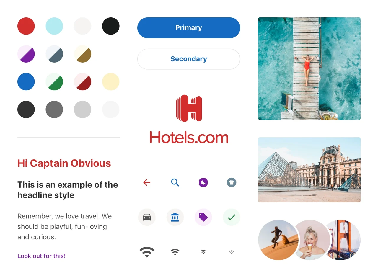
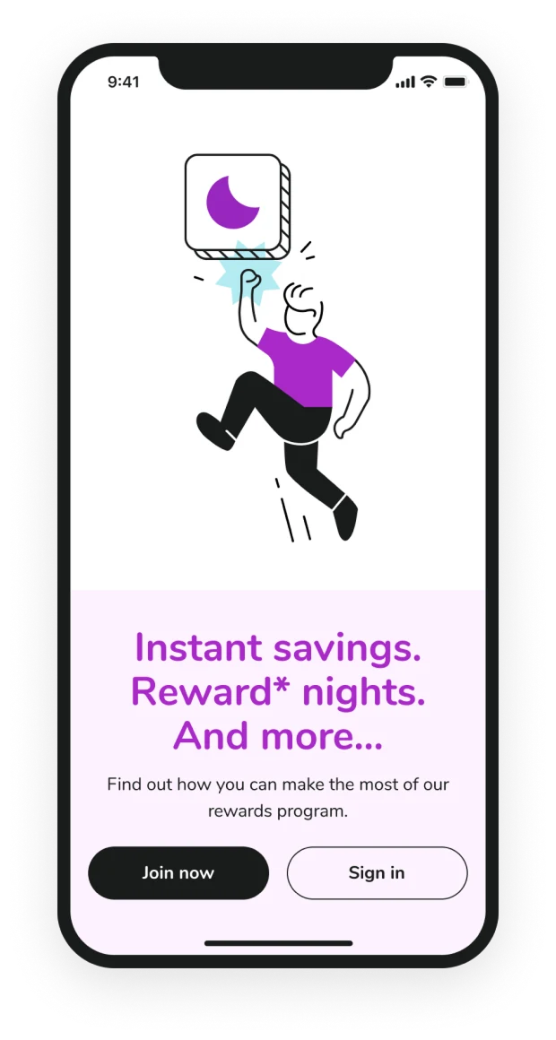
Hotels.com had a brand refresh underway at the same time, moving towards a more playful feel. It was a big body of brand work, but the colours that came to us were built for brand rather than digital UI: a small set of core hues, plus a few key ones for the rewards programme. Making them usable in the product was our job: scaling those base colours into ramps and mapping them to the jobs they had to do in the UI, all contrast-checked to AA.
Making the case for building both at once
Hotels.com had never had a design system. The culture ran on MVT testing at high velocity, 100+ tests a quarter - good for conversion, but it left the site full of UI shouting at once: the same button built in a handful of versions, grids that didn’t line up page to page. Rebuilding in React was the moment to fix it: as we designed the new screens we kept reaching for the same pieces and documenting them, and without really planning to, we’d started a design system.
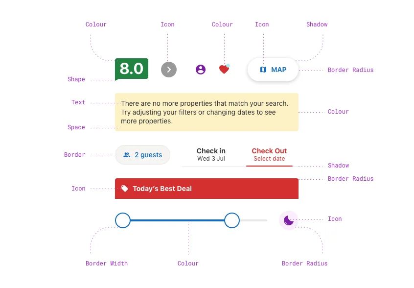
Making it official was the harder sell. Taking inspiration from Salesforce’s approach to design tokens, I pinned down colour, type, space, size, borders, radii and shadows as values design and engineering shared. On a tight deadline the objection was that a system would be a distraction and a cost; my argument was that a weak foundation just ships the same inconsistencies at higher fidelity, then forces the system work later anyway, under more pressure. With no time allocated, three of us ran it on the side, presenting to leadership every week until they bought in.
The call
We built the product and the system at the same time.
The product became the system’s first user, and the system kept going long after the product had moved on.
Bringing people with us
Alongside the system we were building a new visual language, and the hard part wasn’t the design, it was bringing people with us. Some felt it was too much change at once, preferring to keep the legacy styling and just make the site faster. But the React rebuild was a clean slate that doesn’t come round often, so we fought for it and won people over rather than overruling them. Rather than port years of trusted patterns across pixel for pixel, we worked with the PMs and designers who owned each area, dug into why an old experiment had won, and rebuilt for it in the new language. The performance budget shaped the work too: dropping shadows was as much about render cost as looks.
"Joe was the lead designer on both the end-to-end experience redesign and the design system that underpinned it - running both in parallel, which is no small feat... He had a rare ability to hold both a systems-level view and a pragmatic 'how do we actually ship this' mindset at the same time."
Harry Nightingall, Product Manager, Hotels.comWhat we actually built
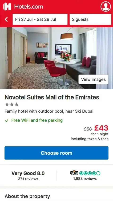
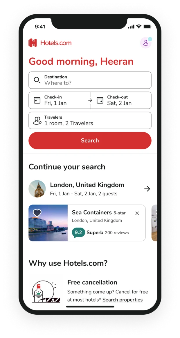
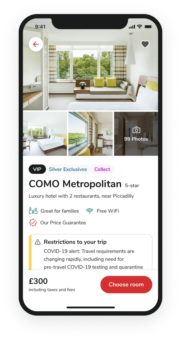
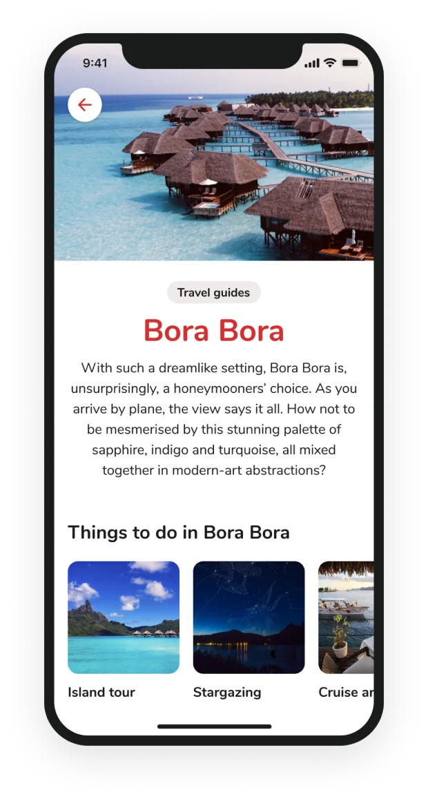
On the product side I led design across every main surface of the PWA: homepage, search results in list and map, property pages and their modals, the global header, and the search query module.
Every main surface of the PWA
Mobile-first, 30+ languages.

On the system side, UHDS covered the whole stack: tokens for colour, type and spacing, components built on them, standardised motion, governance, documentation, and the Sketch library we designed from.
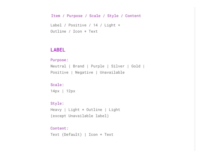
Vocabulary
A shared vocabulary that let design and development speak the same language.
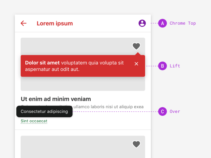
Tokens
Our design decisions encoded as tokens, keeping the product consistent as it scaled.
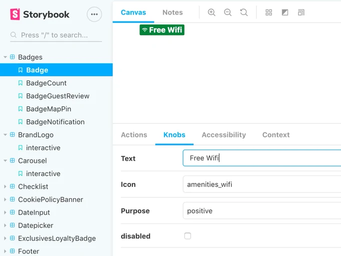
Components
Built in Sketch and React from the same tokens, documented and testable in Storybook.
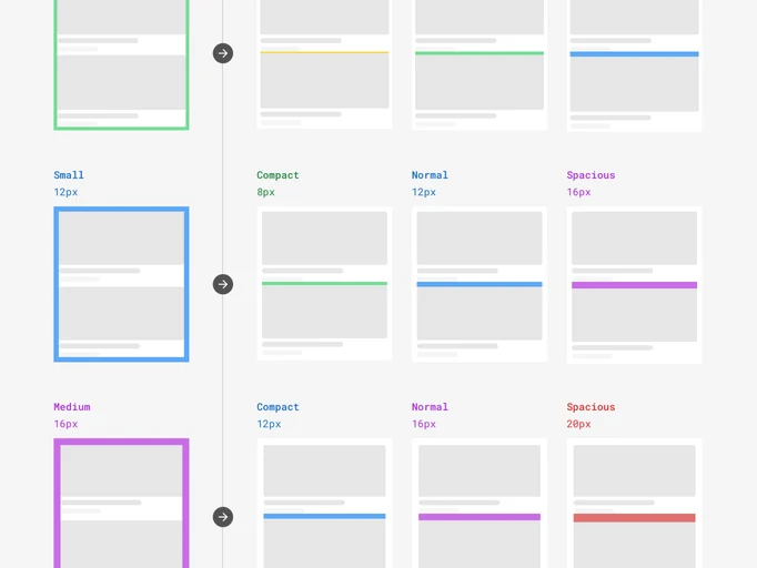
Layout
Page wrappers and child-spacing scales that give every screen a consistent rhythm.
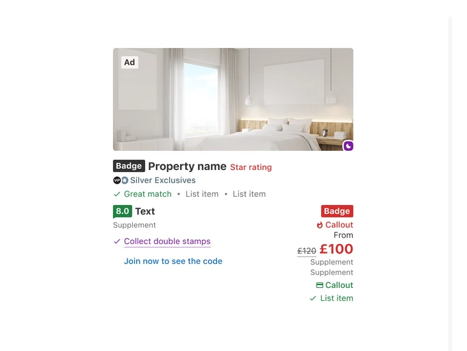
Patterns
Reusable chunks of UI assembled from components and documented for reuse.
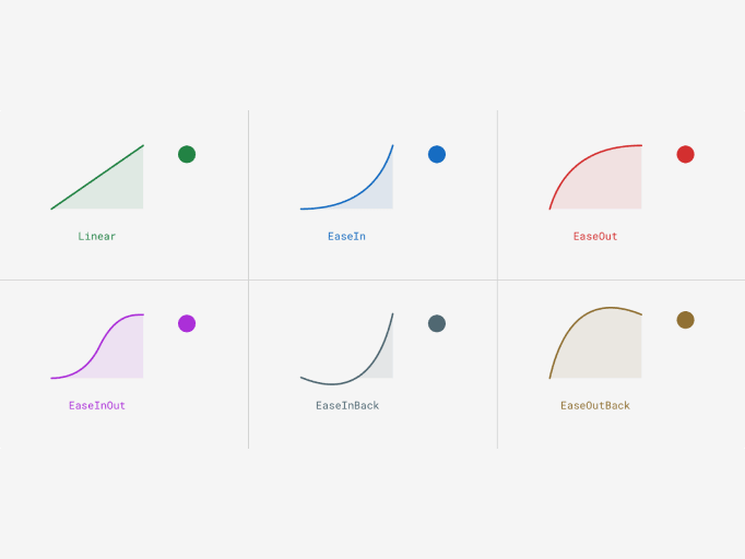
Motion
A motion framework and guidance, so teams built consistent, familiar motion faster.
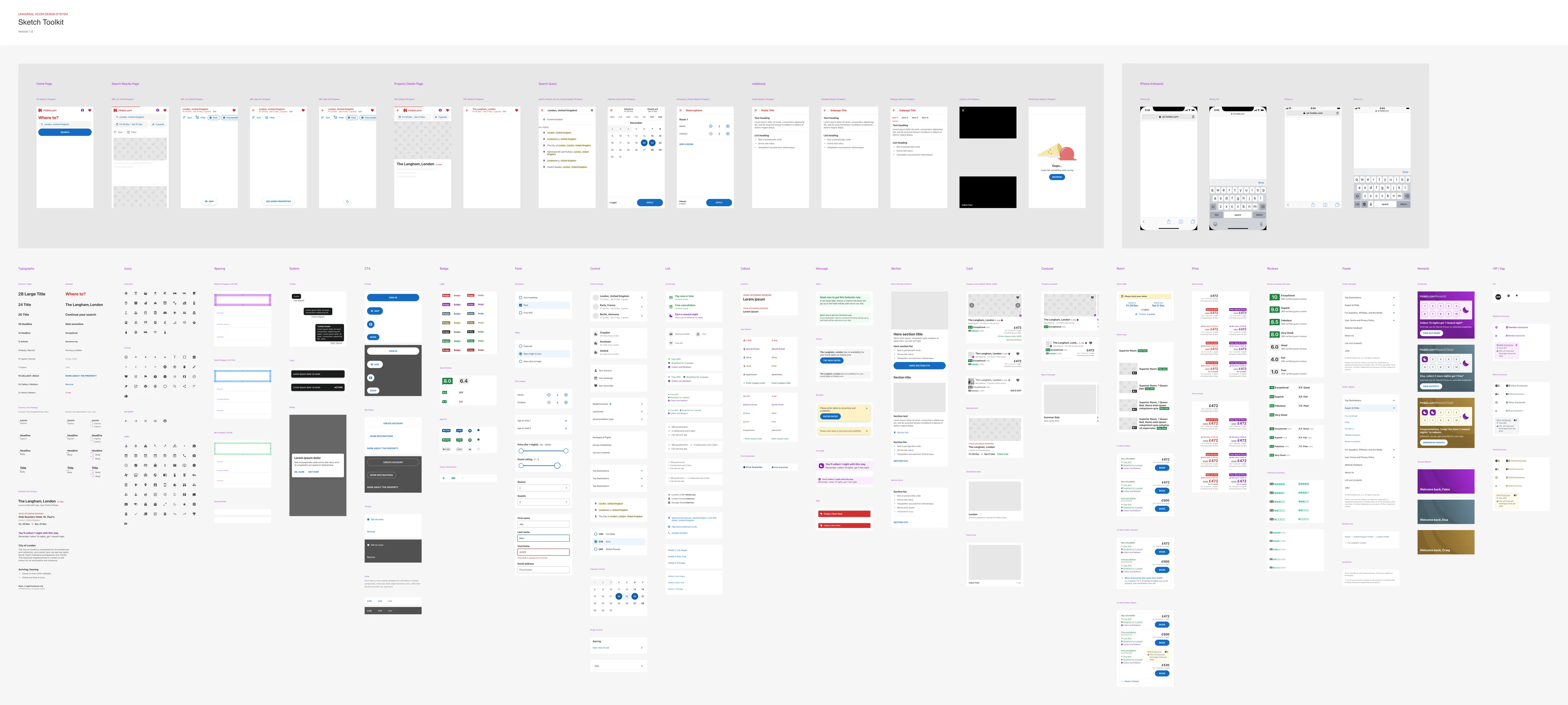
The sticker sheet we designed from
We had a lot to get through, and were always looking to work quicker. Digging a component out of the full library every time was slow for the things we used day to day, so we built a sticker sheet: the most-used components and patterns on one canvas, grouped by job, ready to grab and adapt rather than hunt for. It started as a shortcut for the bits we reached for over and over. We could see it being just as useful as the team grew, so we built it out properly, ready for a bigger team to design from.
User testing with RITE
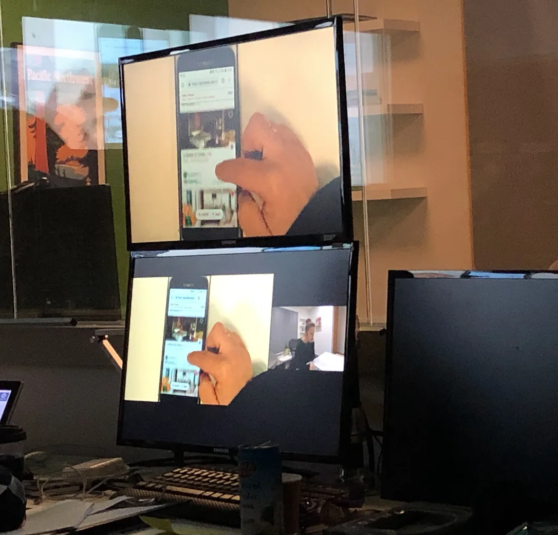
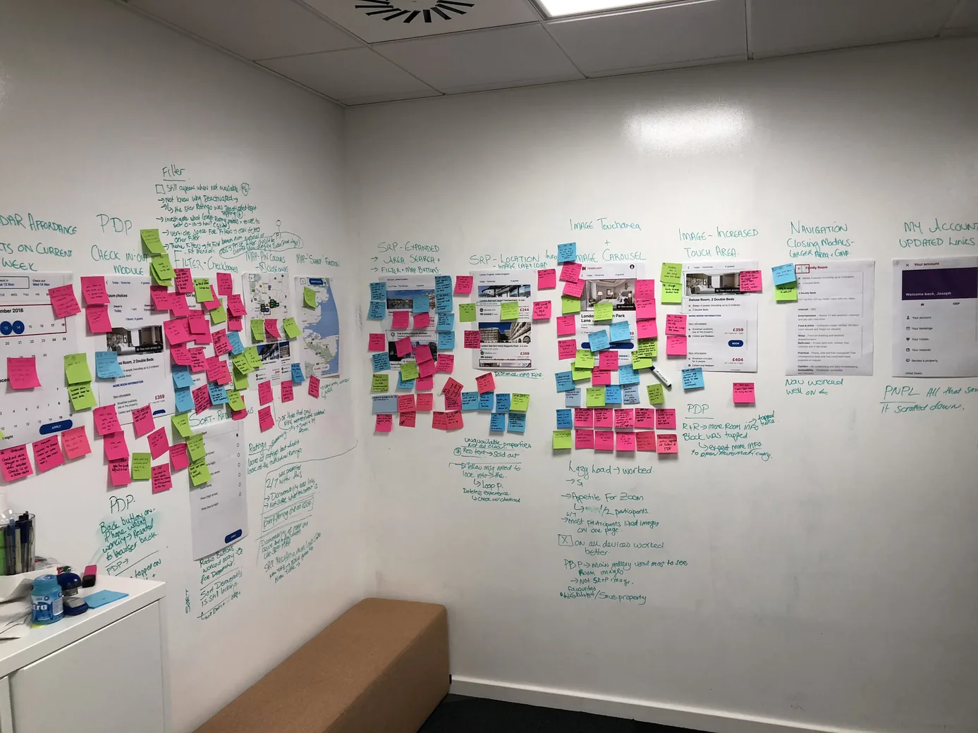
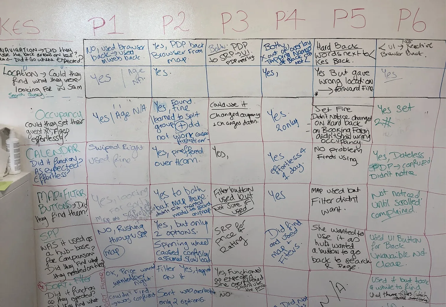
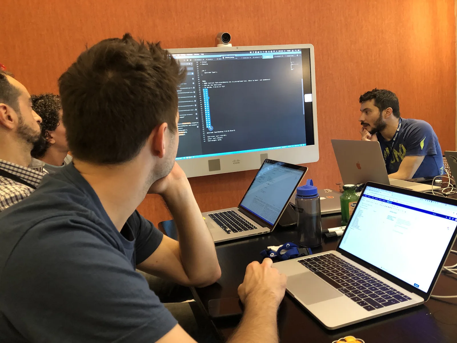
We ran usability testing on tight cycles using RITE (Rapid Iterative Testing and Evaluation) - small rounds in the lab, fixing the obvious problems the moment they showed up rather than waiting for a big study to end. We’d book the lab for a few days and test the whole journey with designers, engineers and PMs watching, agreeing fixes on the spot and sometimes changing something overnight to retest the next morning. Watching the same customers hit the same walls gave the team a shared sense of what people were really struggling with.
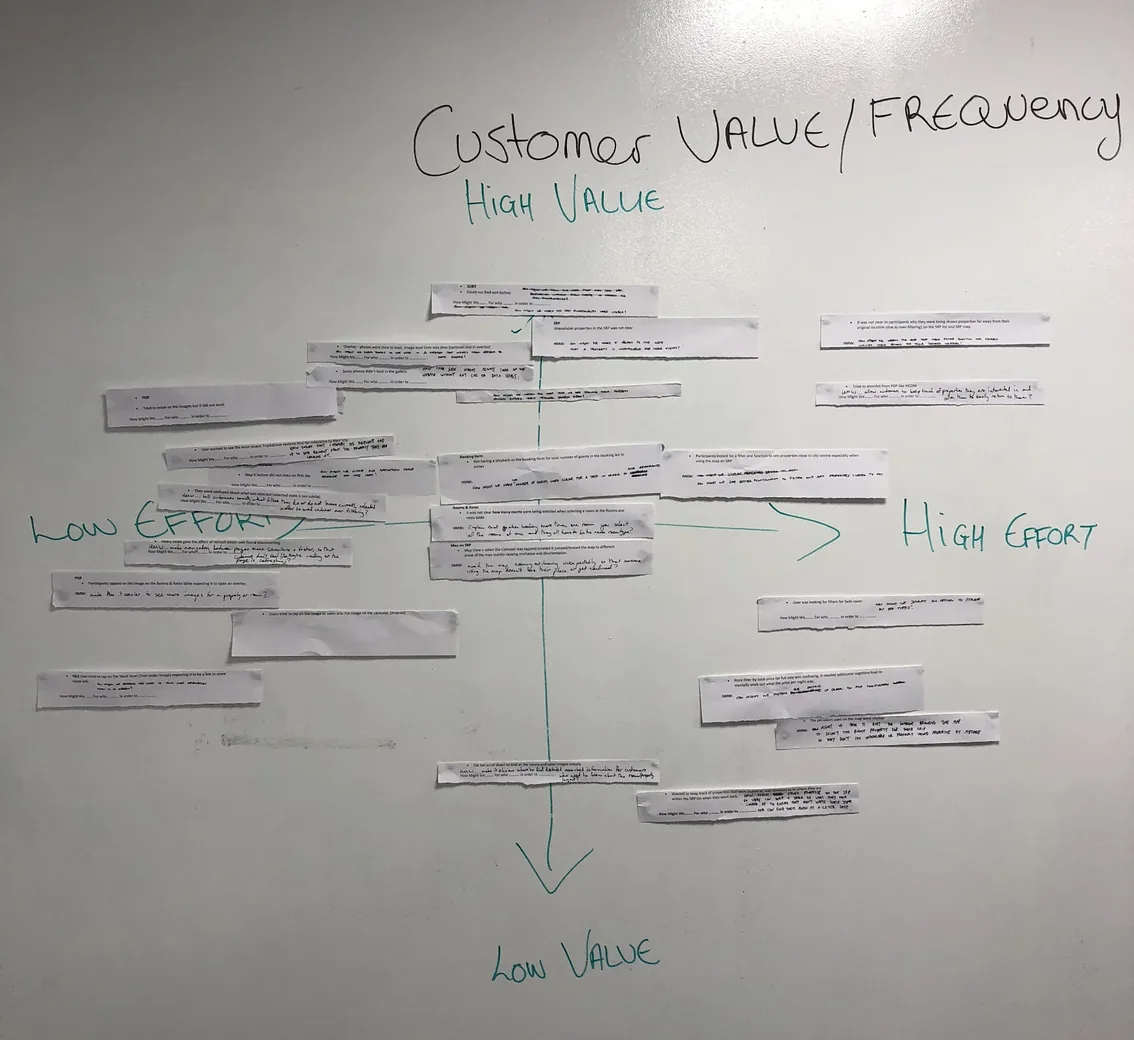
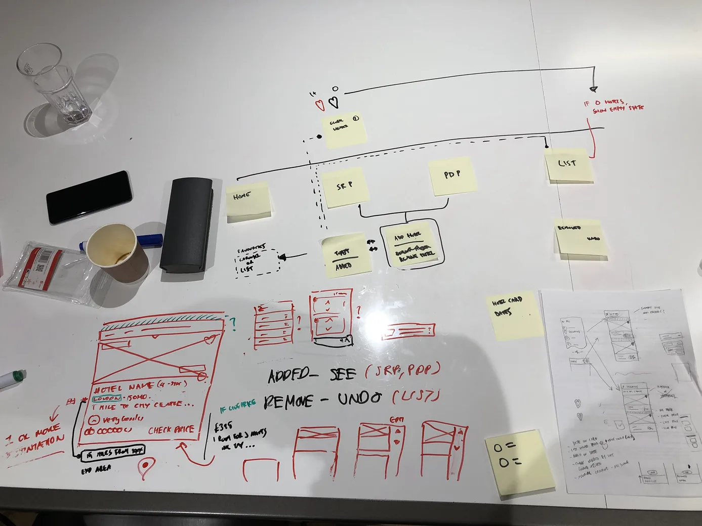
From the lab to the backlog
How a session in the UX research lab turned into an ordered list of fixes, and sometimes a build the next morning.
Scaling to desktop with rules, not a second redesign
Ideally we wanted to build each feature once and run both channels on a single front-end platform. A strict performance budget came with it: we stayed adaptive rather than responsive, so phones only ever downloaded a lean, mobile-only bundle. The deadline pulled against that. Rebuilding the desktop from scratch risked losing conversion parity, so the business wanted us to use the existing, tried-and-tested layout initially. That call wasn’t mine, but finding a way to make it work was: the mobile-first components had to stretch to meet a layout they were never built for - which is what put the system to the test.
Channels and grids
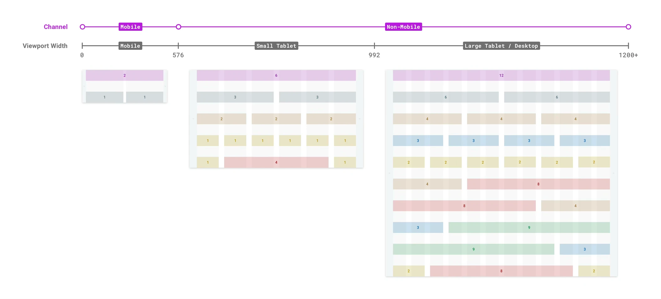
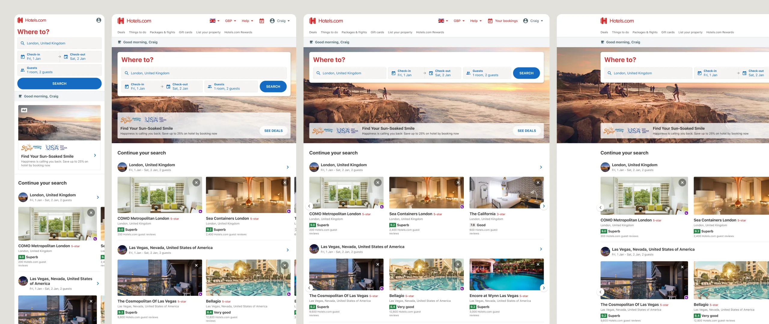
The real question was what could be shared and what had to change for desktop. Rather than decide that screen by screen, we went through every component and checked it against both channels, keeping the shared version wherever it held up and only changing a component where desktop needed it. Where desktop needed something the shared set didn’t have, we added extended components on top of the core instead of forking it. The six rules came out of that work, and by the end UHDS wasn’t just a mobile system, it worked across every channel.
Scale
Components scale up or down by device: bigger, thumb-first targets on mobile, tighter sizing where a pointer is precise.
Density
How much lives in a viewport flexes by channel, looser on mobile and denser on desktop, without changing the component underneath.
Normalised components
The shared core: one build per component, no per-market or per-channel forks.
Extended patterns
Where desktop needed something the core did not cover, we built on top of it rather than forking, like the results property card.
Grid
One grid across every page, one or two columns on mobile and multi-column on desktop.
Section spacing
Vertical rhythm settled once as a rule, not re-argued on every screen.
Experimenting on paper
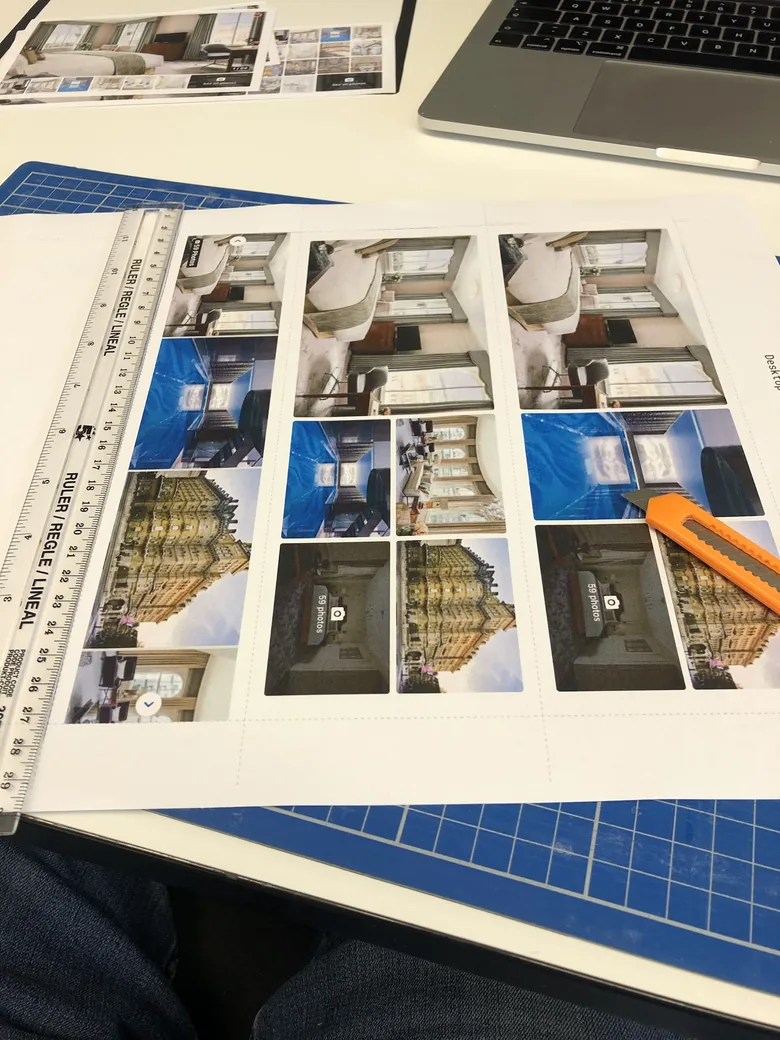
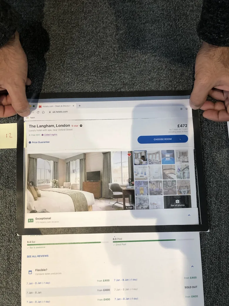
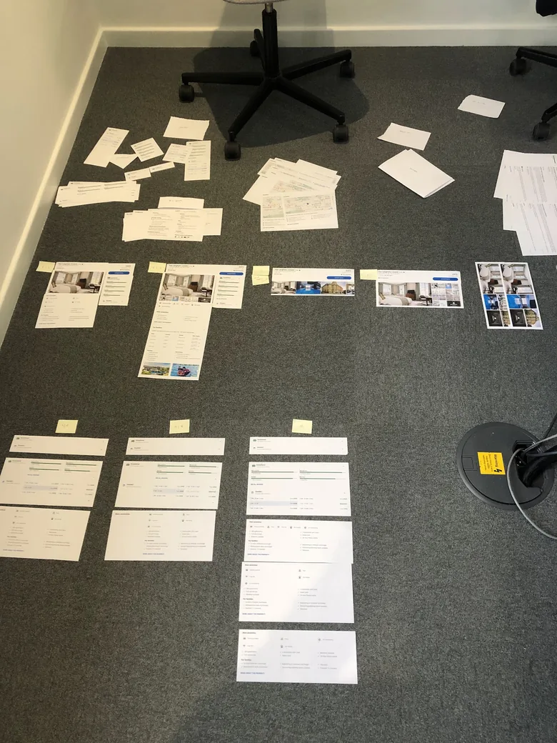
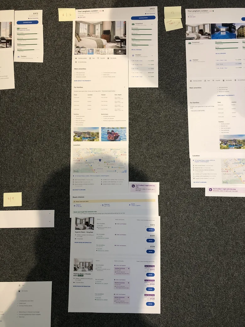
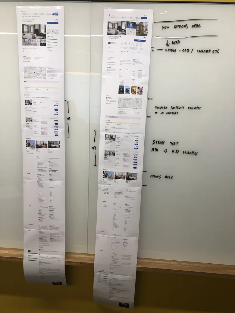
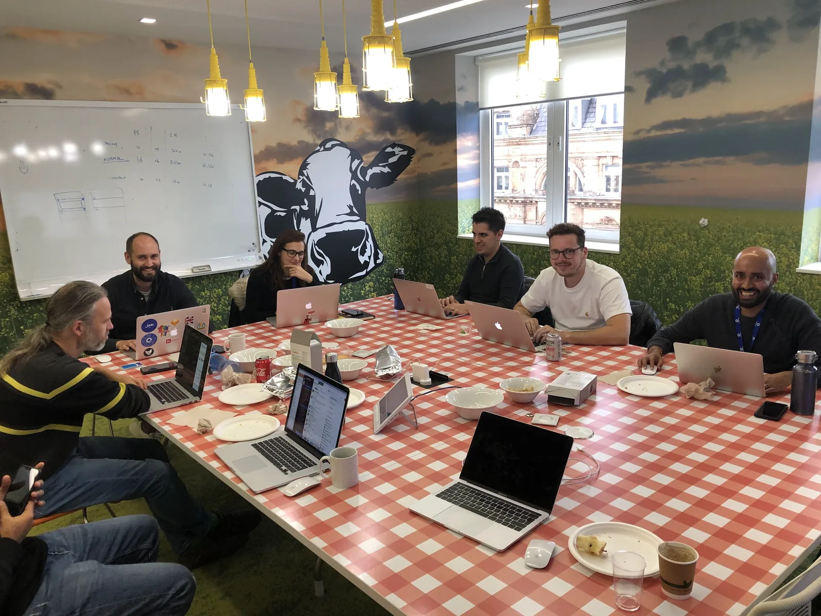
We already had the pieces designed, so we printed them out and rearranged them by hand - a fast, collaborative way to go wide and try lots of different concepts, then fold the ones that worked back into the digital design.
One role becomes two
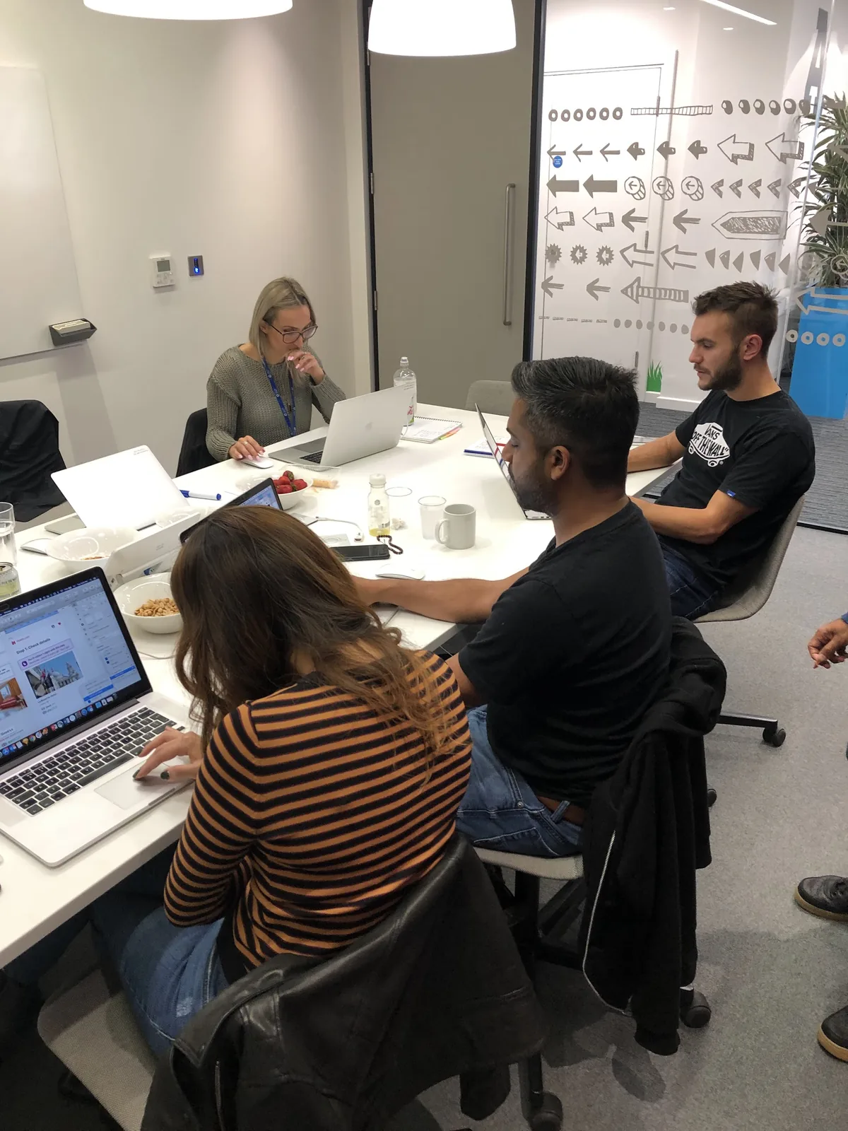
As desktop ramped up and more designers joined, the setup a colleague and I had run, covering both product and system, stopped scaling. So we split it: the two of us moved fully onto the system side, while the product side grew to around twenty designers. If anything the role widened - we still owned the system, but just as much of the job became overseeing the work built on it and bringing a growing team up to speed.
That meant onboarding and mentoring: training, open hours, walking new designers through not just the components but the thinking behind them. When someone needed something the system didn’t have yet, we’d work it out together and fold an agreed rule or token back in for everyone - flexible constraints, we called it. The operational side scaled too: we migrated the whole library to Figma and took on running a design tool at that scale, from licensing and seats to team structure and documentation. Design ops became a real part of the role.
Rolling it out
We went live to a few smaller points of sale first, watching conversion and fixing weak spots without risking the whole company’s revenue, working alongside finance, product owners and execs so the business could see what each release did. Once we were confident, we opened it to the bigger markets, then everyone. The site came out conversion positive, with a 35% increase in Lighthouse scores, and the experience hung together far better, which showed up as a lift in NPS.
"Heeran and Joe with a supporting cast of many, many people across UX, dev and product embraced, challenged and evolved those early ramblings and delivered the robust design system that we have today... I don’t say this lightly, this is a fantastic piece of work that they have sweat blood, tears and a significant amount of alcohol over."
Craig Melbourne, Principal, Product Experience Strategy & Design, Hotels.comWhere it went next
The product shipped, converted, and kept getting better, with faster, more consistent releases because of what sat underneath. Building the system alongside the product made the 2018 timeline harder, but it’s the reason UHDS outlived the product.
By the end we were pushing past the system itself, into a North Star visual language that gave the brand more personality across every touchpoint, and took it to leadership.
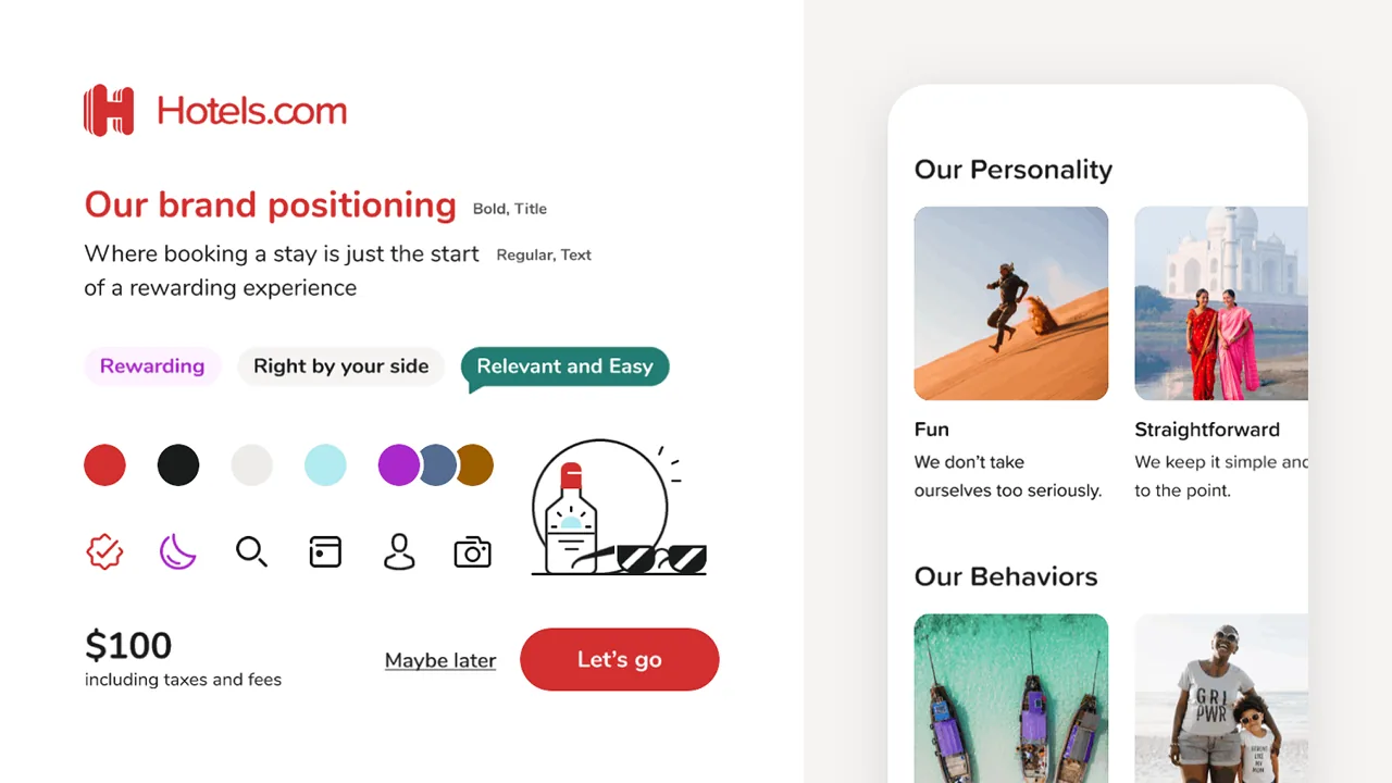
It never quite shipped for Hotels.com alone. The group was moving its major brands onto one shared platform, and UHDS became a flagship system feeding into what’s now EGDS, the Expedia Group Design System. The North Star gave way to a shared one, but much of the thinking carried across.
What I’d do differently
Scope desktop earlier. Going mobile-first was right, but desktop’s needs surfaced late and we took them on under pressure. We could have worked most of them out months before we had to.
Get people onto the system sooner. Building it alongside the product was the right call, but two of us carried it for a long stretch. Dedicated time and a couple more people earlier would have taken the strain off without changing how we built.